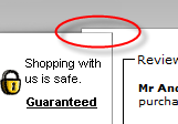
Over on the BOS forum Rensy commented on how ugly the 2Checkout payment page is. They appear to have beaten it with an ugly stick in a recent ‘makeover’. Below is the Perfect Table Plan 2Checkout payment page, click on the image to see it in it’s full glory:
When (if) you finally work out where to click you are confronted with another equally ugly page:
Presumably the icons down the left side are supposed to reassure me that the site is trustworthy. But all they do is distract and confuse me. When you emphasize everything, you emphasize nothing. The overlapping boxes, the choice of fonts and white space also look amateurish.
The PayPal and GoogleCheckout pages are models of taste and minimalism by comparison (apart from the huge and inexplicable white space at the bottom of the GoogleCheckout page):
PayPal and GoogleCheckout also use a single page where 2Checkout uses two. This means one less click for your customer and, critically, one less chance to change their mind. I’m glad I only use 2Checkout as a back-up for customers who don’t want to use PayPal.
Does 2Checkout have the ugliest payment pages? Please add a comment below if you have seen worse (ideally with a link to a screenshot).


I think the whitespace on the Google Checkout page is on purpose for exactly the reasons that you outline for 2Checkout. Thye move it out of the way so there’s less things to mistakenly click on.
I think Google Checkout uses Iframe below to process payments. Some browsers behave strange when div is resized based on Iframe’s height. So they must be using some kind of default Iframe height to be sure. This is why we should large space in google checkout.
“we should large space in google checkout” needs to be read as :
“we see large space in google checkout”. Sorry hit Enter too soon.
That is pretty brutal! There’s so much contention for your attention that you have to actively focus on what you’re doing.
I think some of these places too much emphasis on whats inside the site rather than the landing page.
I think the godaddy.com website is the worst possible. Can never find the correct button to click, since it always seems that the only one presented is the ones to “upgrade” rather than buy what we want.
I love 2checkout.com but for years, I have thought that they have the ugliest checkout page. I was just thinking it, and then I found this thread. I think it’s a bit less ugly since I saw it last, so maybe someone cluded them in.
I really think their checkout pages should be customizable to slightly resemble the store where the shopping is happening. In the early days, use to be able to upload a banner, not sure if you can still do so or not.
There service is good, but not the landing page.
I got a good giggle from the thread and comments!
I’m a new user of 2CO and luckily found that they have a 1-click-checkout routine.
In under 5 min. I had resolved all but their lack of graphic design finesse.
@ Iamhereonline, I tend to agree that rather than overly branding themselves, they could, would and should place equal emphasis on the corporate ID of the merchant they are conducting the transaction for.
Thank you all for the entertainment.
AF
i agree, ugliest payment page i ever seen!!!