Is the golden age of Indie software over?

The concept of shareware appeared in the 1980s. Developers would use relatively primitive tools to create their software, then promote it via fanzines, user groups and bulletin boards to a niche audience of shareware fans. If you wanted to try the software, you would have to get hold of a floppy disk with it on. And, if you wanted to buy a licence, you would generally have to post a physical cheque to the developer. This was being an Indie developer in hard mode. A few people made a lot of money, but most vendors made modest returns on their efforts.

I started selling my first software product in 2005. This was a good time to start up as an independent software vendor. High quality compilers, IDEs, debuggers, version control systems and web servers were widely available and mostly free. The market for software was growing, as more and more people purchased PCs and Macs. Payment processors were starting to streamline online payments. But the real revolution was being able to distribute your software worldwide via an increasingly ubiquitous Internet. And getting noticed by potential customers, while never easy, was generally achievable through writing content for search engines to find, paid online ads (such as Google Adwords pay per click), download sites or even ads in physical magazines. With a lot of hard work and a bit of luck, it was quite possible to make a decent living.

Things have continued evolving at a rapid pace over the 20 years I have been selling software. Development tools have continued to improve. Mobile and web-based software has become mainstream. App stores have appeared. Outsourcing became a thing. Subscription payment models are increasingly common. Mostly these changes haven’t affected my business too much. But recently things have begun to feel noticeably harder.

LLMs have made a major impact. While I don’t worry that LLMs will do a better job than my seating planner software, data wrangling software or visual planning software any time soon (my main competitor remains Excel), everyone is noticing that their web traffic is falling. People increasingly read LLM summaries rather than clicking on search engine links or the accompanying ads. Maybe the LLM will include a link to the website that they ripped off the content from, but probably they won’t. So writing content in the hope of traffic from search engines is becoming less and less of a viable strategy to get noticed.

Other promotional channels are getting squeezed as well. Online ads are increasingly expensive and rife with click fraud. This makes it hard to get any chance of a return, unless lifetime customer value is hundreds of dollars. Google Adwords is a case in point. In the early days, I could get lots of targeted clicks at an affordable price. But Google have done everything they can to raise bid prices and generally enshittify Adwords, so they can grab more and more of the value in every transaction. I now get barely any clicks at bid prices I am prepared to pay.

One of the few useful promotional channels left is YouTube. But it is very time-consuming to produce videos and the amount of competition is huge. I fully expect generative AI to erode its value over time, as AI slop floods the channel.

Typically promotional channels start off great for vendors and become less great over time (the law of shitty clickthrus). But then new promotional channels appear and the dance starts again. But there just doesn’t seem to be much in the way of viable new channels appearing for Indie vendors like myself. My experiment with advertising on Reddit did not go well.

LLMs potentially also make software easier to write, which is a double-edged sword. It might help you code features faster, but it also lowers the barrier, so that more people can compete. Even if your new competition is bug riddled garbage, ‘vibe coded’ by someone who doesn’t know what they are doing, it still makes it harder for your product to get noticed.

The general cost of living crisis hasn’t helped either. The super-rich are making out like bandits, but everyone else has less disposable income. And that is only going to get worse when the current AI funding circle-jerk implodes.

Each of the different software platforms also have their own issues.

  • Downloadable software has fallen out of fashion and the market is shrinking as increasingly people expect software to be web-based. People are also wary about downloading software onto their computers, in case it contains malware.
  • Web-based software is more of a service than a product and is expected to be available 24×7. Expect to get lots of very unhappy emails if your server falls over. And woe betide you if your customer data is hacked. Disappearing off somewhere for a few days without an Internet connection is not really viable, unless you have employees.
  • Mobile-based software is expected to be free or, at best, very cheap. So requires huge scale to make any decent return. And that is tough when there are some 2 million apps in the iPhone app store. You are also at the mercy of app store owners, who really don’t have your best interest at heart.

The new wave of AI tools must be creating new opportunities, but it seems these opportunities are mostly there for big companies, not for Indie developers. And it is very risky to build your product as a thin layer on top of someone else’s platform. Ask people who built tools and services on top of Twitter.

It feels that it is getting harder for small software vendors, like myself, to make a living. Of course, this could be just the ramblings of a 50-something-year-old, looking back through his rose-tinted varifocals. What do you think? Has it got harder?

If you want to show indie software vendors some love, check out all the great indie software for Mac and Windows (including my own Easy Data Transform and Hyper Plan) on sale at Winterfest.

Updating application icons for macOS 26 Tahoe and Liquid Glass

The application icon for my data wrangling software looks like this on a Mac up to macOS 15.x:

However, Apple has once again nuked everything from orbit. Now it looks like this in macOS 26 Tahoe when the application is inactive or if you choose any Icon & widget style apart from Default:

Thanks Apple. It is such a joy to develop for Mac.

With some help from a designer and hours of going around in circles, I have finally managed to fix things to support the new ‘liquid glass’ look. This is how it should look in the next release, depending on the setting in Appearance>Icon & widget style:

Default
Dark
Clear/Light
Clear/Dark
Tinted

I’m not convinced it is an improvement in terms of usability. But, at least my app icon doesn’t look like shit.

What you need to know

The new macOS 26 icon format is .icon. It is a folder full of various resources and is totally different to the old .icns format.

The .icon file can be created by Apple Icon Composer. I used a freelancer on Fiverr who did a good job of converting my existing vector artwork and was very cheap. The .icon file should contain a maximum of 4 groups (which seem to be like layers) other it won’t compile to a resource properly.

Note that macOS hide the extension of .icon folders by default, which was a source of some confusion.

The .icon file then has to be processed into an Assets.car file using actool. For example:

xcrun actool application.icon --compile ./icons/macosx --output-format human-readable-text --notices --warnings --errors --output-partial-info-plist temp.plist --app-icon Icon --include-all-app-icons --enable-on-demand-resources NO --development-region en --target-device mac --minimum-deployment-target 26.0 --platform macosx

You will need to change the bold parts above, as appropriate.

I had to update my Mac laptop to macOS 26, Xcode 26 and the macOS 26 SDK for the above to work.

You can check the Assets.car file using assetutil to create a .json file listing the contents:

xcrun --sdk macosx assetutil --info ./icons/macosx/Assets.car > ./icons/macosx/temp.json 

You will need to change the bold parts above, as appropriate.

Then you need to reference the new icon in your existing application .plist file. For example, add at the same level as CFBundleGetInfoString:

<key>CFBundleIconName</key>
<string>application</string>

You will need to change the bold part above, as appropriate. I believe the string value if based on the file stem of the original .icon file. But I’m not 100% sure about that. Look at the .json file produced by assetutil for clues. Mine contained this:

The temp.plist file generated by actool is apparently supposed to give you a .plist file that refers to the icon resource. It didn’t and was completely useless.

Then place both Assets.car and your old .icns file in the Resource folder of your application (before you sign it). That way it should look ok on both macOS 26 and earlier OSes.

If you develop using XCode, it will probably do some of the above for you. I develop in C++/Qt using Qt Creator, so I had to do it all manually.

I was able to generate the Assets.car on macOS 26 and then incorporate it into the build on my macOS 12 development machine.

I hope the above saves someone a few hours. Now I need to repeat the process for PerfectTablePlan.

You might also find this post useful (where I got some of the information):

https://www.hendrik-erz.de/post/supporting-liquid-glass-icons-in-apps-without-xcode

How many elephants? Get helpful comparisons of height, distance, area, volume, time, speed and other quantities.

How many elephants?

When people are trying to convey a quantity, they will generally try to compare it to something that they think people already have a feel for. For example, ‘weighing as much as 10 elephants’ or ‘twice the area of a tennis court’. But people often come up with terrible comparisons, and this grates on my nerves. So I have done a little side project to generate comparisons for you. I named it ‘How many elephants’ as elephants (and Jumbo jets) seem to figure a lot in these comparisons.

It allows you to create comparisons for:

  • Length/Height
  • Area
  • Volume
  • Mass/Weight
  • Time
  • Velocity/Speed
  • Energy

I might add more dimensions, such as force, acceleration and pressure, later on.

You can try it at http://howmanyelephants.co.uk/ .

It is just a single page of HTML + CSS + JQuery. I used Microsoft Copilot to generate the image and, as a sort of turbocharged Stackoverflow, to help me with the coding.

Did I miss a good comparison or make a mistake? Feel free to give some feedback in the comments.

Software upgrade economics: some real numbers

My seating planner software, PerfectTablePlan, is now at v7. Major upgrades are paid (discounted 60% compared to new licences), which means I have done 6 cycles of paid upgrades. I was curious about how long it took people to upgrade, and what percentage of sales are upgrades. So I took a few minutes to crunch the numbers direct from my licence key database, using my data wrangling software, Easy Data Transform.

Here are the number of upgrade licences I sold for each week after the major upgrade. Each release is in a different colour. The values are normalised so that the peak is the same height for each release:

Upgrade licences sold per week after a major upgrade, across 6 upgrades

That looks rather messy. So here it is with the values for the 6 upgrades summed:

Upgrade licences sold per week after a major upgrade, summed across 6 upgrades.

There is a long tail of upgrades. Even when the gap between releases was 6 years, I was still getting regular upgrade purchases.

With the v5 to v6 upgrade it took:

  • 23 weeks before 50% of the upgrades were sold.
  • 74 weeks before 75% of the upgrades were sold.

So it isn’t a neat exponential decay.

This table shows how many users actually upgraded from v5 to v6:

EditionUpgraded
Home edition12%
Advanced edition31%
Professional edition45%

Most of the Home edition purchasers are buying a licence for a one-off event, such as a wedding. So it is not surprising that they are much less likely to upgrade. But I think it also shows that less price-sensitive customers are significantly more likely to upgrade, even when the upgrade is more expensive.

This graph show the percentage of PerfectTablePlan licences sold each month that were upgrades, over the 20 year life of the product:

Percentage of sales that are upgrades per month.

You can see that upgrades are still increasingly important over time. Upgrades are worth less than new sales, so selling 80% upgrade licences in a month doesn’t mean 80% of revenue is from upgrades. However, upgrades are still an increasingly significant source of revenue for us. I’m glad I never agree to free upgrades for life.

Could I have made more sales with more frequent major upgrades? Definitely. But I was also working on other projects. And I am not out to squeeze every last penny out of my loyal customers.

Could I have made more sales with a subscription model? Possibly. But subscriptions weren’t really a thing for desktop software, when I started 20 years ago. And I never felt like making a major change to a licensing model that had worked well for me, so far.

What I learned spending $851 on Reddit Ads

I am always on the lookout for cost and time effective ways that I can market my software products. Previously, I have had quite a lot of success with Google Adwords Pay Per Click ads. However, the law of shitty clickthroughs means that advertising platforms generally get less and less profitable (for the advertisers) over time. And Google Adwords is a case study of that law in action. As Reddit is a less mature advertising platform, I thought it might still offer opportunities for a decent return. So I decided to experiment with advertising my data munging software, Easy Data Transform, on Reddit.

[By the way, I understand that nobody goes to Reddit because they want to see ads. But commercial products need to market themselves to survive, and Reddit probably wouldn’t exist without ads. Yay capitalism.]

Setup

The basic process to get started with Reddit Ads is:

  • Sign up for a Reddit Ads account.
  • Enter your details and credit card number.
  • Create a campaign.
  • Create one or more ad groups for your campaign. Choose a bid for each ad group, which countries you want it shown in and who you want it shown to.
  • Create one or more ads for each group.
  • Add the Reddit tracking pixel to every page of your website.
  • Set up conversion goals.

All pretty standard stuff for anyone who has used Google Adwords. The twist with Reddit is that you can advertise to communities (sub-Reddits), rather than based on search keywords. For example, Easy Data Transform is a much better tool for most data wrangling tasks than Excel, so I can bid to show ads targeted at Excel users in communities such as: reddit.com/r/excel/ and reddit.com/r/ExcelTips/.

Like Adwords, there are various ways to bid. I don’t want the advertising platform to set the bid prices for me (because I’m not insane), so I opted for fixed price bids of between $0.20 and $0.40 per click. Some of the ad groups suggested much higher bids than that. For example, the suggested bid for my Excel ad group is $0.79 to $4.79 per click!

However, Easy Data Transform is only a one time payment of $99. Paying more than $0.40 per click is unlikely to be profitable for me, especially when you factor in support costs. So that is the maximum I was prepared to bid. Also, the suggested bids are just the ad platform trying to push up the bid price. Something that anyone who has used Google Adwords will be all too familiar with. I was still able to get clicks, bidding significantly less than the recommended minimum.

I also set a daily maximum for each ad group, just in case I had messed up and added a zero in a bid somewhere.

I created multiple ads for each ad group, with a range of different text and images specific to the communities targeted. Here are some of the ones I ran in the Excel ad group:

Clicking ‘Learn more’ takes you to https://www.easydatatransform.com/.

I didn’t try to use edgy images or memes, because that isn’t really my style. There is an option to turn comments on below ads. As Reddit users are generally not well-disposed to ads, I didn’t try turning this on.

Based on hard-won experience with Google Adwords, I only set my ads to run in wealthy countries. I also restricted my ads to people on desktop devices as Easy Data Transform only runs on the desktop.

When Easy Data Transform is installed, it opens a page on my website with some instructions. So I used this to set up the Reddit conversion tracking to count the number of times a click ended up with a successful install of either the Windows or Mac version of Easy Data Transform.

I monitored the performance of the ads and disabled those that has poor click through or conversion rates and made variants of the more successful ones. Darwinian evolution for ads. I ended up creating 70 ads across 15 ad groups, targeting 50 communities.

I wasted an hour trying to get Reddit to recognize that I had installed their tracking pixel. But, overall, I found the Reddit Ads relatively simple to setup and monitor. Especially compared to the byzantine monstrosity that Google Adwords has become.

Reddit advertises a deal where you can get $500 of free ads.

But the link was broken when I clicked on it. Someone else I spoke to said they had tried to find out more, but gave up when they found out you had to have a phone call with a sales person at Reddit.

Results

I ran my experiment from 08-Jul-2025 to 31-Jul-2025. These are the stats, according to reddit.

Spend$851.04
Impressions490,478
Clicks3,585
Windows installs177
Mac installs63
Total installs240
Click Through Rate0.73%
Cost Per Click$0.24
Click to install conversion rate6.59%
Cost Per Install $3.55

I generally reckon that somewhere around 10% of people who install are going on to buy. So $3.55 per install would mean around $35.50 cost per sale, which is reasonable for a $99 sale. So that all looks quite encouraging.

But, comparing the Reddit number to the numbers I get from Google Analytics and my web logs, I think the Reddit numbers are dubious. At best. In a week when Reddit says it sent me 1174 clicks, Google Analytics says I received 590 referrals from Reddit and my web log says I received 639 referrals from Reddit. Some of the difference may be due to comparing sessions with clicks, time zones etc. But it looks fishy.

The discrepancy is even greater if you look at conversions. The total installs per week reported by Google Analytics and my web logs didn’t go up anything like you would expect from looking at the Reddit conversion numbers. If you dig a bit further, you find that Reddit uses ‘modeled conversions‘ to:

“Gain a more complete view of your ads performance with modeled conversions, which leverages machine learning to bridge attribution gaps caused by signal loss.”

Uh huh. Sounds suspiciously like ‘making shit up’.

And then there are the sales. Or lack of. I don’t have detailed tracking of exactly where every sale comes from. But I estimate that my $851 outlay on ads resulted in between $0 and $400 in additional sales. Which is not good, given that I don’t have VC money to burn. Especially when you factor in the time taken to run this experiment.

The top 5 countries for spend were:

  1. Italy
  2. Spain
  3. France
  4. Germany
  5. Singapore

The US only accounted for 0.28% of impressions, 13 clicks and $3.81 in spend. Presumably because the US market is more competitive, and I wasn’t bidding enough to get my ads shown.

You can look at various breakdowns by country, community, device etc. This is helpful. But some of the breakdowns make no sense. For example, it says that 41% of the click throughs from people reading Mac-related communities were from Windows PCs. That sounds very unlikely!

But the worst is still to come. Feast your eyes on this Google Analytics data from my website:

Average engaged time per active user (seconds)Engaged sessions per active user
Google / organic330.75
Successfulsoftware.net / referral310.74
Youtube.com / referral270.86
Chatgpt.com / referral240.69
Google / CPC160.65
Reddit / referral80.25

8 seconds! That is the mean, not the median. Yikes. And 75% of the sessions didn’t result in any meaningful engagement. This makes me wonder if the majority of the Reddit clicks are accidental.

I had intended to spend $1000 on this experiment, but the results were sufficiently horrible that I stopped before then.

If I had spent a lot of time tweaking the ad images and text, landing pages, communities and countries, then I could probably have improved things a bit. But I doubt I could ever get a worthwhile return on my time and money.

If the lifetime value of a sale is a lot more than $99 for you, or your product is a good fit for Reddit, then Reddit Ads might be worth trying. But be sure not to take any Reddit numbers at face value.

The Online Safety Act for forum owners

Bearing in mind that I am a developer and NOT A LAWYER, it is my understanding that if:

  • You host a discussion forum.

and

  • You, or any of your users, are based in the UK.

Then the UK government considers you subject to the UK Online Safety Act. Even if your forum is about hamsters. Failing to comply could get you a fine of up to £18 million or 10% of the company’s global revenue, whichever is greater.

That got your attention, didn’t it?

How can you be subject to UK law if you don’t have a presence in the UK? Good question. Are they going to extradite you or grab you if you come to the UK on holiday? I have no idea. Isn’t it all a bit over the top for a small customer forum? I think so. What if every country starts trying to apply their laws to citizens in other countries? Bigger yachts for the partners in law companies, I guess.

If you are outside the UK, you will have to make your own decision about whether to care about this law. But I am based in the UK. So I definitely need to care about it – even though my Discourse forum is a highly moderated, technical forum about data cleaning, transformation and analysis, with no porn, violence or gambling content.

There are hundreds of pages of guidance about this new law, which covers massive companies, such as Google and PornHub, as well as my little company. But my understanding is that the minimum a forum owner needs to do is:

  • Have an online safety policy
  • Assess the likelihood of children accessing your site
  • Assess the risk of harmful content
  • Take appropriate measure based on the above
  • Regularly update your assessments

Depending on your assessment and the type of content, you may need age verification checks or other measures. I assess that my data wrangling forum is not attractive to children and very unlikely to have harmful content, so I have not gone through the massive ball-ache of adding age verification.

For good measure, I have also disabled the ability of customers to direct message each other. As that is something I can’t moderate and don’t want to be responsible for.

This is 2025, so I generated my online safety policy and assessments with some help from Microsoft CoPilot. Feel free to use them for some inspiration if you need to generate your own policy. But please don’t copy them word-for-word.

Incidentally, generating documents that none of my customers will ever read seems the perfect use case for LLMs.

I really hope I don’t get forced to add age verification. I would rather shut down the forum.

For more details, start with the official Online Safety Act Explainer.

I see Wikimedia is pushing back against the UK government. It will be interesting to see how that goes.

If you think I have got anything wrong here, please post in the comments.

** Update: 29-Jul-2025 **

The Online Safety Act probably also applies to this blog. Oh boy…

Pay to play: The ugly truth behind top 5 rankings

I received this unsolicited email a few days ago.

I develop a data wrangling tool, Easy Data Transform. It not really a ‘data extraction service’. Also, they are implying that they will put you in the top 5 for whatever category you want. If you pay, presumably. Sounds sketchy. I decided to email them back, to find out a bit more.

I got a long reply. But the key bits are:

So basically ‘Top 5’ is actually ‘Top 5 most willing to pay’. Ugh. I feel dirty just reading the email.

Bear this in mind next time you see a ‘Top X of Y’ article. They may not all be pay-to-play. But I suspect a lot of them are.

Eurovision 2025 Jury vs Public Vote Discrepancies

I rather enjoy the glorious spectacle of high camp that is Eurovision. Eurovision voting has always been rather suspect, with strong regional voting patterns. But the 2025 voting patterns seemed particularly odd, with jury scores seeming to have very little relation to the public scores. It was particularly noticeable that (IMHO, rather mediocre) Israel entry got only 60 jury votes, but a massive 297 public votes. Despite the widely condemned actions of the Netanyahu government in Gaza. Also, that the Swiss entry got 215 jury votes, but 0 public votes. I had a quick dig into the data using my data wrangling software, Easy Data Transform, to see what I could find.

I copied and pasted the results table from https://eurovisionworld.com/eurovision/2025 into Easy Data Transform. I had to do a bit of simple data wrangling to massage the data into the correct columns so I could calculate the Pearson correlation of the jury and public scores.

I repeated this for competitions back to 2016. Here are the correlation scores:

YearPearson correlation, jury vs public scores
20250.160
20240.627
20230.490
20220.467
20210.618
2020No competition, due to COVID-19
20190.441
20180.255
20170.656
20160.447

It is noticeable that the correlation is significantly lower in 2025 than previous years (where 1.0 = perfect correlation, 0.0 = no correlation). The only other year getting anywhere close being 2018, where Sweden got 253 jury votes, but only 21 public votes.

Here are the 2025 results as an Excel scatter plot, with a regression line:

And here are the 2017 results, for comparison:

Of course, this doesn’t prove anything. But it does make wonder why there was such a big discrepancy this year.

Reaching 3 million page views on my blog

My recent post, 20 years working on the same software product, finally got this blog past 3 million page views:

And it only took me 18 years! I know some people wouldn’t get out of bed for 3 million views, but that isn’t going to stop me bragging about it.

I haven’t really done much to promote the blog, apart from occasionally posting links to Hacker News.

The yearly hits have gone down over time. Mostly because I have been writing less often. These days I have 3 products to keep me busy. But also blogs are less of a ‘thing’ than they used to be.

Here are the 20 most visited posts:

Probably the high point for the blog was the software awards scam post getting a mention in the Guardian newspaper.

The low point was when WordPress accidentally shut down the blog.

Power laws are very much in evidence, with the top 1% of the posts accounting for 18% of the hits. I have been consistently wrong in guessing which posts would be popular.

Was all that effort, writing articles worth 35k (of untargetted) clicks throughs to my PerfectTablePlan website? Probably not directly. Even when people did click through to my product websites, the engagement was often very low. But I am guessing that the improved domain authority from links to my seating plan software website has been helpful in improving search rank (see what I did there?). Promoting my products was never the only aim of the blog anyway.

Some posts I have written were mostly notes to my future self. And there have been several cases where Googling for an answer sent me to an article on my own blog that I had fogotten having written.

I have accepted a few guest posts. But I have been extremely picky about which guest posts to accept. I have also turned down plenty of offers for paid links.

Here is where the traffic came from, by source:

I was quite suprised by how much traffic has come from stumbleupon.com.

Digg.com, remember them?

Google completely dominates the search engine results, with Bing managing a pitiful 2.6% of search engine hits. Presumably from people too lazy or ‘non technical’ to change their Windows defaults.

Here is the traffic, by country:

Very little traffic came from Africa, South America or Asia:

Of course, it is hard to know how much of the traffic is humans and how much is bots.

There have been some 37k non-spam comments:

Quite a lot of the comments are responses by me. I have also learnt a lot of useful stuff through feedback on the blog and discussions, when links were posted to places like Hacker News. But the number of comments on the blog has markedly decreased, even taking account of the overall decrease in traffic. On the plus side, I have a lot less comment spam to deal with. It was quite overwhelming at one point. This is a comment from the blog in 2008:

I have given up looking through the spam logs. There is just too much of it and one can only read so many spam comments about Viagra and bestiality without becoming profoundly depressed about the human condition.

Thankfully WordPress seem to have greatly upped their game on spam detection since then.

Here is the top 20 sites where the traffic went:

The ‘social capital’ from the blog has been useful for promoting my consulting services and the training course I ran. Also for promoting various charitable and other causes I felt worthwhile.

I have a vague idea that I might, one day, write a book about starting a small software company. If I do, I will certainly mine the blog for material.

PS/ No, tiresome ‘SEO experts’, I still don’t want to put your boring, crappy guest post ‘articles’ with their dodgy links on my blog. So please don’t waste both our time by asking.

A quick experiment with generative AI

WordPress offered to generate an image for my last blog post. Here is the prompt it suggested:
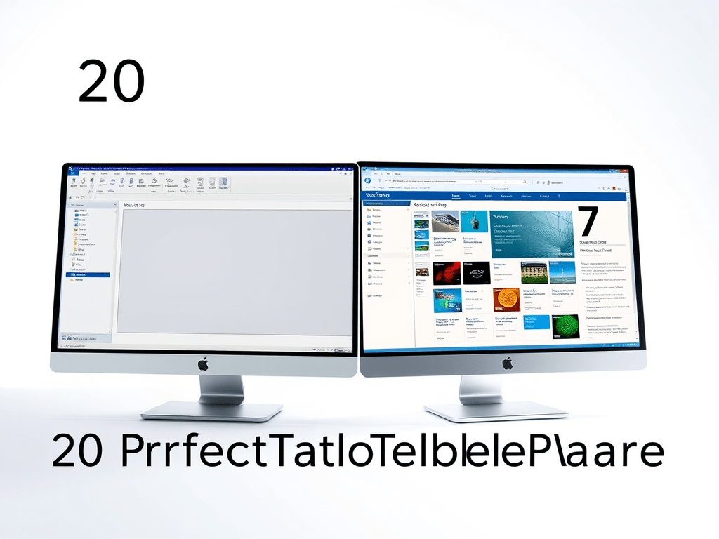
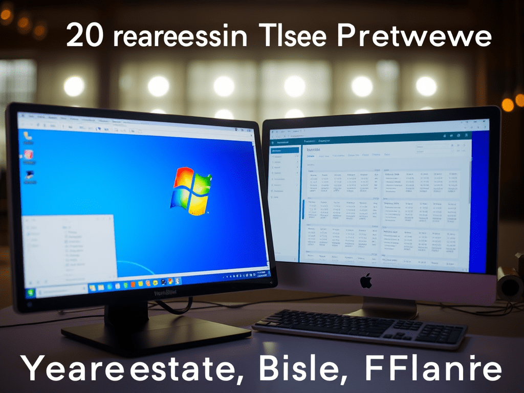
“Generate a high-resolution, highly detailed image capturing the essence of “20 Years of PerfectTablePlan Software.” The main subjects should be two screenshots side-by-side: one showcasing PerfectTablePlan version 1, reflecting a vintage desktop interface with a Windows aesthetic from 2005, and the other displaying version 7 with a sleek, modern design. The lighting should be bright and inviting, emphasizing the contrast between the older and newer software. The style should blend nostalgia with innovation, showcasing the journey of the product over two decades. Ensure the image has sharp focus and intricate details to attract the reader’s attention.”
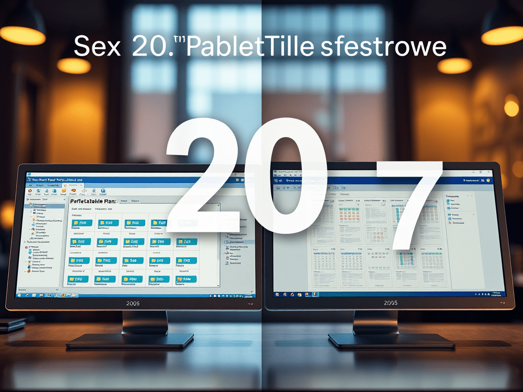
And here 5 images it came up with, from that prompt:

They are simulateously very impressive and hilariously awful. Quite apart from the weird text (“sex 20”?), none of the screenshots look even slightly like PerfectTablePlan. I think I’ll pass!