This video shows all commercial air traffic in the world during a 24-hour period. Although the technique used is very simple in principal, it conveys a huge amount of information in a short space of time.
From gdyel2007 at dailymotion via TechTalk Newsletter.
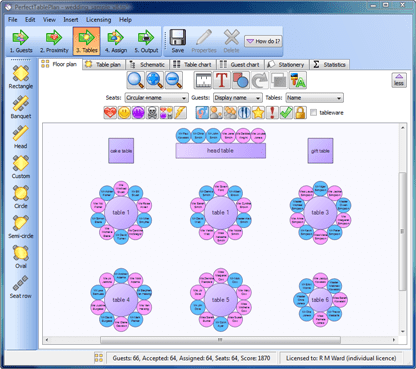
I use various simple visualisation techniques in my table planning software, for example males can be shown in blue and females in pink. This allows the host to check at a glance whether they have a good distribution of genders.
Could you use colour, shape, size, positioning, motion or other visual cues to better convey information to your users?


Maybe you should be able to visulise marital status so you could put all the single people together on a table. :-D
Interesting. When I look at the table plan, I don’t find that the blues and purples are sufficiently different from the purples of the tables themselves. As a result it all just kind of gives the impression of pastel!
I acknowledge that this may be my eyes, but have you tried making the table colours significantly different – maybe green? I would be interested to see if the gender distribution is more visible then.
@vcolin
The default colour for tables and the background is white. I agree purple wasn’t the best choice to illustrate my point. But purple looks a bit prettier and I couldn’t resist showing off my new colour gradients. ;0)
Oh without a doubt, it looks good. :)