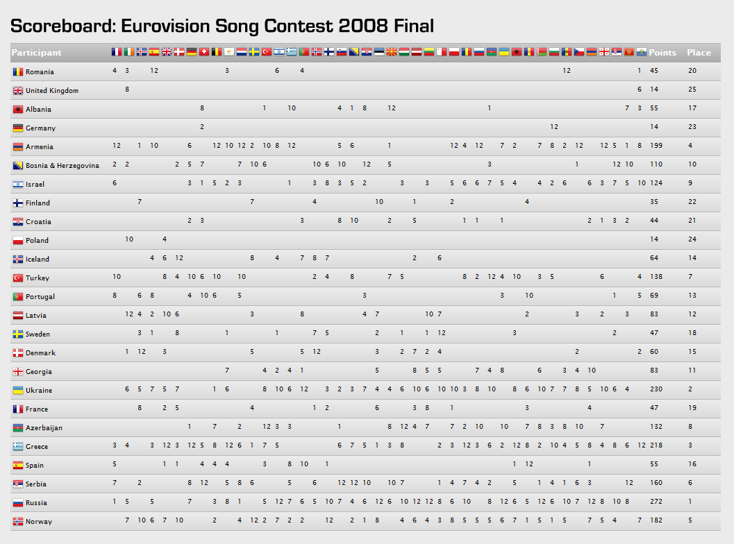
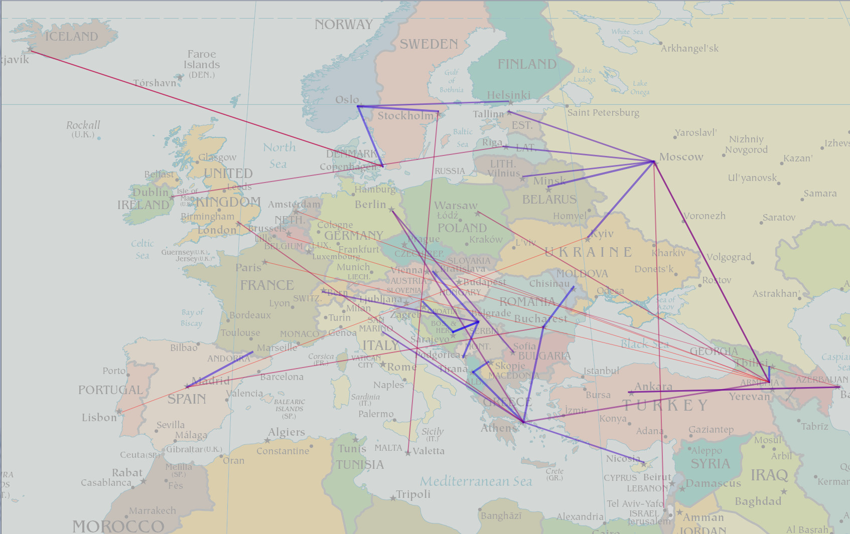
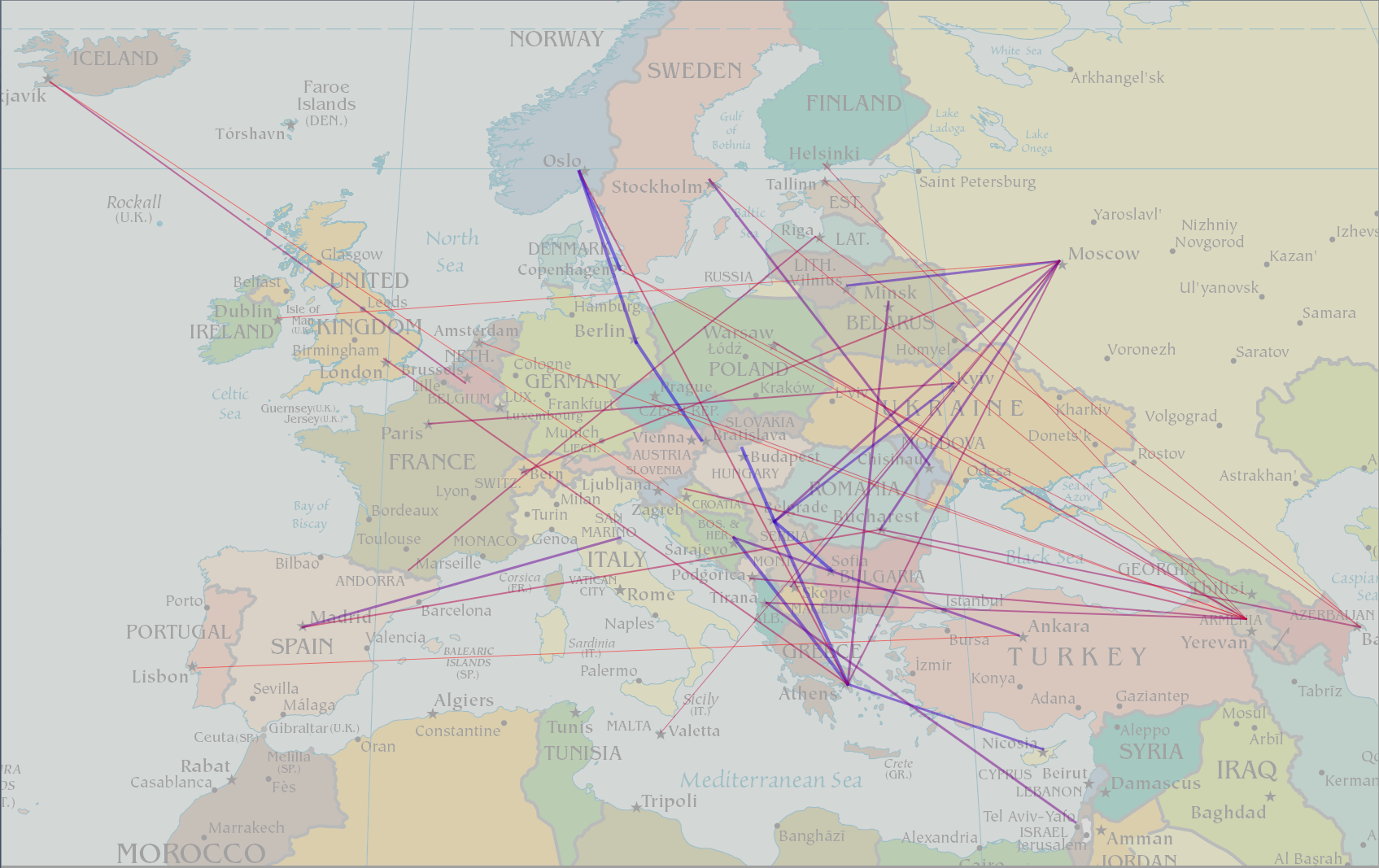
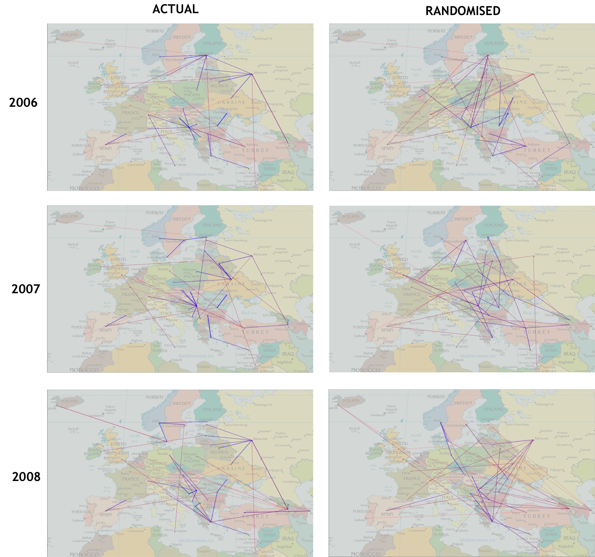
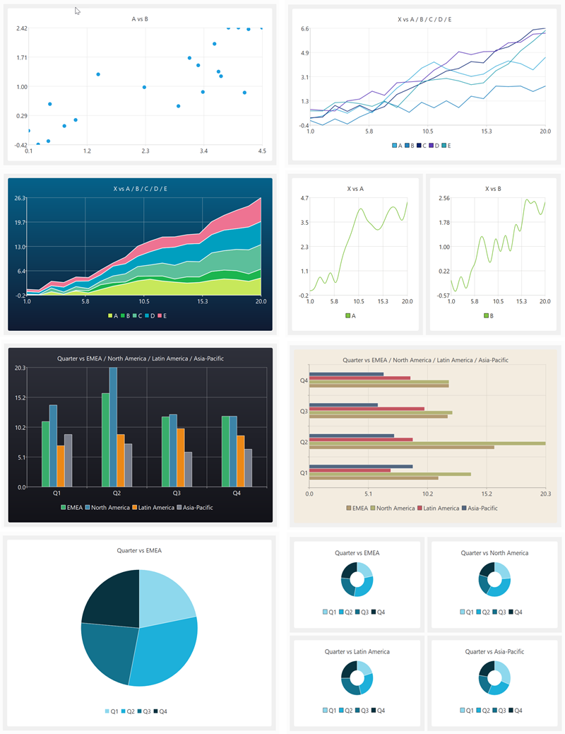
Tag Archives: visualization

Programming skills wanted

I am looking to outsource some self-contained programming tasks in areas that I don’t have expertise in. I am hoping that someone reading this blog might be able to help (or know someone that can) so I don’t have to go through outsourcing sites. These are the two skills sets I am currently looking for:

  1. Javascript/CSS/HTML – To write a single page web app. This will have a relatively simple UI displaying data read from XML. The app will need to work on a wide range of browsers and devices. Ideally you should also have some web design skills, but this isn’t essential.
  2. C++/Qt 4/OpenGL – To write a relatively simple 3D visualization model that runs on Windows and Mac. This will involve populating a 3D space with specified shapes and allowing simple movement around it.

Details:

  • I am expecting that I will need 2 different people, but it is possible there might be someone out there with experience in both.
  • These are small projects (probably less than 2 weeks for task 1 and less than 1 week for task 2). But they might lead on to more work in future.
  • Time scales are reasonably relaxed. Ideally I would like the work to be finished by the end of September.
  • You can be based anywhere in the world, but must be able to communicate in English (written and spoken).
  • Full copyright to the work will pass to my company on full payment.
  • Obviously cost is an issue. If I have 2 promising candidates, I am likely to pick the cheaper one.

If you are interested in doing either of these tasks please email me ( andy at oryxdigital.com ) before the end of Friday 26th August with subject “programming work” and a brief outline of:

  • Which of the 2 tasks you are interested in.
  • Your relevant experience. Ideally including details of related projects completed.
  • Your daily rate in Pounds Sterlings or US dollars.

I will send detailed specs to a shortlist of the best candidates. The work will be awarded on the basis of fixed price bids against the spec. Please don’t apply unless you have relevant experience – if I wanted a programmer without experience in these areas I could do it myself. ;0)

Visualization

This video shows all commercial air traffic in the world during a 24-hour period. Although the technique used is very simple in principal, it conveys a huge amount of information in a short space of time.

From gdyel2007 at dailymotion via TechTalk Newsletter.

I use various simple visualisation techniques in my table planning software, for example males can be shown in blue and females in pink. This allows the host to check at a glance whether they have a good distribution of genders.

visualization

Could you use colour, shape, size, positioning, motion or other visual cues to better convey information to your users?

Is the Eurovision song contest rigged?

There has been a lot of moaning in the UK press that the Eurovision song contest is rigged. Specifically that countries are voting for each other in geographical blocs, with little regard for the merit of the songs. But are they? It is hard to see any patterns from looking at a table of voting results:

Eurovision 2008 voting

2008 results from Eurovision.tv, click to enlarge.

So I created a simple visualisation of the data[1], similar to one of the approaches I use in my table planner software, PerfectTablePlan. In this visualisation I draw a line from each country to the country that it gave the highest points to. The closer the country is geographically, the thicker and bluer the line.

Eurovision 2008 voting visualisation

Eurovision 2008 voting patterns. Click to enlarge.

Looking at the diagram, there does appear to be bloc voting going on in the Balkans, Scandinavia & the former Soviet Union. But what would the voting look like if there was no bloc voting? To find out I randomly swapped columns in the table. For example votes made by the UK I assigned to Belarus and votes made by San Marino[2] I assigned to the UK. So each finalist now has the same number of incoming votes, but from random countries. Assuming they are voting for the best (or least awful) song, not by geography, the results should look similar. The randomised version looks more, well, random.

randomised Eurovision 2008 voting patterns

Randomised Eurovision 2008 voting patterns. Click to enlarge.

These results are suggestive, but not conclusive. But If I put the last 3 year’s results together with their randomised versions, I think there is little doubt that geography is the key factor in determining Eurovision voting patterns. The actual voting patterns look remarkably similar year-on-year and the difference between the actual and randomised results are quite marked.

Eurovision voting patterns

Eurovision voting patterns, actual and randomised, for 2006, 2007 and 2008. Click to enlarge.

Maybe if the western European countries liked each other a bit more, the UK wouldn’t have come last this year? But I can’t really see Britain, Spain, France and Germany voting for each other any time soon. ;0)

Does it really matter whether Eurovision song contest voting is based on merit? It certainly won’t keep me awake at night. But I think it is a nice illustration of how you can use simple visualisation techniques (even something hacked together in a few hours) to turn raw data into usable information. The human brain has incredibly powerful visual processing hardware. Have you optimised your software to run on this platform?

[1] I wrote some throwaway code to generate these images in C++ and Qt over a few hours on a wet bank holiday Sunday. QA amounted to ‘that looks about right’.

[2] I’ve never heard of it either – but apparently it gets as many votes as the UK.