 Online businesses generate a lot of data. Sales data, marketing data, traffic data etc. Pivot tables can be a useful tool for analysing and extracting useful information from this sea of data. A lot of people seem to have heard of Pivot Tables without understanding what they are or how to use them. Despite the slightly cryptic name they are really just a way of summarizing tables of data. Nothing to be intimidated by. I’m going to try to demystify them here with a simple example.
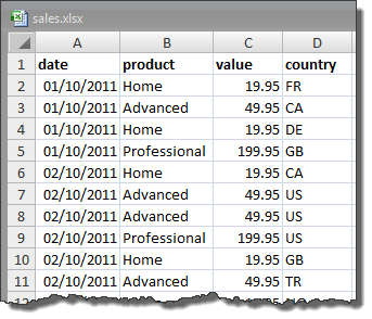
Let’s imagine you have got an Excel spreadsheet with a month of (fictitious) sales transaction. It looks like this:
You want to find out:
- The total value of sales of each product
- The number of sales of each product
- The total value of sales of each product by country
- The total value of sales of each product by day of the week
How would you do it? You can crunch the numbers using a calculator, but that is very tedious and error prone. If you are a programmer you can export the data to a .csv file and write a small program in your favourite language to read it in, crunch the data and write the results out. You probably think you can do it in 10 minutes, but I bet it will take you at least an hour to get it working and debugged. I did all the above in 1 minute and 20 seconds using Excel pivot tables.
Here is how you can do it (screenshots from Excel 2007). You can download the spreadsheet if you want to try it yourself.
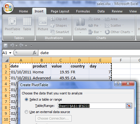
Select all the data, including the header (A1 to D222).
Click on Insert in the Excel Ribbon bar.
Click on PivotTable.
The Create Pivot Table window will appear. Click OK.
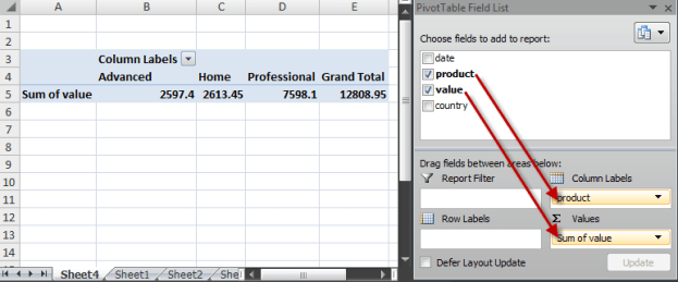
The PivotTable Field List will appear. We want to find the number of sales for each product. Drag the product field to Column labels and the value field to Values. This gives us the total value of sales by product.
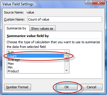
To change this to the number of sales pull down the Sum of value drop-down list and select Value Field Settings….
Change Summarize value field by from Sum to Count and click OK.
The number of sales of each product are now shown.
Now drag the country field to Row labels. Then click on Count of value, select Value Field Settings…, change it back to Sum and click OK. The total value of sales of each product by country is now displayed.
We now need to add a day of the week column. Click on Sheet 1 and add a new column as shown.
Now select all the data from A1 to E222 and insert a new pivot table, as before.
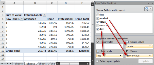
Drag the fields as shown to get the total value of sales of each product by day of the week.
(We’ll quietly ignore the fact that the number of days aren’t divisible by 7 in the data.)
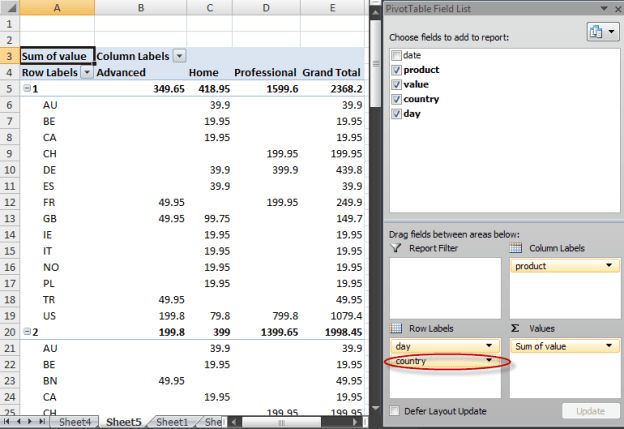
We can even display by product, day of the week and country with one more drag.
Excel also supports pivot charts if you prefer your results in graphical form.
Obviously this is a very simple example, but pivot tables can be used to quickly analyse much larger and more complex data sets. Next time you have got some data to analyse consider whether you would be better using pivot tables or pivot charts.
*** UPDATE ***
You can also use my Hyper Plan software to create pivot tables. It is a lot simpler than the above! There is a free trial.

