Tag Archives: voting

Eurovision 2025 Jury vs Public Vote Discrepancies

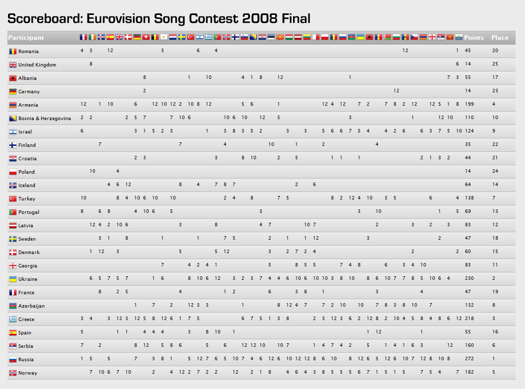
I rather enjoy the glorious spectacle of high camp that is Eurovision. Eurovision voting has always been rather suspect, with strong regional voting patterns. But the 2025 voting patterns seemed particularly odd, with jury scores seeming to have very little relation to the public scores. It was particularly noticeable that (IMHO, rather mediocre) Israel entry got only 60 jury votes, but a massive 297 public votes. Despite the widely condemned actions of the Netanyahu government in Gaza. Also, that the Swiss entry got 215 jury votes, but 0 public votes. I had a quick dig into the data using my data wrangling software, Easy Data Transform, to see what I could find.

I copied and pasted the results table from https://eurovisionworld.com/eurovision/2025 into Easy Data Transform. I had to do a bit of simple data wrangling to massage the data into the correct columns so I could calculate the Pearson correlation of the jury and public scores.

I repeated this for competitions back to 2016. Here are the correlation scores:

YearPearson correlation, jury vs public scores
20250.160
20240.627
20230.490
20220.467
20210.618
2020No competition, due to COVID-19
20190.441
20180.255
20170.656
20160.447

It is noticeable that the correlation is significantly lower in 2025 than previous years (where 1.0 = perfect correlation, 0.0 = no correlation). The only other year getting anywhere close being 2018, where Sweden got 253 jury votes, but only 21 public votes.

Here are the 2025 results as an Excel scatter plot, with a regression line:

And here are the 2017 results, for comparison:

Of course, this doesn’t prove anything. But it does make wonder why there was such a big discrepancy this year.

Is the Eurovision song contest rigged?

There has been a lot of moaning in the UK press that the Eurovision song contest is rigged. Specifically that countries are voting for each other in geographical blocs, with little regard for the merit of the songs. But are they? It is hard to see any patterns from looking at a table of voting results:

Eurovision 2008 voting

2008 results from Eurovision.tv, click to enlarge.

So I created a simple visualisation of the data[1], similar to one of the approaches I use in my table planner software, PerfectTablePlan. In this visualisation I draw a line from each country to the country that it gave the highest points to. The closer the country is geographically, the thicker and bluer the line.

Eurovision 2008 voting visualisation

Eurovision 2008 voting patterns. Click to enlarge.

Looking at the diagram, there does appear to be bloc voting going on in the Balkans, Scandinavia & the former Soviet Union. But what would the voting look like if there was no bloc voting? To find out I randomly swapped columns in the table. For example votes made by the UK I assigned to Belarus and votes made by San Marino[2] I assigned to the UK. So each finalist now has the same number of incoming votes, but from random countries. Assuming they are voting for the best (or least awful) song, not by geography, the results should look similar. The randomised version looks more, well, random.

randomised Eurovision 2008 voting patterns

Randomised Eurovision 2008 voting patterns. Click to enlarge.

These results are suggestive, but not conclusive. But If I put the last 3 year’s results together with their randomised versions, I think there is little doubt that geography is the key factor in determining Eurovision voting patterns. The actual voting patterns look remarkably similar year-on-year and the difference between the actual and randomised results are quite marked.

Eurovision voting patterns

Eurovision voting patterns, actual and randomised, for 2006, 2007 and 2008. Click to enlarge.

Maybe if the western European countries liked each other a bit more, the UK wouldn’t have come last this year? But I can’t really see Britain, Spain, France and Germany voting for each other any time soon. ;0)

Does it really matter whether Eurovision song contest voting is based on merit? It certainly won’t keep me awake at night. But I think it is a nice illustration of how you can use simple visualisation techniques (even something hacked together in a few hours) to turn raw data into usable information. The human brain has incredibly powerful visual processing hardware. Have you optimised your software to run on this platform?

[1] I wrote some throwaway code to generate these images in C++ and Qt over a few hours on a wet bank holiday Sunday. QA amounted to ‘that looks about right’.

[2] I’ve never heard of it either – but apparently it gets as many votes as the UK.