Tag Archives: usability

Adding colour schemes to Easy Data Transform

Easy Data Transform user interface.

The colours used in Easy Data Transform make no difference to the output. But the colours are an important part of a user interface, especially when you using a tool for significant amounts of time. First impressions of the user interface are also important from a commercial point of view.

But colour is a very personal thing. Some people are colour-blind. Some people prefer light palettes and others dark palettes. Some people like lots of contrast and other don’t. So I am going to allow the user to fully customize the Center pane colours in Easy Data Transform.

I also want to include some standard colour schemes, to get people started. Looking around at other software it seems that the ‘modern’ trend is for pastel colours, invisible borders and subtle shadows. This looks lovely, but it is a bit low contrast for my tired old eyes. So I have tried to create a range of designs in that hope that everyone will like at least one. Below are the standard schemes I have come up with so far. They all stick with the convention pink=input, blue=transform, green=output.

Which is your favourite (click the images to enlarge).

Is there a tool that you use day to day that has particular nice colour scheme?

I hope to also add an optional dark theme for the rest of the UI in due course (Qt allowing).

Giving a shit

Sturgeon’s law states that “90% of everything is crap”. He was probably an optimist. Here are some recent examples of the sort of crap I come across day to day:

The school selection website

My wife and I had to select which secondary school we want out son to go to, an important decision for our family. We had to do this via a website created on behalf of Swindon council. I won’t bore you with all the painful details, but only an impressive combination of incompetence and apathy could have produced something so egregiously awful. At the end of the process we got an error message and the promised confirmation email never arrived. We were left feeling confused and angry. Every other parent we spoke to had a similar experience.

The ATM

Feast your eyes on my local ATM:

ctnybk8wiaaqkza-jpg-large

Yes, that’s right, the buttons aren’t correctly aligned with the screen, so they have added some shonky visual cues in a feeble attempt to compensate for it. They failed – I have pressed the wrong button more than once. If they couldn’t move the buttons, why didn’t they just change the text positions in the software? I would like to know what sort of horrific set of bad decisions and sloppy planning led to this laughably bad design.

The in-flight meal

Check out this British Airways in-flight meal I was served:

IMG_1083.jpg

Behold, the cutlery is in a sealed plastic bag in the pasta. To get at your cutlery you have to open a slippery plastic bag covered in sauce with your fingers, which are now also covered in sauce. Who could have possibly have thought this was a good experience? You might as well just eat the pasta with your fingers. Or stick your face in the plate. Maybe the subliminal message is: if you won’t pay for business class we are going to make you eat like an animal.


You don’t have to look very hard to find crappy design. Badly designed parking buildings, confusing ticket machines, painful to use Sat Navs, packaging that is almost impossible to open, web forms that won’t let you use a space or a dash in a telephone number. I could go on, but I’m sure you could come up with plenty of examples from your own life. The most frustrating thing is that these issues could have been avoided with a little bit of thought and care. I doubt it would have added more than an extra 1% more effort or cost to get them right.

Crappy products and services make everyone’s life worse. Hold yourself to a higher standard. Take pride in your work. Do usability tests. Get feedback from your users. Fix things that are broken. Keep improving. Above all, give a shit.

First impressions count

Imagine you are on a blind date. You’ve heard great things about how funny and intelligent your date is and they are certainly very attractive. But it isn’t going well. They just sit there, staring at you with glassy eyes. Nothing you say gets more than a nod or a shake of the head. Maybe they are just shy, but you are never going to find out about their hidden depths if you climb out of the toilet window and run off into the night after twenty minutes.

Now imagine you have downloaded some new software. You have high expectations and your credit card to hand. But you just can’t figure out how to get started. It just sits there, a blank canvas. Totally inscrutable. Offering no clue as to what you should do next. How long would you click buttons and examine the menus before you gave up and downloaded a competing product. Two minutes perhaps? Competing products are only a few clicks away, after all.

As developers we spend months or years lovingly crafting our products. This makes it very hard for us to see them with the same eyes as potential customers. But those first few minutes are crucial for converting a download into a sale. Give the user some pointers on what to do first: show a set-up wizard, quick start guide or tutorial when the application first runs; populate the application with sample data; show hint text or images in the GUI (e.g. grey “start by typing your email here” text in the background of an edit field). If they feel they are making some progress within those first few minutes they are much more likely to buy. It really isn’t difficult to do, and yet it will probably have a bigger effect on your conversion rate than adding a complex feature that may take weeks or months to write.

I remember reading about usability problems with one of the early wordprocessor packages. Users weren’t used to wordprocessors and many just sat there, not knowing what to do. The solution was simple – to show a flashing cursor at the top of the page as a cue that this is where text would appear when they started typing. Usability improvements are usually simple in retrospect. But this apparently trivial change made a big difference to the initial experience.

How good a job are you doing at engaging users in those crucial first few minutes? Are they hitting the ground running, or just hitting a brick wall? Are you sure? Try comparing your download to conversion ratio to industry averages. Better still, do some testing. Find a few people in your target market that haven’t used your software before and watch them try to use it. Don’t help them, no matter how much you want to. It is often a painful experience, but I have yet to speak to anyone who has tried it and didn’t find it incredibly useful. Remember, you only get one chance to make a good first impression.

This article was also published as a guest post in the upload.com newsletter.

10 things non-technical users don’t understand about your software

If you are writing consumer software you have to understand that you and your average user have a very different level of understanding of computers. When you first start doing support it can be a shock to realize just how vast this gulf is. It doesn’t mean that your users are stupid, just that they haven’t spent the thousands of hours in front of a computer that you have. Below I have summarized a few of the things I have come to understand about non-techies through answering thousands of support requests relating to my own table planning software.

1. Copy and paste

It is very clear from many support emails I have received that users will often re-type a licence key emailed to them because they don’t know how to (or even that they can) copy and paste text. Yes, really. You can mitigate this to some extent by including instructions on how to copy and paste where relevant and making licence keys easy to type (short and without ambiguous characters, e.g. ‘0’ and ‘o’).

2. The difference between web and native applications

Many users are used to web applications and don’t understand that they need to download and install new versions of desktop software to get access to the features in a new version. You can avoid this by automating the update process, but this can be pretty catastrophic if you get it wrong.

3. Data storage

Many users don’t understand how or where data is stored or even that it is separate from the application. They don’t understand that some data is stored on their local harddisk and some is stored ‘in the cloud’. And they don’t understand the difference between storage in a file, a database or the Windows registry. Consequently, when they install a desktop app on a new machine they are often surprised that it can’t automatically access the documents they created on a previous machine. So it is worth having something in your FAQ about moving from one machine to another.

Given that users don’t understand the basics of data storage it should come as no surprise that they also don’t understand the concept of file formats either. For example when told to ‘save a .xlsx file as a .csv file’ some users will simply change the file extension from .xlsx to .csv and be surprised when the resultant .csv file is gibberish when they open it in Excel. You can try to avoid this by providing clear step-by-step instructions on how to save a .xlsx file as a .csv file.

4. The jargon you use

Using terms that your users don’t understand can be very off-putting. For example, non-techies have no idea what a “dialog” is, let alone a “modal dialog”. Just call it a “window”.

5. Right click

Some users have not discovered (or will not think to try) clicking the right mouse button. You should therefore never put something only in a right click menu or anywhere else that it can’t easily be discovered.

6. Concurrency

Some applications can handle concurrent access (e.g. client-server and web-based apps) others can’t (e.g. most desktop apps). But many users assume that all software can be safely used by multiple concurrent users. If your software can’t it might be worth spelling this out in your marketing so as not to raise false expectations.

7. What changes can be reversed

Techies are happy to play with software to see what it does. They aren’t usually too worried about trying things because they can rely on some combination to undo, version control and backups to reverse most changes and they can usually judge when a change won’t be reversible. Non-technical users aren’t so confident and won’t try things in the same way. In fact some of them seem to think that a wrong move could cause the computer to burst into flames. So try to stick to conventions they will understand (e.g. on Windows those used by MS Office and Outlook) and offer step-by-step guidance for complex tasks.

8. The need for backups

Every few days I get an email from someone who has lost all their data because they had a major hardware problem and no backups on a separate device. Sometimes this is because they don’t even realize the data is stored on their computer. You can mention the need for back-ups in your documentation and/or in the software, but it is unlikely to make much difference. History shows that this is a lesson most people have to learn the hard way (techies included). Mentioning it doesn’t hurt though and it might help to defuse an angry users if you point it out to them after the event.

9. That they should read the documentation

People are using your software because they have things to do. Like it or not, your beloved software is just a means to that end. Although some users will read documentation, most consider it a waste of their precious time. In fact, support emails I receive provide incontrovertible evidence that some users won’t even read a single sentence of text in an error message explaining what the problem is. This means you need to write clear and concise documentation, but you also should develop your software under the assumption that most users won’t read it. That is where usability testing comes in.

10. Problem exists between keyboard and chair

Unskilled users often don’t realize how unskilled they are. Consequently they may blame your software for problems that are of their own making. One just has to be as polite as possible in such cases. Making your customer feel stupid is never great for business. If it is clear that the customer doesn’t have a sufficient level of skill to use your software, you should politely suggest that it “obviously isn’t ideal for their requirements” and offer to refund them. However, if several people have the same problem then you need to change your product to be a better fit for your users (changing your users to be a better fit to your software unfortunately not being an option for most of us).

Have you been caught out by assuming technical knowlege that your users don’t have? If so, please leave a comment below.

Easy screen sharing with Skype

The latest version of Skype allows you to share all or part of your screen with another Skype user in a couple of clicks.

This can be incredibly useful. So far I have used it for:

  • support – Sometimes email just doesn’t cut it. If your customer has Skype, you can use screen sharing to see exactly what your customer is doing while talking to them.
  • remote usability testingUsability testing is very important. But luring a stream of  fresh victims  to your office to take part is a logistical headache. If you use Skype screen sharing neither of you has to leave the comfort of your own computer. I have used it successully to do usability testing with people on the other side of the world.

Skype screen sharing has its limitation. The images are bit blurry, there is some latency and you can’t interact with the remote computer (as you can with services such as Copilot). But it is good enough for most purposes, and it’s free!

If you are going to be using Skype much, then I strongly recommend buying a USB headset. It is much more comfortable than holding a phone to your ear for extended periods and it keeps your hands free for typing. I use a Logitech headset and I have been quite happy with it. I sometimes get sweaty ears during a long call, but it seems a small price to pay.

Logitech ClearChat Pro USB on amazon.com (affiliate link)

Logitech ClearChat Pro USB on amazon.co.uk (affiliate link)

Ten mistakes microISVs make

Here is a video of the “Ten mistakes microISVs make” talk I gave at the Software Industry Conference 2009 in Boston. Total duration: 27 minutes.

The slides aren’t terribly easy to read, due to the resizing and compression of the video. But you can also download the paper and slides:

A big thank you to Alwin and Sytske of collectorz.com for doing the video. You can read Alwin’s excellent software marketing blog at alwinhoogerdijk.com.

Feel free to embed this video, as long as you include a credit and a link back to this blog.

How many of these mistakes have you made? How many are you still making?

Interviewed on the Startup Success Podcast

startup-success-podcastI was recently interviewed by Bob Walsh and Patrick Foley for The Startup Success Podcast, episode 25. We cover a wide ange of topics including: microISVs, conversion ratios, being specific, PerfectTablePlan, usability, the global recession, software award scams, ‘works with vista’ certification, stackoverflow.com and twitter. I wonder how much I have to pay them to edit out the ‘ums’?

Download the MP3

Is the Eurovision song contest rigged?

There has been a lot of moaning in the UK press that the Eurovision song contest is rigged. Specifically that countries are voting for each other in geographical blocs, with little regard for the merit of the songs. But are they? It is hard to see any patterns from looking at a table of voting results:

Eurovision 2008 voting

2008 results from Eurovision.tv, click to enlarge.

So I created a simple visualisation of the data[1], similar to one of the approaches I use in my table planner software, PerfectTablePlan. In this visualisation I draw a line from each country to the country that it gave the highest points to. The closer the country is geographically, the thicker and bluer the line.

Eurovision 2008 voting visualisation

Eurovision 2008 voting patterns. Click to enlarge.

Looking at the diagram, there does appear to be bloc voting going on in the Balkans, Scandinavia & the former Soviet Union. But what would the voting look like if there was no bloc voting? To find out I randomly swapped columns in the table. For example votes made by the UK I assigned to Belarus and votes made by San Marino[2] I assigned to the UK. So each finalist now has the same number of incoming votes, but from random countries. Assuming they are voting for the best (or least awful) song, not by geography, the results should look similar. The randomised version looks more, well, random.

randomised Eurovision 2008 voting patterns

Randomised Eurovision 2008 voting patterns. Click to enlarge.

These results are suggestive, but not conclusive. But If I put the last 3 year’s results together with their randomised versions, I think there is little doubt that geography is the key factor in determining Eurovision voting patterns. The actual voting patterns look remarkably similar year-on-year and the difference between the actual and randomised results are quite marked.

Eurovision voting patterns

Eurovision voting patterns, actual and randomised, for 2006, 2007 and 2008. Click to enlarge.

Maybe if the western European countries liked each other a bit more, the UK wouldn’t have come last this year? But I can’t really see Britain, Spain, France and Germany voting for each other any time soon. ;0)

Does it really matter whether Eurovision song contest voting is based on merit? It certainly won’t keep me awake at night. But I think it is a nice illustration of how you can use simple visualisation techniques (even something hacked together in a few hours) to turn raw data into usable information. The human brain has incredibly powerful visual processing hardware. Have you optimised your software to run on this platform?

[1] I wrote some throwaway code to generate these images in C++ and Qt over a few hours on a wet bank holiday Sunday. QA amounted to ‘that looks about right’.

[2] I’ve never heard of it either – but apparently it gets as many votes as the UK.

Getting customer feedback

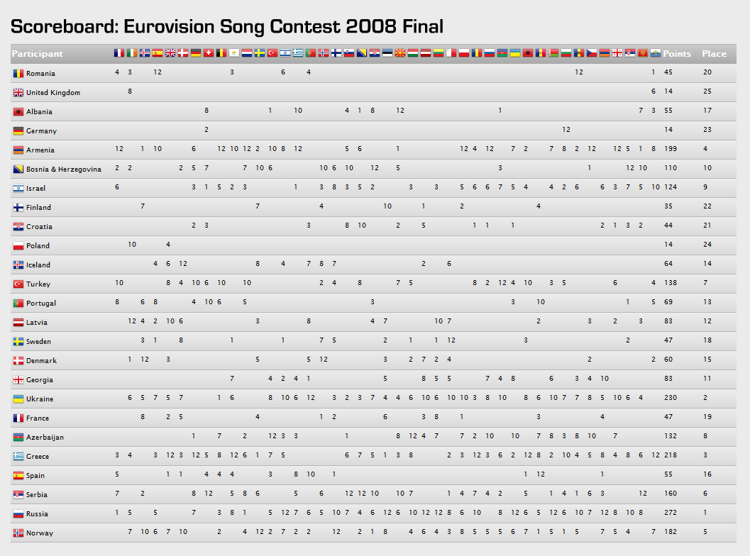
Lack of feedback is one of the most difficult things about caring for a small child. You know they are unhappy because they are crying. But you don’t know if that unhappiness is due to: hunger, thirst, too hot, too cold, ear ache, stomach ache, wind, tiredness, boredom, teething or something else. They can’t tell you, so you can only guess. Creating software without feedback is tough for the same reasons. You know how well or badly you are doing by the number of sales, but without detailed feedback from your customers and prospective customers, it is difficult to know how you could do better.

The importance of feedback is amply illustrated by many of the stories of successful companies in the excellent book “Founders at work” by Jessica Livingston. For example, PayPal started out trying to sell a crypto library for the PalmPilot. They went through at least 5 changes of direction until they realised that what the market really wanted was a way to make payments via the web.

So good feedback is essential to creating successful software. But how do you get the feedback?

Face-to-face meetings

Meeting your customers face-to-face can give you some detailed feedback. But is time consuming and doesn’t scale when you have hundreds or thousands of customers. You can meet a lot of customers at a exhibitions, but it hardly an ideal venue for any sort of in-depth interaction. Also, they may be too polite to tell you what they really think to your face.

Technical support

Technical support emails and phone calls are a gold-mine of information on how you can improve your product. If one customer has a particular problem, then they might be having a bad day. But if two or more customers have the same problem, then it is time to start thinking about how you can engineer out the problem. This will both improve the utility of your product and reduce your support burden.

In order to take advantage of this feedback the people taking the support calls need to be as close to the developers as possible. Ideally they should be the same people. Even if you have separate support and development staff you should seriously think about rotating developers through support to give them some appreciation of the issues real users have with their creation. Outsourcing your support to another company/country threatens to completely sever this feedback.

Monitoring forums and blogs

Your customers are probably polite when they think you are listening. To find out what they really think it can be useful to monitor blogs and relevant forums. Regularly monitoring more than one or two forums is very time-consuming, but you can use Google alerts to receive an alert email whenever a certain phrase (e.g. your product name) appears on a new web page. This feedback can be valuable, but it is likely to be too patchy to rely on.

Usability testing

A usability test is where you watch a user using your software for the first time. You instruct them to perform various typical tasks and watch to see any issues that occur. They will usually be asked to say out loud about what they are thinking to help give you more insight. There really isn’t much more to it than that. If you are being fancy you can video it for further analysis.

Usability tests can be incredibly useful, but it isn’t always easy to find willing ‘virgins’ with a similar background to your prospective users. Also the feedback from usability tests is likely to be mainly related to usability issues, it is unlikely to tell you if your product is missing important features or whether your price is right.

Uninstall surveys

It is relatively easy to pop-up a feedback form in a browser when a user uninstalls your software. I tried this, but got very few responses. If they aren’t interested enough in your software to buy it, they probably aren’t interested enough to take the time to tell you why. Those that I did get were usually along the lines “make it free”[1].

Post purchase surveys

I email all my customers approximately 7 days after their purchase to ask whether there is anything they would like me to add/improve/fix in the next version of the software. The key points about this email are:

  • I give them enough time to to use the software before I email them.
  • I increase the likelihood of getting an answer by keeping it short.
  • I make the question as open as possible. This results in much more useful information than, say, asking them to rate the software on a one to ten scale.
  • I deliberately frame the question in such a way that the customer can make negative comments without feeling rude.

The responses fall into five categories[2]:

  1. No response (approx 80%). They didn’t respond when given the opportunity, so I guess they must be reasonably happy.
  2. Your software is great (approx 10%). This really brightens up my day. I email them back to ask for permission to use their comment as a testimonial. Most people are only too happy to oblige.
  3. Your software is pretty good but it doesn’t do X (approx 10%). Many times my software actually does do X – I tell them how and they go from being a satisfied customer to a very happy customer. Also it gives me a pointer that I need to make it clearer how to do X in the next version. If my software doesn’t do X, then I have some useful feedback for a new feature.
  4. Your software sucks, I want my money back (rare). Thankfully I get very few of these, but you can’t please all of the people all of the time. Sometimes it is possible to address their problem and turn them from passionately negative to passionately positive. If not, I refund them after I get some detailed feedback about why it didn’t work for them[3].
  5. Stop spamming me (very rare). From memory this has happened once.

I consider them all positive outcomes, except for the last one. Even if I have to make a refund, I get some useful feedback. Anyway, if you didn’t find my software useful, I don’t really want your money.

Being pro-active like this does increase the number of support emails in the short-term. But it also gives you the feedback you need to improve your usability, which reduces the number of support emails in the longer term. I think the increased customer satisfaction is well worth the additional effort. Happy customers are the best possible form of marketing. Post-purchase emails are such a great way to get feedback, I don’t know why more people don’t use them. Try it.

If you make it clear that you are interested in what your customers have to say they will take more time to talk to you. If you act on this feedback it will improve your product (some of the best features in my software has come from customer suggestions). A better product means more customers. More customers means more feedback. It is a virtuous cycle.

All you have to do is ask.

[1] Only if you pay my mortgage. Hippy.

[2] The percentages are guesstimates. I haven’t counted them.

[3] My refund policy specifies that the customer has to say what they didn’t like about the software before I will issue a refund.