Tag Archives: design

Giving a shit

Sturgeon’s law states that “90% of everything is crap”. He was probably an optimist. Here are some recent examples of the sort of crap I come across day to day:

The school selection website

My wife and I had to select which secondary school we want out son to go to, an important decision for our family. We had to do this via a website created on behalf of Swindon council. I won’t bore you with all the painful details, but only an impressive combination of incompetence and apathy could have produced something so egregiously awful. At the end of the process we got an error message and the promised confirmation email never arrived. We were left feeling confused and angry. Every other parent we spoke to had a similar experience.

The ATM

Feast your eyes on my local ATM:

ctnybk8wiaaqkza-jpg-large

Yes, that’s right, the buttons aren’t correctly aligned with the screen, so they have added some shonky visual cues in a feeble attempt to compensate for it. They failed – I have pressed the wrong button more than once. If they couldn’t move the buttons, why didn’t they just change the text positions in the software? I would like to know what sort of horrific set of bad decisions and sloppy planning led to this laughably bad design.

The in-flight meal

Check out this British Airways in-flight meal I was served:
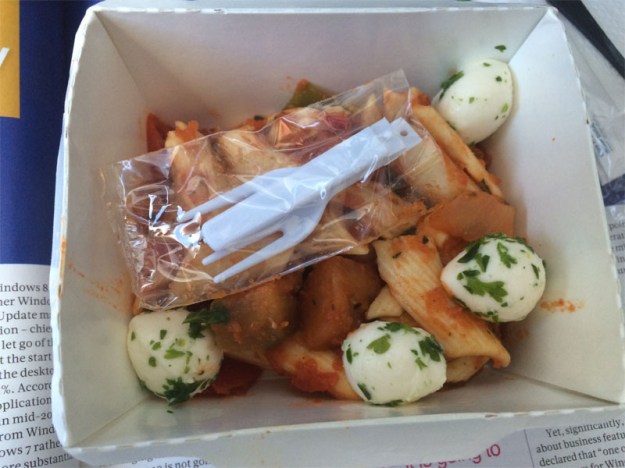
IMG_1083.jpg

Behold, the cutlery is in a sealed plastic bag in the pasta. To get at your cutlery you have to open a slippery plastic bag covered in sauce with your fingers, which are now also covered in sauce. Who could have possibly have thought this was a good experience? You might as well just eat the pasta with your fingers. Or stick your face in the plate. Maybe the subliminal message is: if you won’t pay for business class we are going to make you eat like an animal.


You don’t have to look very hard to find crappy design. Badly designed parking buildings, confusing ticket machines, painful to use Sat Navs, packaging that is almost impossible to open, web forms that won’t let you use a space or a dash in a telephone number. I could go on, but I’m sure you could come up with plenty of examples from your own life. The most frustrating thing is that these issues could have been avoided with a little bit of thought and care. I doubt it would have added more than an extra 1% more effort or cost to get them right.

Crappy products and services make everyone’s life worse. Hold yourself to a higher standard. Take pride in your work. Do usability tests. Get feedback from your users. Fix things that are broken. Keep improving. Above all, give a shit.

Updating the PerfectTablePlan website

I created the website for PerfectTablePlan back in 2005, using a dreadfully buggy piece of software called NetObjects Fusion (NOF). The sorry story of why I ended up using NOF is told here.

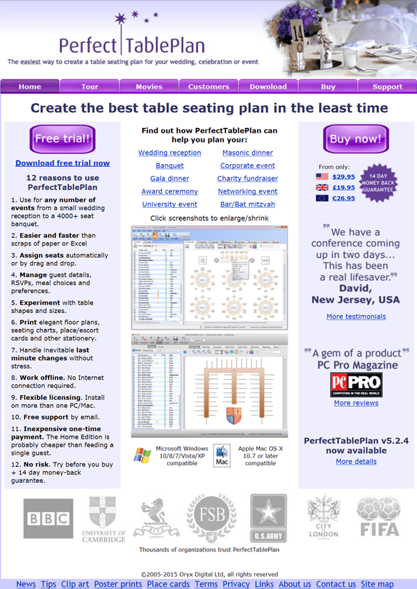
Until recently the front page looked like this.

old-website-design

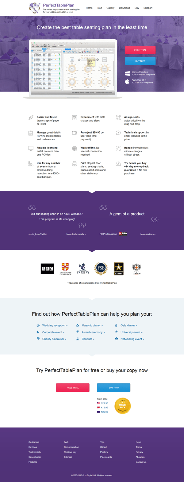
I had done a fair amount of A/B test tweaking and it converted visitors to downloads and sales relatively well compared to other downloadable product websites. But it had that ‘designed by a programmer’ look and it wasn’t responsive, so it didn’t work on well on mobile devices. My software only runs on Windows and Mac, but I still want to appear in mobile searches. The HTML generated by NOF was also pretty horrible. Frankly, I was a bit embarrassed by it when I looked at websites for other products. I kept on meaning to update it, but there was always something more urgent or (to be honest) more interesting to do. I finally bit the bullet and had it redesigned in 2015. The front page now looks like this:

new-website-design

The process was:

  1. I wrote a specification for the new design.
  2. I ran a 99Designs.com competition to design a new home page based on the spec.
  3. I selected the winning designer and paid them to design 3 additional pages in the same style.
  4. I paid pixelcrayons.com to code up the 4 pages in responsive CSS/HTML.
  5. I poured all the old content into the new design. Being careful to maintain the existing page names, titles, text and images etc, so as not to lose existing organic traffic.

The whole process didn’t cost a great deal (somewhere around $2k), but it took quite a lot of my time, spread over 5 months. Especially the final step. This wasn’t helped by the size (some 128 pages were converted) and general cruftiness of the old website, and my lack of knowledge of CSS and responsive design.

I didn’t want to be locked in to a CMS, so I used Mac static website generator Hammer4Mac to generate the HTML. It goes without saying that I wrote a program to help me pull all the content out of the old website and into Hammer4Mac! While Hammer4Mac isn’t without flaws, I found it a vast improvement over NOF and the new website is now much easier to update and maintain than the old one.

The new website went live on 16-Dec-2015.

So how much difference did the redesign make? Here are the changes based on comparing 25 weeks of data before the change and 25 weeks of data after the change:

bounce rate +1.5%
time on page +16.0%
traffic +6.5%
        desktop traffic -2.2%
        mobile & tablet traffic +40.0%
completed installs +1.4%
sales transactions +11.4%
total sales value +21.8%
visit to sale conversion ratio +4.6%
average order value +9.4%

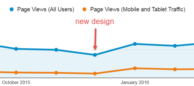
The increase in mobile traffic as a proportion of total traffic is pretty clear from analytics (the dip in December is seasonal):

traffic

I believe  a 21.8% improvement in sales is a lot more than I would have got by spending the same amount of time and money improving the product itself, which is pretty mature after 11 years of work.

Overall it looks pretty positive. But, as analytics data is fairly dirty (e.g. due to analytics spam) and I didn’t run a split test, I can’t definitely say that the changes above were due to the website changes. I wasn’t able to compare all the above data with the same time period for the previous year due to some missing analytics data. But the sales data for 25 weeks before and after 16-Dec in the previous year was:

sales transactions -9.9%
total sales value -2.7%
average order value +8.1%

Which implies that the sales changes are unlikely to be due to seasonal factors.

Best of all, I never have to use NetObjects Fusion again!

Presents for programmers

It is coming up to that time of year again. You had better start dropping some hints on what you want for Christmas if you don’t want socks again. How about a software themed T-shirt? You can never have too many T-shirts and it means you can go an extra day before you have to do the laundry.

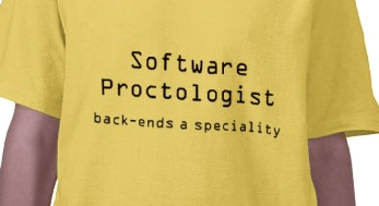
It just so happens that www.programmer-tshirts.com (set up by myself and Patrick McKenzie last year) carries a range of wittily(?) captioned T-shirts for software types of all stripes including: microISVS, C++ programmers, LISP programmers, Mac developers, software engineers, managers and bloggers. Following on from a conversation at ESWC 2009 (with someone who might prefer to remain anonymous) I have just added another design for server programmers:

I know the T-shirts aren’t cheap (print-on-demand is expensive), but I have ordered a couple myself from the European shop and the quality is very good. Also you can customise the t-shirts (e.g. choose a different colour). Best of all the commission on each T-shirt (12.5% for the US shop and £1.50 for the European shop) goes to two very worthy charities:

  • Sightsavers International works to alleviate sight problems around the world. Every year Sightsavers and their partners treat millions of people for potentially blinding conditions. It costs as little as $0.10 to protect someone from river blindness for a year.
  • Jaipur Foot have developed an effective and easy-to-fit prosthetic lower limb that can be produced for a little as $30. The charity has distributed over 300,000 limbs free of charge in 22 countries.

It won’t be a surprise to regular readers that I am going to finish this post with a less than subtle call-to-action.

(STOP PRESS: 15% off everything in the European shop until 29-Nov-2009, use voucher code: NOVEMBERSALE)