Tag Archives: user interface

Adding colour schemes to Easy Data Transform

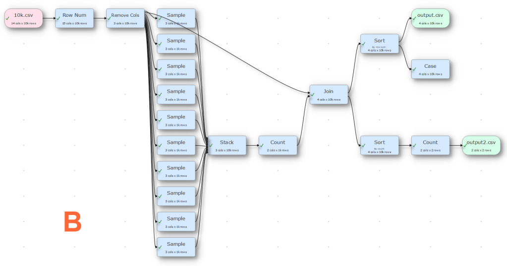
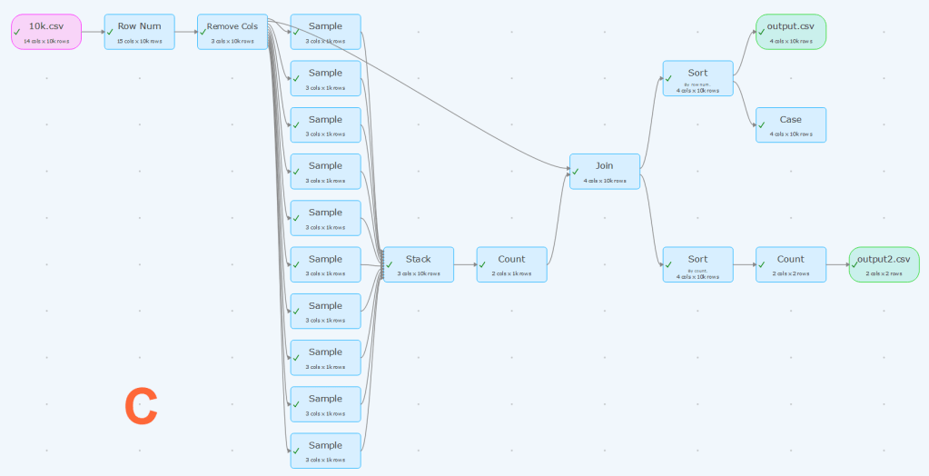
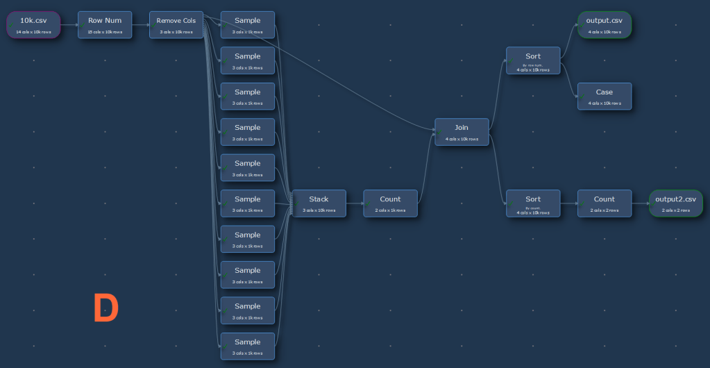
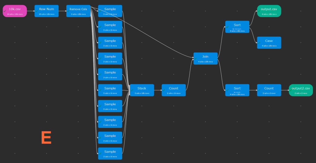
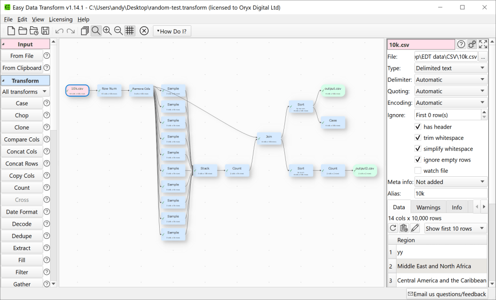
Easy Data Transform user interface.

The colours used in Easy Data Transform make no difference to the output. But the colours are an important part of a user interface, especially when you using a tool for significant amounts of time. First impressions of the user interface are also important from a commercial point of view.

But colour is a very personal thing. Some people are colour-blind. Some people prefer light palettes and others dark palettes. Some people like lots of contrast and other don’t. So I am going to allow the user to fully customize the Center pane colours in Easy Data Transform.
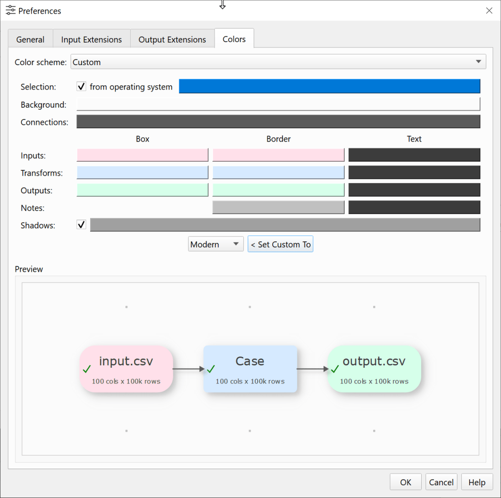
I also want to include some standard colour schemes, to get people started. Looking around at other software it seems that the ‘modern’ trend is for pastel colours, invisible borders and subtle shadows. This looks lovely, but it is a bit low contrast for my tired old eyes. So I have tried to create a range of designs in that hope that everyone will like at least one. Below are the standard schemes I have come up with so far. They all stick with the convention pink=input, blue=transform, green=output.

Which is your favourite (click the images to enlarge).

Is there a tool that you use day to day that has particular nice colour scheme?

I hope to also add an optional dark theme for the rest of the UI in due course (Qt allowing).

Giving a shit

Sturgeon’s law states that “90% of everything is crap”. He was probably an optimist. Here are some recent examples of the sort of crap I come across day to day:

The school selection website

My wife and I had to select which secondary school we want out son to go to, an important decision for our family. We had to do this via a website created on behalf of Swindon council. I won’t bore you with all the painful details, but only an impressive combination of incompetence and apathy could have produced something so egregiously awful. At the end of the process we got an error message and the promised confirmation email never arrived. We were left feeling confused and angry. Every other parent we spoke to had a similar experience.

The ATM

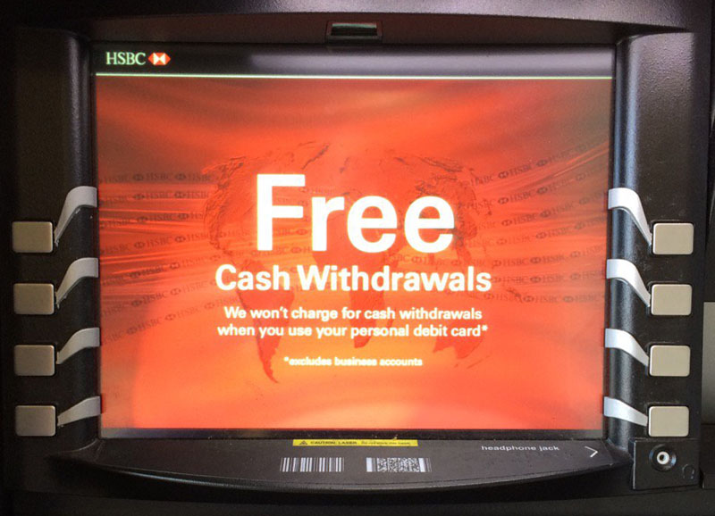
Feast your eyes on my local ATM:

ctnybk8wiaaqkza-jpg-large

Yes, that’s right, the buttons aren’t correctly aligned with the screen, so they have added some shonky visual cues in a feeble attempt to compensate for it. They failed – I have pressed the wrong button more than once. If they couldn’t move the buttons, why didn’t they just change the text positions in the software? I would like to know what sort of horrific set of bad decisions and sloppy planning led to this laughably bad design.

The in-flight meal

Check out this British Airways in-flight meal I was served:

IMG_1083.jpg

Behold, the cutlery is in a sealed plastic bag in the pasta. To get at your cutlery you have to open a slippery plastic bag covered in sauce with your fingers, which are now also covered in sauce. Who could have possibly have thought this was a good experience? You might as well just eat the pasta with your fingers. Or stick your face in the plate. Maybe the subliminal message is: if you won’t pay for business class we are going to make you eat like an animal.


You don’t have to look very hard to find crappy design. Badly designed parking buildings, confusing ticket machines, painful to use Sat Navs, packaging that is almost impossible to open, web forms that won’t let you use a space or a dash in a telephone number. I could go on, but I’m sure you could come up with plenty of examples from your own life. The most frustrating thing is that these issues could have been avoided with a little bit of thought and care. I doubt it would have added more than an extra 1% more effort or cost to get them right.

Crappy products and services make everyone’s life worse. Hold yourself to a higher standard. Take pride in your work. Do usability tests. Get feedback from your users. Fix things that are broken. Keep improving. Above all, give a shit.