Category Archives: article

Your harddrive *will* fail – it’s just a question of when

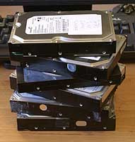
failed harddisksThere are a few certainties in life: death, taxes and harddisk failure. I have no less than 6 failed harddisks sitting here on my desk patiently awaiting their appointment with Mr Lump Hammer. 2 Seagates, 3 Maxtors and 1 Western Digital. This equates to roughly one disk failure per year. Perhaps this is not suprising given that I have about 9 working harddisks at the moment spread across various machines. Given the incredible tolerances to which harddisks are manfactured, perhaps it is a miracle harddisks work at all.

As an analogy, a magnetic head slider flying over a disk surface with a flying height of 25 nm with a relative speed of 20 meters/second is equivalent to an aircraft flying at a physical spacing of 0.2 µm at 900 kilometers/hour. This is what a disk drive experiences during its operation. –Magnetic Storage Systems Beyond 2000, George C. Hadjipanayis from Wikipedia

We all know we need to back-up our data. But it is a chore that often gets forgotten at the most critical periods. Here are my hints for preparing yourself for that inevitable ‘click of death’.

  • Buy an external USB/Firewire harddrive. 500GB drives are ridiculously cheap these days. Personally I don’t like back-up tapes due to experiences of them stretching and corrupting data.
  • Back-up images of the entire OS, not just the data. You can use Acronis TrueImage on Windows and SuperDuper on MacOSX. This can save you days restoring your entire development environment and applications from scratch.
  • Back-up individual files as well as entire OS images. You don’t want to have to restore a whole image to retrieve one critical file. Windows Vista and Mac OS X Leopard both have back-up applications built into the OS.
  • Use a separate machine to your development machine as source code server.
  • Use a RAID-1 (mirrored) disk on your main development machine[1]. It is worth noting that this actually doubles the likelihood of harddisk failure, but makes the likelihood of a catastrophic failure much lower. Keep an identical 3rd drive on hand to swap in when a drive fails.
  • Back-ups aren’t much use if they get incinerated along with your office in a fire, so store copies off-site. For example you can:
  • Make sure any off-site copies are securely encypted, for example using Axcrypt.
  • Automate your back-ups as far as possible. Computers are much better at the dull repetitive stuff.
  • Test restoring data once in a while. There is not much point backing up data only to find you can’t restore it when needed.

There are lots of applications for backing up individual files. So many in fact, that no-one has any hope of evaluating them all (marketing tip: don’t write another back-up application – really). I also worry that data stored in their various proprietary formats might not be accessible in future due to the vendor going out of business. I find the venerable DOS xcopy adequate for my needs. I run it in a scheduled Windows batch file to automatically synch file changes on to my usb harddrive (i:) every night. Here it is in all its glory:

XCOPY c:\data i:\data /d /i /s /v /f /y /g /EXCLUDE:exclude.txt

The exclude.txt file is used to exclude subversion folders and intermediate compiler files:

\.svn\
.obj
.ilk
.ncb
.pdb
.bak>

Which of the above do I do? Pretty much all of them actually. At least I try, I haven’t yet automated the offsite backup. This may seem rather excessive, but it paid dividends last month when gremlins went on the rampage here in the Oryx Digital office. I had 2 harddrive failures in 2 weeks. The power supply+harddisk+network card on my old XP development machine failed then, while I was in the process of moving everything to my new Vista development machine, one of the RAID-1 disks on the new machine failed.

Things didn’t go quite according to plan though. The new RAID-1 box wouldn’t boot from either harddisk. I have no idea why.

raid1Also the last couple of weekly Acronis image back-ups had failed and I hadn’t done anything about it. I had recent back-ups of all the important data, but I faced a day or more reinstalling all the apps I had installed since the last successful image. It took several hours on the phone to Dell technical support and much crawling around on the floor before I could I get the new RAID-1 box to boot off one harddisk. I was then able to rebuild RAID-1 using the spare harddisk I had on standby for such an eventuality. Nothing was lost, apart from my sense of humour.

Dell offered to replace the defective harddisk under warranty, but I declined on the grounds that there is far too much valuable information on this disk (source code, digital certificate keys, customer details etc) for me to entrust it to any third party. Especially given that Dell reserve the right to refurbish the harddisk and send it to someone else. What if they forgot to wipe it? My experiences with courier companies also haven’t given me great confidence that the disk would reach Dell. And I didn’t want to receive a reburbished disk as a replacement. It just isn’t worth relying on a refurb given how cheap new harddisks are. So the harddisk has joined the back of the growing queue to see Mr Lump Hammer.

The availability of cheap harddisks and cheap bandwidth means that it has never been easier to backup your systems. No more fiddling with mag tapes. Of course it is possible that your harddisk will work perfectly until it becomes obselete, but I think it would be very unwise to assume that this will be the case. Don’t say I didn’t warn you…

Further reading:

What’s your backup strategy? (the prolific and always worth reading Jeff Atwood beats me to the punch)

[1] RAID-1 is built in to some Intel motherboards and is available as a relatively inexpensive extra from Dell. You may have to ask for it though – it wasn’t listed as a standard configuration option when I purchased my Dell Dimension 9200.

[2] Since I wrote this article I installed the latest version of JungleDisk on my Vista box. On the 3 occasions I have tried to use it it hung Vista to the point where I had to I had to cut the power in order to reboot. I have now uninstalled it.

Seeing your software through your customers’ eyes

usabilityWe all like to think that our software is easy to use. But is it really? How do you know? Have you ever watched anyone use it? When I asked this questions to a room full of developers last year I was surprised at how many hadn’t.

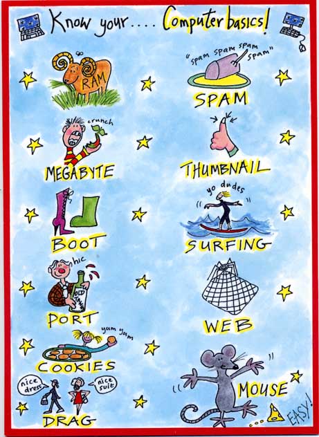
Other people don’t see the world the way you do. Their weltanschauung (view on the world) is influenced by their culture, education, expectations, age, gender and many other factors. Below is a copy of a card I received for my birthday a few weeks ago (click for a larger image) which I think illustrates the gulf between how developers and their customers see the world rather well.

birthday_card.jpg

If your customers are also developers the difference in backgrounds may not be so large. But the difference in how they see your software and how you see it is still huge. You have been working on your software for months or years. You know everything worth knowing about it down to the last checkbox and command line argument. But your potential customer is probably going to download it and play with it for just a few minutes, or a few hours if you are lucky, before they decide if it is the right tool for the job. If they aren’t convinced, your competitors are only a few clicks away. To maximise your chances of making a sale you need to see your software afresh through your customer’s eyes. You can get some useful feedback from support emails, but the best way to improve the ease of use of your software is to watch other people using it. This is usually known as usability testing.

The basic idea of usability testing is that you take someone with a similar background to your target audience, who hasn’t seen your software before and ask them to perform a typical series of tasks. Ideally they should try to speak out loud what they are thinking to give you more insight into their thought processes. You then watch what they do. Critically, you do not assist them, no matter how irresistible the urge. The results can be quite surprising and highly revealing. Usability testing can be very fancy with one way mirrors, video cameras etc, but that really isn’t necessary to get most of the benefits. There is a good description of how to carry out usability tests in Krug’s excellent book Don’t make me think: a common sense guide to web usability. Most of his advice is equally applicable to testing desktop applications.

The main problems with usability testing are logistical. You need to find the right test subjects and arrange the time and location for testing. You also need to decide how you are going to induce them to give up an hour of their time. Worst of all, once you have used someone they are ‘tainted’ and can’t be used again (except perhaps to test changes in the new versions). It’s a hassle. Or at least it was. Much of this hassle is now taken care of for you by new web-based service www.usertesting.com .

The idea behind usertesting.com is very simple. You buy a number of tests for your website and specify your website url, the tasks you want carried out and the demographics (e.g. preferred age, gender and expertise of testers). Testers are then selected for you and carry out the testing. Once tests have been completed a flash audio+video recording of the session and a brief written report is uploaded for you. Finally you rate the testers on a 5-star scale. Presumably testers who score well will get more work in future. Ideally you should re-run your usability testing after any changes to verify that they are an improvement. I don’t know if usertesting.com allows for the fact that you probably won’t want the same tester a second time for the same project.

I paid $57 for 3 tests on perfecttableplan.com. I was happy with the tests, which pointed out a number of areas I can improve on. There was a problem which meant one of the tests still hadn’t been completed 4 days later. I emailed support and they sorted this out in a timely fashion. It is a new service and they are still ironing out a few glitches. Given the low costs and the 30 day money back guarantee I think it is definitely worth a try. It won’t take many extra conversions to repay your investment. usertesting.com is probably more useful to those of us selling to the wider consumer market. If you are selling to specialised niches (e.g. developers, actuaries, llama breeders) they might have difficulty finding suitable testers.

Unfortunately usertesting.com is currently only available for website usability testing. When I emailed them to suggest they extend the service to desktop apps they told me that it this might be a possibility if there was sufficient interest. I will be first in-line if such a service becomes available. Until then I am left with the hassle of organising my own usability tests. It occurs to me that I could do this remotely using a service such as copilot.com (now free at weekends)+Skype. This might be a good workaround for the fact that my office isn’t really big enough for two people (especially if they don’t know me very well!). It would also allow me to do testing with customers outside the UK, e.g. professional wedding planners in the USA. If I do try this I will report back on how I get on.

Google Adwords: improving your ads

google adwordsOne of the keys to success in Google Adwords (and other pay per click services) is to write good ad copy. This isn’t easy as the ads have a very restrictive format, reminiscent of a haiku:

  • 25 character title
  • 2×35 character description lines
  • 35 character display url

Whats more, there are all sorts of rules about punctuation, capitalisation, trademarks etc. You will soon find out about these when you write ads. Most transgressions are flagged immediately by Google algorithms, others are picked up within a few days by Google staff (what a fun job that must be).

Google determines the order in which ads appear in their results using a secret algorithm based on how much you bid, how frequently people click your ads and possibly other factors, such as how long people spend on your site after clicking. Nobody really knows apart from Google, and they aren’t saying. The higher your click frequency, generally the higher your ad will appear. The higher your ad appears in the results, generally the more clicks you will get. So writing relevant ads is very important. This means that each adgroup should have a tightly clustered group of keywords and the ads should be closely targeted to those keywords.

There is no point paying for clicks from people who aren’t interested in your product, so you need to clearly describe what you are offering in the few words available. For example you might want to have a title “anti-virus software” instead of “anti-virus products” to ensure you aren’t paying for useless clicks from people looking for anti-viral drugs (setting “drugs” as a negative keyword would also help here).

I have separate campaigns for separate geographic areas. Each campaign contains the same keywords in the same adgroups, but with potentially different bid prices and ads. This allows me to customise the bid prices and ads for the different geographic areas. For example I can quote the £ price in a UK ad and the $ price in a US ad. Having separate campaigns for separate geographic areas is a hassle, but it is manageable, especially using Google Adwords editor.

Writing landing pages specific to each adgroup can also help to increase your conversion rate. It is worth noting that the ad destination url doesn’t have to match the display url. For example you could have a destination url of “http://www.myapp.com/html/landingpage1.html?ad_id=123” and a display url of “www.myapp.com/freetrial”.

Obviously what makes for good ad copy varies hugely with your market. Here are some things to try:

  • a call to action (e.g. “try it now!”)
  • adding/removing the price
  • different capitalisation and punctuation
  • keyword insertion (much beloved of EBay)
  • changing the destination url

But, as always, the only way to find out what really works is testing. Google have made this pretty easy with support for conversion tracking and detailed reporting. I run at least 2 ads in each adgroup and usually more. Over time I continually kill-off under-performing ads and try new ones. Often the new ads will be created by slight variations on successful ads (e.g. changing punctuation or a word) or splicing two successful ads together (e.g. the title from one and the body from another). This evolutionary approach (familiar to anyone that has written a genetic algorithm) gradually increases the ‘fitness’ of the ads. But you need to decide how to measure this fitness. Often it is obvious that one ad is performing better than another. But sometimes it can be harder to make a judgment. If you have an ad with a 5% click-through rate (CTR) and 0.5% conversion rate is this better than an ad with a 1% click-through rate and a 2% conversion rate? One might think so ( 5*0.5 > 1*2 ) but this is not necessarily the case. I think the key measure of how good an ad is comes from how much it earns you for each impression your keywords get.

I measure the fitness by a simple metric ‘profit per thousand impressions’ (PPKI) where, for a given time period:

PPKI = ( ( V * N ) – C ) / ( I / 1000 )

V = value of a conversion (e.g. product sale price)

N = number of conversions (e.g. product sales) from the ad

C = total cost of clicks for the ad

I = impressions for the ad

Say your product sells for $30. Over a given period you have 2 ads in the same adgroup that each get 40k impressions and clicks cost  an average of $0.10 per click.

  • ad1 has a CTR of 5%, a conversion rate of 0.5% and gets 10 conversions, which gives PPKI=$2.5 per thousand impressions
  • ad2 has a CTR of 1%, a conversion ratio of 2% and gets 8 conversions, which gives PPKI=$5 per thousand impressions

So ad2 made, on average, twice the profit per impression despite the lower number of conversions. Given this data I would replace ad1 with a new ad. Either a completely new ad or a variant of ad2.

PPKI has the advantage of being quantitative and simple to calculate. You can just export your Google Adwords ‘Ad Performance’ reports to Excel and add a PPKI column. Some points to bear in mind:

  • Selling software isn’t free. You may want to subtract the cost of support, CD printing & postage, ecommerce fees, VAT etc from the sale price to give a more accurate figure for the conversion value.
  • PPKI doesn’t take account of the mysterious subtleties of Google’s ‘quality score’. For example an ad with low CTR and high conversion rate might conceivably have a good PPKI but a poor quality score. This could result in further decreases in CTR over time (as the average position of the ad drops) and rises in minimum bid prices for keywords.
  • PPKI is a simple metric I have dreamt up, I have no idea if anyone else uses it. But I believe it is a better metric than cost per conversion, or any of the other standard Google metrics.

To ensure that all your ads get shown evenly select ‘Rotate: Show ads more evenly’ in your Adwords campaign settings. If you leave it at the default ‘ Optimize: Show better-performing ads more often’ Google will choose which ads show most often. Given a choice between showing the ads that make you most money and the ads which make Google most money, which do you think Google will choose?

Text ads aren’t the only type of ads. Google also offer other types of ads, including image and video ads. I experimented with image ads a few years ago, but they got very few impressions and didn’t seem worth the effort at the time. I may experiment with video ads in the future.

The effectiveness of ads can vary greatly. Back in mid-December I challenged some Business Of Software forum regulars to ‘pimp my adwords’ with a friendly competition to see who could write the best new ads for my own Google Adwords marketing. The intention was to inject some fresh ‘genes’ into my ad population while providing the participants with some useful feedback on what worked best. Although it is early days, the results have already proved interesting (click the image for an enlargement):

adwords ad results

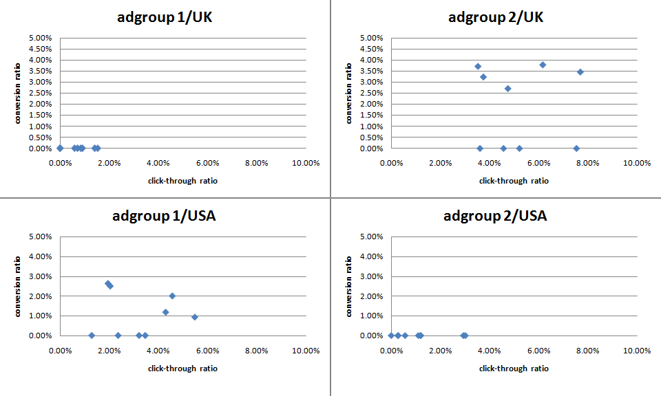
The graph above shows the CTR v conversion ratio of 2 adgroups, each running in both USA and UK campaigns. Each blue point is an ad. The ads, keywords and bid prices for each ad group are very similar in each country (any prices in the ads reflect the local currency for the campaign). Points to note:

  • There were enough clicks for the CTR to be statistically significant, but not for the conversion rate (yet).
  • The CTRs vary considerably within the same campaign+adgroup. Often by factor of more than 3.
  • Adgroup 1 performs much better in the USA than in the UK. The opposite is true for adgroup 2.
  • Adgroup 1 for the USA shows an inverse correlation between CTR and conversion rate. I often find this is the case – more specific ads mean lower CTR but higher conversion rates and higher profits.

‘Pimp my adwords’ will continue for a few more months before I declare a winner. I will be reporting back on the results in more detail and announcing the winner in a future post. Stay tuned.

Optimising your application

When I first released PerfectTablePlan I considered 50-200 guests as a typical event size, with 500+ guests a large event. But my customers have been using the software for ever larger events, with some as large as 3000 guests. While the software could cope with this number of guests, it wasn’t very responsive. In particular the genetic algorithm I use to optimise seating arrangements (which seats people together or apart, depending on their preferences) required running for at least an hour for the largest plans. This is hardly surprising when you consider that seating assignment is a combinatorial problem in the same NP-hard class as the notorious travelling salesman problem. The number of seating combinations for 1000 guests in 1000 seats is 1000!, which is a number with 2,658 digits. Even the number of seating combinations for just 60 guests is more than the number of atoms in the known universe. But customers really don’t care about how mathematically intractable a problem is. They just want it solved. Now. Or at least by the time they get back from their coffee. So I made a serious effort to optimise the performance in the latest release, particularly for the automatic seat assignment. Here are the results:

ptp308_vs_ptp_310.png

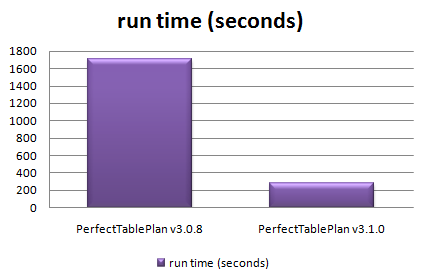
Total time taken to automatically assign seats in 128 sample table plans varying in size from 0 to 1500 guests

The chart shows that the new version automatically assigns seats more than 5 times faster over a wide range of table plans. The median improvement in speed is 66%, but the largest plans were solved over ten times faster. How did I do it? Mostly by straightening out a few kinks.

Some years ago I purchased my first dishwasher. I was really excited about being freed from the unspeakable tyranny of having to wash dishes by hand (bear with me). I installed it myself – how hard could it be? It took 10 hours to do a wash cycle. Convinced that the dishwasher was faulty I called the manufacturer. They sent out an engineer who quickly spotted that I had kinked the water inlet pipe as I had pushed the dishwasher into place. It was taking at least 9 hours to get enough water to start the cycle. Oops. As soon as the kink was straightened it worked perfectly, completing a cycle in less than an hour. Speeding up software is rather similar – you just need to straighten out the kinks. The trick is knowing where the kinks are. Experience has taught me that it is pretty much impossible to guess where the performance bottlenecks are in any non-trivial piece of software. You have to measure it using a profiler.

Unfortunately Visual Studio 2005 Standard doesn’t seem to include profiling tools. You have to pay for one of the more expensive versions of Visual Studio to get a profiler. This seems rather mean. But then again I was given a copy of VS2005 Standard for free by some nice Microsofties – after I had spent 10 minutes berating them on the awfulness of their “works with vista” program (shudder). So I used an evaluation version of LTProf. LTProf samples your running application a number of times per second, works out which line and function is being executed and uses this to build up a picture of where the program is spending most time.

After a bit of digging through the results I was able to identify a few kinks. Embarrassingly one of them was that the automatic seat assignment was reading a value from the Windows registry in a tight inner loop. Reading from the registry is very slow compared to reading from memory. Because the registry access was buried a few levels deep in function calls it wasn’t obvious that this was occurring. It was trivial to fix once identified. Another problem was that some intermediate values were being continually recalculated, even though none of the input values had changed. Again this was fairly trivial to fix. I also found that one part of the seat assignment genetic algorithm took time proportional to the square of the number of guests ( O(n^2) ). After quite a bit of work I was able to reduce this to a time linearly proportional to the number of guests (O(n) ). This led to big speed improvements for larger table plans. I didn’t attempt any further optimisation as I felt was getting into diminishing returns. I also straightened out some kinks in reading and writing files, redrawing seating charts and exporting data. The end result is that the new version of PerfectTablePlan is now much more usable for plans with 1000+ guests.

I was favourably impressed with LTProf and will probably buy a copy next time I need to do some optimisation. At $49.95 it is very cheap compared to many other profilers (Intel VTune is $699). LTProf was relatively simple to use and interpret, but it did have quirks. In particular, it showed some impossible call trees (showing X called by Y, where this wasn’t possible). This may have been an artefect of the sampling approach taken. I will probably also have a look at the free MacOSX Shark profiler at some point.

I also tried tweaking compiler settings to see how much difference this made. Results are shown below. You can see that there is a marked difference with and without compiler optimisation, and a noticeable difference between the -O1 and -O2 optimisations (the smaller the bar, the better, obviously):

vs2005_optimisation_speed.png

Effect of VS2005 compiler optimisation on automatic seating assignment run time

Obviously the results might be quite different for your own application, depending on the types of calculations you are doing. My genetic algorithm is requires large amounts of integer arithmetic and list traversal and manipulation.

The difference in executable sizes due to optimisation is small:

vs2005_optimisation_size.png

I tried the two other optimisation flags in addition to -O2.

  • /OPT:NOWIN98 – section alignment does not have to be optimal for Windows 98.
  • /GL – turns on global optimisation (e.g. across source files, instead of just within source files).

Neither made much noticeable difference:

vs2005_additional_opt.png

However it should be noted that most of the genetic algorithm is compiled in a single file already, so perhaps /GL couldn’t be expected to add much. I compared VC++6 and VS2005 version of the same program and found that VS2005 was significantly faster[1]:

vc6_vs_vs2005_optimisation_speed1.png

I also compared GCC compiler optimisation for the MacOSX version. Compared with VS2005 GCC has a more noticeable difference between optimised and unoptimised, but a smaller difference between the different optimisations:

gcc_optimisation_speed.png

Surprisingly -O3 was slower than -O2. Again the effect of optimisation on executable size is small.

gcc_optimisation_size2.png

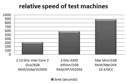
I also tested the relative speeds of my 3 main development machines[2]:

relative-machine-speed.png

It is interesting to note that the XP box runs the seat assignment at near 100% CPU utilisation, but the Vista box never goes above 50% CPU utilisation. This is because the Vista box is a dual core, but my the seat assignment is currently only single threaded. I will probably add multi-threading in a future version to improve the CPU utilisation on multi-core machines.

In conclusion:

  • Don’t assume, measure. Use a profiler to find out where your application is spending all its time. It almost certainly won’t be where you expected.
  • Get the algorithm right. This can make orders of magnitude difference to the runtime.
  • Compiler optimisation is worth doing, perhaps giving a 2-4 times speed improvement over an application built without compiler optimisation. It probably isn’t worth spending too much time tweaking compiler settings though.
  • Don’t let a software engineer fit your dishwasher.

Further reading:

“Programming pearls” by Jon Bentley a classic book on programming and algorithms

“Everything is fast for small n” by Jeff Atwood on the Coding Horror blog

[1] Not strictly like-for-like as the VC++6 version used dynamic Qt libraries, while the VS2005 version used static Qt libraries.

[2] I am assuming that VS2005 and GCC produce comparably fast executables when both set to -O2.

Beware upgradeware

fungi.jpgSome years back my wife bought a PC and got a ‘free’ inkjet printer with it. It was a really lousy printer, but hey, it was free. When it ran out of ink we tried to get a new inkjet cartridge, but the cheapest set of cartridges we could find was £80. That was 4 times the price of other comparable cartridges at the time. Some further research showed that you could buy the printer for £20 – with cartridges! Their ugly sales tactics didn’t work. We threw it in the dustbin and bought an Epson inkjet, which gave years of sterling service using third party sets of cartridges costing less than £10.

When I started my company I had a thousand decisions to make. One of them was which software to use to create and maintain my new product website. It just so happened that my new ISP (1and1.co.uk) was offering a bundle of ‘free software worth £x’ when you signed up (I forget the amount). It included a web design package (NetObjects Fusion 8 ) and an FTP package (WISE-FTP). Hoorah, free (as in beer) software and 2 less decisions to make. I was weak. Instead of spending time checking out reviews and evaluating competitors, I just installed and starting using them. It didn’t occur to me that they might be using the same sales tactics as the manufacturer of the lousy printer. In this imperfect world, if something appears too good to be true, it usually is. And so it was in this case. I grew to hate both these pieces of software.

WISE-FTP was just flaky. It kept crashing and displaying German error messages, despite the fact that I had installed the English version. No problem, I just uninstalled and installed FileZilla which is free (as in beer and speech), stable and does everything I need and more.

NetObjects Fusion was flaky and hard to use. By saving after every edit I could minimise the effects of the regular crashes and I assumed that I would learn how to work around other problems in time. But I never did. By the time I decided that the problems were more due to the shortcomings of NetObjects Fusion as a software package, rather than my (many) shortcomings as a web designer, it was a little late. I had already created an entire website, which was now stored in NetObjects Fusion’s proprietary database. Some of the bugs in NetObjects Fusion are so major that one wonders how much testing the developers did. My ‘favourite’ is the one where clicking a row in a table causes the editor to scroll to the top the table. This is infuriating when you are editing a large table (my HTML skills haven’t yet reached the 21st century).

In despair I eventually paid good money to upgrade to NetObjects Fusion 10. Surely it would be more stable and less buggy after two major version releases? Bzzzzt, wrong. The table scrolling bug is still there and it crashed 3 times this morning in 10 minutes. Also, every time I start it up the screen flashes and I get the ominous Vista warning message “The color scheme has been changed to Windows Vista Basic. A running program isn’t compatible with certain visual elements of Windows”. Even just trying to buy the software upgrade off their website was a confusing nightmare. The trouble is that it is always easier in the short-term to put up with NetObject Fusion’s many shortcomings than to create the whole site anew in another package.

For want of a better term I call this sort of software ‘upgradeware’ – commercial software that is given away free in the hope that you will buy upgrades. This is quite distinct from the ‘try before you buy’ model, where the the free version is crippled or time-limited, or freeware, for which there is no charge ever. Upgradeware is the software equivalent of giving away a printer in the hope that you will buy overpriced cartridges. Only it is less risky, as the cost of giving away the software is effectively zero. It seems to be a favoured approach for selling inferior products and it is particularly successful when there is some sort of lock-in. It certainly worked for NetObjects in my case.

Norton Anti-virus are the masters of upgradeware. Norton Anti-virus frequently comes pre-installed on new PCs with a free 1-year subscription. The path of least resistance is to pay for upgrades when your free subscription runs out. By doing these deals with PC vendors, Symantec sell vast amounts of subscriptions, despite the fact that Norton Anti-virus has been shown in test after test to be more bloated and less effective than many of its competitors. And if you think Norton Anti-virus doesn’t have any lock-in, just try uninstalling it and installing something else. It is almost impossible to get rid of fully. Last time I tried I ended up in a situation where it said I couldn’t uninstall it, because it wasn’t installed, and I couldn’t re-install, because it was still installed.

I feel slightly better now that I have had a rant about some of my least favourite software. But there is also a more general point – ‘free’ commercial software can end up being very expensive. Time is money and I hate to think how much time I have wasted struggling with upgradeware. So be very wary of upgradeware, especially if there is any sort of lock-in. When I purchased a new Vista PC, the first thing I did was to reinstall Vista to get rid of all the upgradeware that Dell had installed (Dell wouldn’t supply it to me without it). You could also draw the alternative conclusion that upgradeware might be a good approach for making money from lousy software. But hang your head in shame if you are even thinking about it. It would be better for everyone if you just created a product that was good for customers to pay for it up-front.

Ps/ If you fancy the job of converting www.perfecttableplan.com to beautiful sparkly clean XHTML/CSS and your rates are reasonable – feel free to contact me with a quote.

The other side of the interface

all_seeing_eyes.jpgWhile researching my talk on usability for ESWC2007 I came across this article I wrote some years ago. It has quite a lot of material I would have liked to have included, but there is only so much you can fit into a 60 minute talk. I am putting it here as a supplement to the talk and as a tribute to the late lamented EXE magazine which first published the article in June 1998. EXE went under in 2000 and I can’t find anyone to ask permission to republish it. I think they wouldn’t have minded. It is quite a long article and may be truncated by feed readers. Click through to the site to read the whole article.

It has been said that if users were meant to understand computers they would have been given brains. But, in fairness to users, the problem is often that interfaces are not designed to take account of their strengths and weaknesses. I have struggled with my fair share of dire user interfaces, and I’m supposed to be an expert user.

An interface is, by definition, a boundary between two systems. On one side of a user interface is the computer hardware and software. On the other side is the user with (hopefully) a brain and associated sensory systems. To design a good interface it is necessary to have some understanding of both of these systems. Programmers are familiar with the computer side (it is their job after all) but what about the other side? The brain is a remarkable organ, but to own one is not necessarily to understand how it works. Cognitive psychologists have managed to uncover a fair amount about thought processes, memory and perception. As computer models have played quite a large role in understanding the brain, it seems only fair to take something back. With apologies to psychologists everywhere, I will try to summarise some of the most important theory in the hope that this will lead to a better understanding of what makes a good user interface. Also, I think it is interesting to look at the remarkable design of a computer produced by millions of years of evolution, and possibly the most sophisticated structure in the universe (or at least in our little cosmic neighbourhood).

The human brain is approximately 1.3kg in weight and contains approximately 10,000,000,000 neurons. Processing is basically digital, with ‘firing’ neurons triggering other neurons to fire. A single neuron is rather unimpressive compared with a modern CPU. It can only fire a sluggish maximum of 1000 times a second, and impulses travel down it a painfully slow maximum of 100 meters per second. However, the brain’s architecture is staggeringly parallel, with every neuron having a potential 25,000 interconnections with neighbouring neurons. That’s up to 2.5 x 10^14 interconnections. This parallel construction means that it has massive amounts of store, fantastic pattern recognition abilities and a high degree of fault tolerance. But the poor performance of the individual neurons means that the brain performs badly at tasks that cannot be easily parallelised, for example arithmetic. Also the brain carries out its processing and storage using a complex combination of electrical, chemical, hormonal and structural processes. Consequently the results of processing are probabilistic, rather than deterministic and the ability to store information reliably and unchanged for long periods is not quite what one might hope for.

Perhaps unsurprisingly, the brain has a similar multi-level storage approach to a modern computer. Where a computer has cache, RAM and hard-disk memory (in increasing order of capacity and decreasing order of access speed) the brain has sensory memory, short-term memory and long-term memory. Sensory memory has a large capacity, but a very short retention period. Short-term memory has a very small capacity but can store and retrieve quickly. Long-term memory has a much larger capacity, but storage and retrieval is more difficult. New information from sensory memory and knowledge from long-term memory are integrated with information in short-term memory to produce solutions.

memory_model.gif

A simple model of memory and problem solving[1].

Sensory memory acts like a huge register, retaining large amounts of sensory data very briefly so that it can be processed into a meaningful form, e.g. to recognise a face, which is transferred to short-term memory. The sensory data is then quickly replaced with new incoming data.

Short-term memory acts like a very small queue with a limited retention period. It can hold only 7±2 items of information, with new items added into short-term memory displacing older ones once this limit has been reached. Items disappear after approximately 30 seconds if not rehearsed. The items of information in short-term memory act as ‘pointers’ to arbitrarily large and complex pieces of information stored in long-term memory. For example the seventh of January is one chunk for me (its my birthday), 2 chunks to you (one for each familiar word) and 14 chunks for a non-English speaker familiar with our alphabet (one for each character). The number 7±2 may seem rather arbitrary, but experimentation shows it is remarkably consistent across a wide range of individuals and cultures. Short-term memory acts as a workspace for problem solving. The more items that are held in short-term memory the longer it takes to process them.

It is important not to overload short-term memory. The limited size of short-term memory is a critical bottleneck in problem solving and one of the main constraints to consider for any user interface (designed for human users at least). Don’t force the user to try to hold lots of items in short-term memory. If they have to think about more than 7±2 items then new items will displace old ones. Also the more items that are in short-term memory the slower their response time will be. Having lots of ‘open’ tasks puts a big burden on short-term memory, so tasks should be grouped into well-defined ‘transactions’. Complex tasks can almost always be broken down into simpler sub-tasks.

Long-term memory acts like a huge network database. It has a complex structure and massive capacity, but storing and retrieving information is slow and not always reliable. Items of information are apparently interconnected and accessed by some form of pointer. Some psychologists believe that long-term memory may be permanent, and only the ability to retrieve it may be lost (a bad case of ‘dangling pointers’ perhaps?). Dreaming may be a side-effect of routine re-structuring of long-term memory (garbage collection?) while we are asleep. Transferring information to long-term memory seems to be a process of encoding the memory and creating pointers to access it. The more often an item of information is accessed the easier it becomes to access in future. Each item of information may be accessible by many different routes. Consequently the context in which information is presented can be important factor in remembering. The more context cues that are available the easier it is to retrieve an item from long-term memory. For example, experiments show that students perform better in exams held in the classroom where they learnt the information than elsewhere. So if an item was presented in a particular font, colour and size, it will be easier to remember its meaning if the same font, colour and size are used.

There is some evidence that image and verbal memories are stored in different parts of the brain. We can often remember the faces of people we have met better than their names. Experiments show that it is easier to remember an image than a concrete word, for example it is easier to remember ‘car’ when shown an image of a car than when shown the word ‘car’. It is also easier to remember a concrete word than an abstract word, for example it is easier to remember the word ‘car’, than the word ‘transport’. This implies that the iconic representation of commands on toolbars has value beyond just looking nice. Also keywords used in a command line interface should where possible be concrete, rather than abstract.

The different types of memory are stored using different physical mechanisms, probably electrical, chemical and structural. As proof of this you can train an animal to run a maze, cool it down to the point where all brain activity ceases and then warm it up again. It will have forgotten how to run the maze, but remember things it learnt days before (I don’t recommend you try this with users). Also some diseases have been observed affect short-term memory without affecting long-term memory. Transfer information from short-term to long-term memory and retrieving it again is not very reliable. It is better to allow the user to select from alternatives rather than force them to commit items to long-term memory and then retrieve them. At work, the interface of our old accountancy package had many short-comings. Projects had to be identified as 5 digit numerical codes, even though alphabetic codes would have been easier to remember. Users also had to enter project numbers from memory, no facility for selecting from available projects was provided. It wouldn’t have taken much effort to produce a better interface design, just a little thought. For example the Microsoft Word print dialog cues the user as to the permitted format for specifying pages to be printed.

example.gif

A useful aid to memory.

The brain gets its input from the outside world through the senses. Of the senses vision is the most important, with some 70% of all sensory receptors in the eyes. The importance of vision is also reflected in the design of modern computers. Other than the odd beep the computer communicates with the user almost entirely through the VDU. Consequently I will confine the scope of the discussion on the senses to vision alone.

The eye is an impressive sensing device by any standards. Tests show that its is possible for a human eye to detect a candle flame at a range of 30 miles on a dark, still night. This corresponds to detecting a signal as low as a few photons entering the eye. Incoming light is focused onto the retina at the back of the eye, which contains the light receptors. The retina is actually an extension of the brain. Observation of growing embryos shows that the tissue that forms the retina extends from the brain, it is not formed from the tissue that turns into the rest of the eye. The retina contains some 5 million ‘cone’ receptors and 100 million ‘rod’ receptors. The cones are sensitive to colour, while the rods are sensitive to brightness. Some cones are sensitive to red, some to green and some to blue, depending on the pigment they contain. The cones are much more liberally supplied with nerve cells and are able to discern detail, but they don’t function in low light levels. The cones are densest in the centre of the retina, and virtually absent at the outer edge. The fovea centralis, a spot 1 millimetre across at the centre of the retina, contains some 200,000 cones and no rods. The rods only detect light at the blue end of the spectrum, but they are extremely sensitive and can detect a single photon of light. The uneven distribution of rods and cones is easy to test. Look slightly away from this page and try to read it ‘out of the corner of your eye’ – its not possible. Only the fovea has sufficient acuity to discern this level of detail. You may also notice that it is easiest to see poorly illuminated objects out of the corner of your eye. A very dim star, visible out of the corner of your eye, disappears when looked straight at.

Because the fovea is so small we are only able to distinguish detail over a range of approximately 2 degrees. This equates to about 2.5cm at the normal distance from user to VDU. To build up a detailed picture of what is on the screen we have to scan it. It therefore makes sense to have single items on the interface not bigger than 2.5cm, so they can be recognised without have to scan them. Games and simulators that perform real-time rendering are wasting a lot of processing power by rendering the whole picture at the same level of detail. What they should ideally be doing is performing very detailed rendering at the point where the user’s fovea is pointing and progressively less detailed rendering further away from this. This would allow a much more efficient use of available processing power. It is possible to detect where the user is looking by bouncing an infrared beam off their retina. If this technology becomes widely available it could be used to perform differential rendering, with the result appearing much more detailed without any increase in processing power.

The receptors in the retina, in common with other sense receptors, are only sensitive to change. Using special optical equipment it is possible to project a ‘stabilised’ image onto the retina that does not change, regardless of eye movements. A stabilised image fades to a formless grey and is no longer discernible after only 2-3 seconds. It turns out that the constant movement of the eye, originally thought to be an imperfection of the optical system, is essential for sensing unchanging images. Perversely, light has to pass through 9 layers of nerves cells and blood vessels in the retina before it reaches the light receptors (I guess evolution isn’t perfect). Because the network of nerves and bloods vessels is unchanging, we don’t normally perceive it[2]. The practical consequence is that any form of movement, animation, change in intensity or flashing on a user interface is extremely noticeable. Flashing should be used sparingly as it can be distracting and fatiguing to users. Quickly changing text is also difficult to read, this is why, in our digital age, car speedometers remain as analogue dials rather than numerical LEDs. It may be better to put a flashing symbol next to steady text, this draws attention to the text without reducing its legibility. Mosier and Smith[3] recommend a flash rate between 2-5 Hz, with a minimum ‘on’ time of at least 50 percent. Large flashing areas of colour are believed to aggravate epilepsy (particularly at certain frequencies) and should not be used.

While sensation happens in the eye, perception happens in the brain. The receptors in the retina convert the light to electrical signals which they pass to the brain through the optic nerve, a bundle of approximately 1,000,000 neurons. The information is processed in the visual cortex, the surface of the brain at the back of the head. Our perception is incredibly sophisticated, as artificial intelligence researchers have found to their cost. Experiments on the cortex shows that it has evolved with built-in ‘feature detectors’. A feature detector is a neuron that fires for a very particular stimulus. For example, one neuron in the visual cortex may fire if there is a horizontal line at the top-left of the visual field. Next to it will be a neuron that fires for a slightly different orientation, length or position. Additional processing is then carried out to integrate all the information from the different feature detectors.

As you are reading this page your eye is making rapid movements, with your brain recognising the shape of 2-3 words at a time before moving on to the next group of words (the maximum number of words recognised at a time presumably being limited by the size of the fovea). This is apparently being done by information from different feature detectors being integrated very quickly. For example the word ‘FIX’ can be broken down into six straight lines at different positions in the visual field. We are able to recognise this work in about a third of a second, even though the size and font may vary. Shape recognition is therefore incredibly efficient and seems to be one of the best developed features of our visual system. Tests show that objects can be recognised just as well from line drawings as from colour photographs. A cup is recognisable as a cup because of its shape, not because of its colour, orientation etc. Textual representations are not always the best way to convey information. A map, chart, diagram or other form of image will often convey the same information quicker.

icons-in-explorer.gif

The use of icons in Windows Explorer makes it easier to browse document types than would be possible by reading the file extensions.

Tests show that our ability to pick out simple features such as length, orientation, curvature and brightness are carried at a very low level, in parallel. Consequently we can pick out items based on these features in a constant time, regardless of the number of other items in the image. Careful use of these abilities allow a great deal of information to be filtered very rapidly by the user.

shapes1.gif

The anomalous shape is detected as quickly in b) as in a), even though there are three times as many targets.

But the brain is not so good at integrating (‘conjoining’) different types of feature, for example shape and brightness. It is easy to pick out a black icon or a circular icon, but picking out a black circular icon is more difficult and time consuming.

shapes2.gif

Time taken to pick out the black circle increases at the number of targets increases.

It follows from this that you should try to distinguish features of the interface by shape or brightness or orientation, but not a combination of these factors.

optical.gif

a) the horizontal and vertical lines are the same length. b) the vertical lines are the same length.

The visual cortex carries out a great deal of processing that we are unaware of, not least of which is turning the image of the world the right way up. Even though we can understand the nature of illusions, our visual system is still fooled. This is because it is not just sensing the world, but trying to interpret it, making use of all sorts of cues and in-built knowlege, and this is happening at a lower level than we can consciously control. You may not have even noticed that there was a deliberate spelling mistake in the last sentence because your perceptual system made a sensible guess.

Although the image projected onto our retina is two dimensional we have very well developed depth perception, our ancestors wouldn’t have been able to swing through the trees without it. Partly this is because having two eyes allows stereoscopic vision, but also because our brain processes lots of other visual cues that produce a sensation of depth, even where it doesn’t exist (for example in a photograph). The main cues are:

  • More distant objects are smaller
  • More distant objects appear closer to the ‘vanishing point’ created by converging parallels
  • More distant objects move across the visual field more slowly
  • Superposition, if A overlaps B then A must be closer
  • Shadows and highlights
  • Chromostereopsis, long wavelength colours (e.g. red) appear closer than shorter wavelength colours (e.g. blue) because shorter wavelength light is refracted more strongly by the lens of the eye (but this is rather weak compared to the other effects)

depth-cues.gif

Use of depth cues make the one shape appear closer than the other.

Using these cues can give a very effective illusion of depth, without specialised equipment such as stereoscopic googles. This built-in depth perception is currently taken advantage of only in a very limited way in most GUI environments, for example the use of highlights and shadows to infer a three dimensional element for controls. Many applications would benefit from a three dimensional representation. For example the structure of a complex web site could be better presented in three dimensions than two. The availability of VRML and other technologies is likely to make three dimensional interfaces increasingly common.

buttons.gif

An illusion of depth.

Interestingly it is purely a matter of convention and practise that makes us imagine the light source as at the top-left and see the top button as sticking out and the bottom button as sticking in[4]. If you can also see them the other way around if you try.

Layout is an important feature of an interface. Western users will tend to scan an screen as if they were reading a page, starting from the top-left. Scanning can be made easier by aligning controls in rows. Complex displays can be made easier to scan by adding additional cues, for example a timesheet could have a thicker line denoting the end of each week.

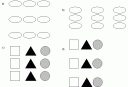
Both layout and similarity can be used to group items on an interface.
grouping.gif

In a) the shapes are perceived as 3 rows, while in b) they are perceived as 3 columns, due to proximity. In c) the shapes are perceived as 3 columns, due to similarity. d) gives a mixed message.

A colour is perceived according to how strongly it activates the red, green and blue cone receptors in our eyes. From this we perceive its intensity (how bright it is), its hue (the dominant wavelength) and saturation (how wide a range of wavelengths make it up). Within the 400-700 nanometer visible range we can distinguish wavelengths 2 nanometers apart. Combined with differing levels of hue and saturation the estimated numbers of colours we can discriminate is 7,000,000. According to the US National Bureau of Standards there are some 7,500 colours with names. But colour should be used sparingly in interfaces. I once worked on an application where a very extrovert student with dubious taste (as evidenced by his choice of ties) had designed the user interface. Each major type of window had a different lurid background colour. This was presumably to make it easy to tell them apart, but the overall effect was highly distracting.

Colour perception, like everything else to do with perception, is complex. Experiments show that how we perceive a colour depends on the other colours surrounding it. If you look through a pinhole at a sheet of green or red paper it doesn’t appear to have a very strong colour. But if you put the sheets next to each other and look at them both through the pinhole the colours appear much stronger. So if you want to make a colour highly visible, put it next to a complementary colour, for example yellow is perceived by red and green cone cells, so to make it more visible put it next to an area of saturated blue.

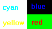
Colour can be used with text and symbols to add information without making them less legible, as long as a careful choice of colours is used. Some combinations of colours work better than others. Saturated blue appears dimmer to the human eye than other saturated colours and is more difficult to focus on. Blue symbols and text are therefore probably best avoided. However, for the same reasons, blue can make a background that is easy on the eye. Saturated yellow appears brighter than all the other colours for the same intensity.
colours1.gif

Ill-advised colour combinations.

colours2.gif

Better colour combinations.

Designers should remember that a significant proportion of the population has deficient colour vision (some 6% of males and 0.4% of females, the difference being due to the way the defective gene is inherited). This is caused by problems with pigmentation in one or more of the red, green and blue cone cells in the eye. While there are a range of different types of colour deficiency the most common is the inability to distinguish between red and green. This raises some questions about the design of traffic lights (some colour-deficient drivers have to rely on the position, rather than the colour, of the lights). Some individuals may not be able to distinguish one or more primary colours from grey, it is therefore unwise to put a primary colour on a dark background. Allowing users to customise colours goes some way to alleviating this problem.

Other forms of vision defect are also common, as evidenced by the number of people wearing glasses. Something that is easily visible on the programmer’s 17 inch screen may be almost impossible to read on a user’s LCD laptop screen. This problem is further compounded by the fact that eyesight deteriorates with age and programmers tend to younger on average than users. There also seems to be a tendency to use ever smaller fonts even though screen sizes are increasing. Perhaps this is based on the assumption that large fonts make things look childish and unsophisticated, so small fonts must look professional. Ideally the user should be able to customise screen resolution and font sizes.

Meaning can sometimes be conveyed with colour, for example a temperature scale may be graded from blue (cold) to red (hot) as this has obvious physical parallels. But the meaning of colour can be very culturally dependent. For example, red is often used to imply danger in the west, but this does not necessarily carry over into other cultures. The relative commonness of defective colour vision and the limited ability of users to attach meaning to colour means that it should be used as an additional cue, and should not be relied on as the primary means of conveying information. Furthermore colour won’t be visible on a monochrome display (now relatively rare) or a monochrome printer (still very common).

Humans are good at recognising patterns, making creative decisions and filtering huge amounts of information. Humans are not so good at arithmetic, juggling lots of things at once and committing them to long-term memory. Computers are the opposite. A good interface design should reflect the respective strengths and weaknesses of human and computer. Just as a well crafted graphical user interface will minimise the amount of machine resources required to run it, it should also minimise the amount of brain resources required to use it, leaving as much brain capacity as possible for the user to solve their actual problem.

[1] After “Psychology”, 2nd Ed, C.Wade and C.Tavris.

[2] However it can be seen under certain conditions. Close one eye and look through a pinhole in a piece of card at a well illuminated sheet of white paper. If you waggle the card from side to side you start to see the network of blood vessel.

[3] “Guidelines for Designing User Interface Software” by Smith and Mosier (1986). Several hundred pages of guidelines for user interface design. They betray their 80’s US Air Force sponsored origins in places, but are still excellent. For the dedicated.

[4] I have since found out that this may not be true. Our brains appeared to be hardwired to assume that the lighting comes from above. For more details see: “Mind Hacks” T.Stafford & M.Webb (2005).

Selling your own software vs working for the man

nz_beach.jpgYou’ve got this great idea for a software product. You are pretty confident that you can crank out version 1.0 working full-time on your own from the spare room, and you are fairly confident that people will buy it. But you’ve also got a well paid full-time job ‘working for the man’. It’s cosy and familiar in that cubicle. Is it worth risking your career and savings to set out into uncharted waters on your own? Do you take the red pill or the blue pill?
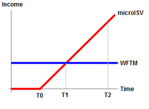
The aim of this article is just to give you some insight into the economic realities of becoming a one man software company (a microISV). The results might surprise you. ‘Working for the man’ you get a steady monthly income every month. Working for yourself you start off with no income, while you create your product. If all goes well you start to make sales when you release v1.0 and these sales gradually improve over time until you are earning the same amount each month as when you were working for the man . As the sales continue to improve you (hopefully) reach the point where you have made as much money as if you had stayed in your old job for the same period of time. From here on it’s all gravy. Here is a very simple model:

simple microISV income model

Monthly income as microISV vs WFTM (T0=version 1.0 release, T1=monthly income equal to WFTM, T2=areas under the red and blue lines are the same)

Obviously I am making a lot of assumptions and simplifications here. In particular I am assuming:

  • Net income from microISV sales rises linearly month-on-month as soon as you release v1.0. Obviously this can’t happen forever (or you will be richer than Bill Gates) but it seems as good a guess as any and it keeps the mathematics simple.
  • MicroISV start-up expenses (buying a domain name, starting your company, buying equipment and software, getting an Internet connection etc) are fairly low compared your monthly WFTM salary.

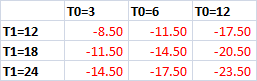
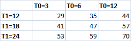
Even though the model is embarrassingly over-simplified, I think it can still give some insights. If I plug some numbers for T0 and T1 into a simple spreadsheet I can come up with values for T2. I’ll choose numbers that I consider optimistic, realistic and pessimistic for each. For T0 (time to V1.0) I choose 3, 6 and 12 months. For T1 (time to same income as WFTM) I choose 12, 18 and 24 months.

T2 calculation

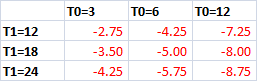
Months required to reach T2

i.e. if it takes you 6 months to get V1.0 out and then another 18 months until it is making the same monthly income (after expenses) as WFTM then it will take you 47 months to reach the point where a microISV has made you more money than WFTM.

So how much do you need in the way of savings to survive until you have a decent income? I can work this out by assuming living expenses as some proportion of WFTM monthly income. Calculating for 50% (living on noodles) and 100% (full speed ahead and damn the torpedoes):

debt incurred with living expenses=50% of WFTM income

Maximum debt in months of WFTM income with living expenses=50% of WFTM income

debt incurred with living expenses=100% of WFTM income

Maximum debt in months of WFTM income with living expenses=100% of WFTM income

i.e. if it takes you 6 months to get V1.0 out and then another 18 months until it is making the same monthly income (after expenses) as WFTM and your living expenses are 50% of your WFTM income then your maximum debt is 5 months of WFTM income.

I think the results of this simple little model make a few points:

  • Rate of sales growth is critical but the the time to getting v1.0 out is also very important. The longer it takes, the more you have to catch up later.
  • You are unlikely to come out financially ahead after 2 years as a microISV, even with fairly optimistic sales figures. It could easily take 3 or 4 years and, if the sales don’t take off or level out too early, you may never get there. There are many reasons to start a microISV, but getting rich quick isn’t one of them.
  • Given that you can’t know what T1 will be for your product, you should probably have at least 6 months WFTM income in the bank. Preferably 12 months.
  • Learn to love noodles.

You can download my Excel spreadsheet here (it’s a quick hack, so don’t expect too much).

So which is it going to be, the red pill or the blue pill?

man in costume holds red and blue pills

digg vs reddit vs slashdot vs stumbleupon – who’s the daddy?

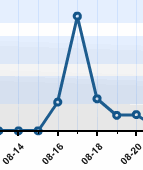
traffic spike from digg reddit stumbleupon and slashdotSocial news and bookmarking sites, such as reddit.com, digg.com, slashdot.org and stumbleupon.com, use voting by users or selection by editors to rank interesting stories. Much to my surprise, I recently had an article from this blog featured prominently on all four of these popular sites. This generated a large amount of traffic and gave me an interesting opportunity to turn the tables, by using my hit statistics to rank these sites.
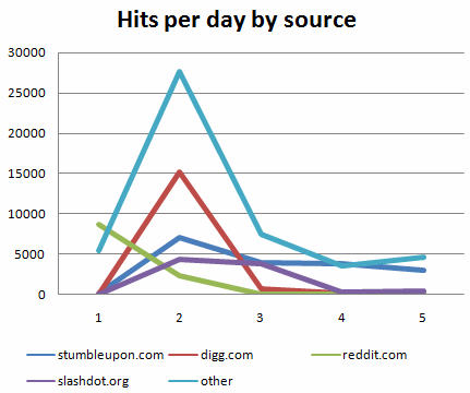
On the 16th August I published an article about a little experiment I did to prove that many software download sites hand out awards automatically, without reviewing the software. Most developers who have submitted software to such sites probably suspected this already. But the experiment proved it conclusively by garnering awards for software that didn’t even run.

I wrote the article because I wanted to shine some light on this unsavoury practise. I wanted it to be as widely read as possible, so I posted a link to it on a few software developer and entrepreneur forums that I frequent. Later in the day I posted it to reddit.com. I also added my vote to the people who had already posted it to digg.com and programming.reddit.com. I expected a few hundred people would read the article, mostly regular readers of my blog. But it got voted up and made its way on to the home page of reddit.com. Traffic started to flood in.

My recollections of the next few days are a bit hazy as it all happened rather quickly. From the front page of reddit.com the article made its way across the front pages of digg.com, and then slashdot.org, like a electronic Mexican wave. The article also appeared on the home page of WordPress.com and received traffic from social bookmarking sites stumbleupon.com and del.icio.us. Large numbers of blogs and forums also linked to the article. Hits on my blog peaked on the 17th at 53,422 hits for the day.

total blog hits per day

blog hits from reddit, digg, slashdot and stumbleupon

A few observations from the data:

  • The social news sites have the attention span of a one year old on amphetamines. The hits from digg.com went from 15,161 on Friday to just 648 on Saturday.
  • The article was linked to from 375 blogs (according to technorati.com) and an unknown number of forums and other sites. The top 4, 10 and 20 sites account for 52%, 61% and 65% of the total traffic, respectively. A long tail of less popular sites makes up the rest.
  • Things really took off once the article reached the front page of reddit.com. I visualise the links spreading across the Internet analogous to a sub-atomic chain reaction. Just as energetic particles decompose into cascades of ever smaller particles, bigger sites propogate their links to ever larger numbers of smaller and smaller sites.
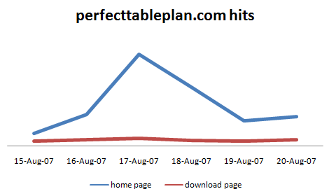
  • The onslaught was wide, but not deep. A relatively low percentage of readers followed links in the article or read other articles on my blog. While that still made quite an impact on the number of visitors to the home page of my seating planner software PerfectTablePlan, there were few additional downloads and (according to my cookie tracking) 0 additional sales. This is not too surprising when you think how untargetted the traffic is. Experience has shown me that small volumes of targetted traffic make more sales than large volumes of untargetted traffic. But still, one of you must know someone who is getting married? ;0)

perfecttableplan_hits.gif

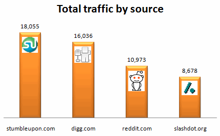
Totalling all the visitors to the blog over the 5 days I give you the successfulsoftware.net official ranking for social news and bookmarking sites.

stumbleupon, digg, reddit and slashdot

Here is the full top 20:

top 20 referrer sites

The article has generated a lot of comments. I particularly enjoyed the reviews here (I hope they haven’t been deleted). Interestingly the order of the number of comments/reviews for the 4 top sites is very different to the number of hits.

comments and reviews on stumbleupon. digg, reddit and slashdot

Please don’t take my ranking too seriously. The story reached similar positions on the reddit, digg and slashdot home pages[1], but my methodology here is far from rigorous. A different type of story on a different day might have resulted in a quite different ranking. Amongst other issues:

  • The WordPress stats only show the top 40 referrers for each day.
  • The article made the front page of different sites at different times.
  • Just because someone clicked through, doesn’t mean they actually read the article.
  • My article might simply have been more interesting to the type of people who read one site than the type of people who read another.
  • I have no way of knowing whether any of the visitors were bots.

But social news sites aren’t exactly rigorous in their ranking either.

Please note that I created this blog to write about what it takes to successfully create and market commercial software. I don’t intend to become another blogger blogging about blogging. It’s bad for your eyesight (see point #10 here). Normal service will be resumed shortly.

[1] To the best of my knowledge the article reached a highwater mark of positions 1,2 and 2 on slashdot.org, reddit.com and digg.com respectively and was featured in one of the ‘popular’ pages on stumbleupon.

The software awards scam

software awardI put out a new product a couple of weeks ago. This new product has so far won 16 different awards and recommendations from software download sites. Some of them even emailed me messages of encouragement such as “Great job, we’re really impressed!”. I should be delighted at this recognition of the quality of my software, except that the ‘software’ doesn’t even run. This is hardly surprising when you consider that it is just a text file with the words “this program does nothing at all” repeated a few times and then renamed as an .exe. The PAD file that described the software contains the description “This program does nothing at all”. The screenshot I submitted (below) was similarly blunt and to the point:
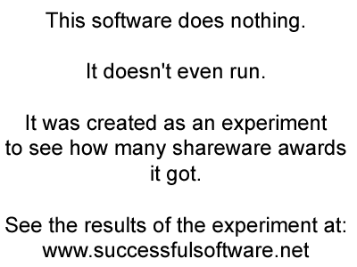
awardmestars_screenshot.gif

Even the name of the software, “awardmestars”, was a bit of a giveaway. And yet it still won 16 ‘awards’. Here they are:

all_awards2.gif

Some of them look quite impressive, but none of them are worth the electrons it takes to display them.

The obvious explanation is that some download sites give an award to every piece of software submitted to them. In return they hope that the author will display the award with a link back to them. The back link then potentially increases traffic to their site directly (through clicks on the award link) and indirectly (through improved page rank from the incoming links). The author gets some awards to impress their potential clients and the download site gets additional traffic.

This practise is blatantly misleading and dishonest. It makes no distinction between high quality software and any old rubbish that someone was prepared to submit to a download site. The download sites that practise this deceit should be ashamed of themselves. Similarly, any author or company, that displays one of these ‘awards’ is either being naive (at best) or knowingly colluding in the scam (at worst).

My suspicions were first aroused by the number of five star awards I received for my PerfectTablePlan software. When I went to these sites all the other programs on them seemed to have five star awards as well. I also noticed that some of my weaker competitors were proudly displaying pages full of five star awards. I saw very few three or four star awards. Something smelled fishy. Being a scientist by original training, I decided to run a little experiment to see if a completely worthless piece of software would win any awards.

Having seen various recommendations for the rundenko.com submit-everywhere.com submission service on the ASP forums I emailed the owner, Mykola Rudenko, to ask if he could help with my little experiment. To my surprise, he generously agreed to help by submitting “awardmestars” to all 1033 sites on their database, free of charge.

According to the report I received 2 weeks after submissions began “awardmestars” is now listed on 218 sites, pending on 394 sites and has been rejected by 421 sites. Approximately 7% of the sites that listed the software emailed me that it had won an award (I don’t know how many have displayed it with an award, without informing me). With 394 pending sites it might win quite a few more awards yet. Many of the rejections were on the grounds of “The site does not accept products of this genre” (it was listed as a utility) rather than quality grounds.

The truth is that many download sites are just electronic dung heaps, using fake awards, dubious SEO and content misappropriated from PAD files in a pathetic attempt to make a few dollars from Google Adwords. Hopefully these bottom-feeders will be put out of business by the continually improving search engines, leaving only the better sites. I think there is still a role for good quality download sites. But there needs to be more emphasis on quality, classification, and additional content (e.g. reviews). Whether it is possible for such a business to be profitable, I don’t know. However, it seems to work in the MacOSX world where the download sites are much fewer in number, but with much higher quality and more user interaction.

Some download site owners did email me to say either “very funny” or “stop wasting my time”. Kudos to them for taking the time to check every submission. I recommend you put their sites high on your list next time you are looking for software:

www.filecart.com

www.freshmeat.net

www.download-tipp.de (German)

This is the response I got from Lothar Jung of download-tipp.de when I showed him a draft of this article:

“The other side for me as a website publisher is that if you do not give each software 5 stars, you don’t get so many back links and some authors are not very pleased with this and your website. When I started download-tipp.de, I wanted to create a site where users can find good software. So I decided the visitor is important, and not the number of backlinks. Only 10% of all programs submitted get the 5 Suns Award.”

Another important issue for download sites is trust. I want to know that the software I am downloading doesn’t contain spyware, trojans or other malware. Some of the download sites have cunningly exploited this by awarding “100% clean” logos. I currently use the Softpedia one on the PerfectTablePlan download page. It shouldn’t be too difficult in principle to scan software for known malware. But now I am beginning to wonder if these 100% clean logos have any more substance than the “five star”awards. The only way to find out for sure would be to submit a download with malware, which would be unethical. If anyone has any information about whether these sites really check for malware, I would be interested to know.

My thanks to submit-everywhere.com for making this experiment possible. I was favourably impressed by the thoroughness of their service. At only $70 I think it is excellent value compared to the time and hassle of trying to do it yourself. I expect to be a paying customer in future.

** Addendum 1 **

This little experiment has been featured on reddit.com, digg.com, slashdot.com, stumbleupon.com and a number of other popular sites and blogs. Consequently there have been hundreds of comments on this blog and on other sites. I am very flattered by the interest. But I also feel like Dr Frankenstein, looking on as my experiment gains a life of its own. If I had known the article was going to be read by so many people I would have taken a bit more time to clarify the following points:

  • I have no commercial interest in, or prior relationship with, the three download sites mentioned. I singled them out because I infer from emails received that they have a human-in-the-loop, checking all submissions (or a script that passes the Turing test, which is even more praiseworthy). I offered all three a chance to be quoted in the article. Today I received a similar email from tucows.com, but they were too late to make the article. I don’t know if they read the article before they emailed me.
  • I have no commercial interest in, or prior relationship with, the automatic submission service mentioned. I approached them for help, which they generously provided, free of charge.
  • The only business mentioned in which I have a commercial interest is my own table planning software, PerfectTablePlan.

** Addendum 2 **

23 awards ‘won’ at the latest count.

If you aren’t embarrassed by v1.0 you didn’t release it early enough

releasing v1.0I cringe every time I hear about someone who has spent years writing their ‘killer app’, but still hasn’t released it. My preferred approach is to get a solid, but minimally featured, v1.0 out there and then iterate like crazy based on real customer feedback. There are a number of arguments for and against releasing early:

Against: Feature poverty

A common reason for holding back on a release is “my competitor has features A and B, so I have to have A and B”. BZZZZT. Wrong. If you are trying to compete feature for feature with a competitor who is already in the market, you are at big disadvantage. By the time you have added A your competitor will have added B. Anyway, maybe some of your potential customers don’t want A or B. Perhaps they actually want something simpler. Or they really want C, which you can do in half the time of doing A and B. Microsoft has released a number of products that were derided at v1.0, but went on to dominate the market (Windows, for one).

Against: Reputation

If you release early, won’t you get a bad reputation? Only if you produce shoddy software that crashes all over the place. There is no excuse for that, even at version 1.0. The key is to pare down the features without sacrificing quality. Pick the smallest sub-set of features that will be useful. Then add more features at each subsequent release, based on user feedback.

The truth is, unless you are a big company with a lot of marketing muscle or you have picked a tiny niche, very few of your potential customers will ever hear about version 1.0 of your software anyway.

Against: Support overheads

As soon as you have customers you will have to spend considerable amounts of effort supporting them. The sooner you release the software the sooner you get this overhead.

Against: Release overheads

Creating a stable release is a lot of work, even if you manage to automate some of it. If you do more releases in a given period of time than your competitor you will inevitably spend a higher percentage of your time testing, proof reading and updating your website.

For: Feedback

Every product launch is a huge guess. If you have lots of competitors, you don’t know if you will be able to take customers from them. If you don’t have many competitors, you don’t know if there is a real market for your product. It is also tough to know what features people really want and how much they are prepared to pay. What people say and what they do are often quite different. Even if you manage to figure all that out, every market is constantly changing.

The only reliable way to find out if people will buy your product is to release it. As soon as you have paying customers they will let you know what you need to improve. Even emails from prospective buyers asking “does it do X?” can be very valuable. Many (perhaps most) successful products have ended up quite different to what the developers originally intended.

For: Motivation

Having customers is great for motivation. If you are working for a year or two on a project without customers to push you on, it is very easy to lose focus or run out of steam.

For: Failing faster

Despite the best efforts of all concerned many products fail. In fact I would guess that the majority of commercial products fail to recoup the initial investment. Yours could be one of them. If you are going to fail, you should fail as fast as you can so you can start over on something more profitable. The sooner you release and start asking people for money the sooner you will know if your product is a dog.

For: Cash-flow

The sooner you start selling, the quicker you start to recoup your investment. As a simple (contrived) illustration:

Company1 release v1.0 after 6 months. As they improve the product and website and word-of-mouth kicks in sales increase linearly for the next 18 months: 10 sales in month 1, 20 sales in month2, 30 sales in month 3 etc.

Company2 release v1.0 after 12 months. They have the same sales: 10 sales in month 1, 20 sales in month2, 30 sales in month 3 etc.

In 18 months Company1 will sell 1900 licence, whereas Company2 will sell only 910 licences. But surely Company2 will have a better product when the release it? Even if Company2 sales grow twice as fast (20 sales in month 1, 40 sales in month2, 60 sales in month 3 etc) they will still sell 80 less licences than Company1. Also I believe Company1 will probably have a better product than Company2 12 months or 24 months in because they have 6 months more feedback on what customers really want and will pay for.

Conclusion

It is well known that the sooner you catch a mistake in development, the cheaper it is to fix. I believe this is just as true in marketing. A sure way to find these marketing mistakes is to release. You wouldn’t write a thousand lines of code before you tried to compile it. Why would you spend a year or more on development before testing it in the market? Creating software should be an incremental process.

The best time to release is a trade-off between the various factors above. Obviously your software has to be able to solve a real problem, or no-one is going to buy it. This is going to take longer for an air traffic control system than a back-up utility. But I would always try to release v1.0 in less than 6 months of elapsed time if it is my money paying for the development (I don’t write air traffic control systems). Spending a year or more writing something with no real customer feedback is more risk than I am prepared to accept. If you think it isn’t possible to produce something useful in that time, then maybe you aren’t being creative or brutal enough with the feature set. As a rule of thumb, I would say that if you aren’t embarrassed by the lack of features in v1.0, then you didn’t release it early enough.