StartupToDo.com

startuptodoBob Walsh has finally broken cover on his latest project and announced StartupToDo.com, an online community/web app for fledgling microISVs and web start-ups.

Starting a software business is a daunting prospect – you have a vast number of tasks to perform and decisions to make with limited time and resources. StartupToDo aims to speed up that process by providing a range of community requested/rated guides, community feedback on your website, a progress tracker,  focussed discussion groups and more. Bob has put a huge amount of work into this and I wish him every success with it. A subscription is just $15 per month, if you pay annually.

The 1000 MPH car

bloodhound-ssc

When Thrust SSC broke the sound barrier on land at 763 miles per hour, it was an amazing achievement. The same UK-based team is now aiming to smash their current record by reaching 1000 miles per hour with their new Bloodhound SSC. It is an incredibly ambitious goal, but they believe they are in with a chance using a Eurofighter jet engine plus rocket propulsion and the application of various lessons learnt from Thrust SSC. For example, they are trying to avoid the shockwave damaging the ground the wheels run over, which was an issue for Thrust SSC. A few mind boggling facts about Bloodhound SSC:

  • it has an 800 hp petrol engine just to drive the oxidizer for the rocket
  • it will use 1.5 tonnes of fuel in 40 seconds
  • the air pressure will reach 12 tonnes per square metre
  • the wheels will be machined from solid titanium to resist up to 50,000 g of force caused by them spinning at up to 10,500 rpm

The stated aims of the Bloodhound SSC project are:

  1. To create a national surge in the popularity of Science Technology, Engineering and Mathematics (STEM) subjects
  2. To create an iconic project requiring extreme research and technology whilst simultaneously providing the means to enable the student population to join in the adventure
  3. To achieve the first 1000 mph record on land
  4. To generate very substantial and enduring media exposure for sponsors

Note that breaking the record is only goal number 3. Anything that results in a few more people doing degrees in science and technology, rather than media studies and homoeopathy, has my full support. So I have stumped up a few pounds to join their supporters club. You can find out more about the challenges of designing a 1000 mph car in this Guardian article. You can find out more about Bloodhound SSC and join their supporters club on their official website. You might even win the draw to see Bloodhound SSC run.

A new front-end for e-junkie

e-junkieI am been very happy using e-junkie as my payment processor for the last 4 years. I pay them a few dollars per month as a flat-fee and they provide an interface to PayPal, GoogleCheckout and 2Checkout (and others) plus additional features such as sending licence keys and handling coupon codes. It isn’t a fully fledged a registration service like Avangate, FastSpring or Plimus, but it has been adequate for my needs, has responsive customer support and is very cheap. In theory I could have written a load of scripts to do what e-junkie does, but re-inventing that wheel would be a lousy use of my valuable time.

I had been using e-junkie ‘Buy now’ buttons, but things were starting to get complicated with the branching of my single PerfectTablePlan product into three products: PerfectTablePlan Home Edition, PerfectTablePlan Advanced Edition and PerfectTablePlan Professional Edition.  3 products, each with and without a CD and available in 3 currencies is 18 purchase options, not including the choice of PayPal, GoogleCheckout and 2Checkout as processor. I also had additional options for upgrading version (e.g. v3->v4) and upgrading edition (e.g. Home->Professional). Doing all this through ‘buy now’ buttons was clearly going to be a mess.

I looked at the e-junkie shopping cart, but it had a number of shortcomings I couldn’t live with, most notably:

  • It always shows a coupon field. I don’t use coupons very often. A coupon field says to a customer without a coupon “Someone else getting this cheaper than you – sucker!”. There is a good chance that they will hit the back button and start searching for a coupon (I have done it myself). Maybe they will never come back. I only want the coupon field to appear if I give the user a particular URL, and I will only give that URL to customers who have coupon codes.
  • It always shows the ‘Buy with GoogleCheckout’ button – even if GoogleCheckout don’t do transactions in that currency. So a customer buying in US Dollars can click the ‘Buy with GoogleCheckout’ button, only to be told they can’t buy in dollars through GoogleCheckout. That is a very poor customer experience.

I investigated e-junkie ‘variants’, but these weren’t an adequate solution either. I was loathe to pay more for my payment processing. So I asked my good friend Paul Kossowski, an experienced Javascript programmer, to write me a payment form front-end to e-junkie. My basic requirements were:

  1. Handle multiple products, options and currencies.
  2. Show a running total depending on the product, number and options selected.
  3. Default to a sensible currency, based on the customer’s location from the free maxmind.com geolocation service.
  4. Mustn’t hang if the geolocation service is down.
  5. Make it easy to change prices and product descriptions.
  6. Make it easy to configure options, currencies etc (e.g. GoogleCheckout only allows me to charge in pounds sterling).
  7. Make it easy to change the ‘look and feel’ of the form.
  8. Only show a coupon field if passed an appropriate argument in the URL.
  9. Allow me access to the Javascript source so I can make it call the appropriate e-junkie URL, pass cookies and make other tweaks.

I am very pleased with the results. Here is a screenshot (click to enlarge):

payment form

click to enlarge

You can play with test versions that link through to PayPal, GoogleCheckout and 2Checkout via e-junkie by clicking on the links below (I prefer you didn’t play with my live payment pages, thanks):

Note that some links are broken on these test pages, but the link to the ecommerce providers are live. So don’t type in your credit card number, unless you are feeling generous.

The HTML on these pages includes some simple Javascript that sets up some arrays with the various products, prices, currencies etc. This then calls a separate (obfuscated) .js file which does the real work. An example of the set-up code is shown below:

form_javascript_example

click to enlarge

The look and feel of the form is controlled by a .css file. The resulting form looks fairly trivial on the page, but the .js file actually runs to several hundred lines of Javascript and took a few days for Paul to write and test, partly because of all the configuration options.

I think Paul’s form + e-junkie makes for a very professional looking and flexible payment solution at a very low cost. If you are interested in having Paul customize the Javascript for use on your site you can email him at: paul (at) dolphinfutures (dot) com . Expect to pay for a day or more of his time at UK rates, depending on your requirements.

The art, science and ethics of software box shots

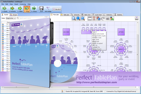
Perfect Table planI have recently revamped the PerfectTablePlan payment pages. I asked Andrew Gibson of 3d-box-shot.com to create an image of the PerfectTablePlan packaging, using the existing artwork. I was very impressed with the result. The image is much cleaner and more aesthetically pleasing than I could have achieved by photographing the physical packaging. But I am much less keen on the practice of using box shots of software where is no box (i.e. download only). It seems disingenuous, at best.  Andrew kindly agreed to write a guest article for this blog with an insider’s view on the art, science and ethics of software box shots.
Almost every time the subject of box shots is raised in any sort of software marketing forum, opinion seems to split diametrically in two opposing camps. The first group don’t see any ethical problem with displaying a box shot for a “download only” product. The typical argument used in favour of box shots is that it makes a product appear more tangible to consumers. They can see what you’re selling without having to read about it. It removes any doubt that the site they are looking at has software to sell and, when used effectively, can add an air of professionalism to a site. Finally, there’s a widely held belief that because of this, displaying a box shot can improve conversion rates.

In contrast, the opposing group believe that displaying a box shot for a “download only” product is ethically wrong and fundamentally dishonest. They maintain that customers would complain about not receiving a physical package in the post that’s identical in every respect to the “bogus” box shot displayed on the website. I run my own Micro ISV, selling amongst other applications, a product called 3D Box Shot. As a result, you might be inclined to think that I fall into the first camp. However, I’m actually quite ambivalent about the issue. I use box shots on some of my sites and have never received a single complaint from a customer about them not receiving a physical product in the mail. However, consumers in different markets don’t all behave the same way, which is why advice that works for some ISV’s can be commercial suicide for others. I’m entirely willing to accept that in some markets, some customers may indeed complain about not receiving a physical product. I just haven’t experienced this first-hand.

It’s worth noting that existing users of your product can often be persuaded to purchase additional copies to give as gifts. They may not even make this connection themselves, so why not put the thought in their heads? Send a festive email offering to ship additional physical copies of your products (gift wrapped) to friends and relatives. Add something like the following to your site to make the point visually:

selling-software-as-a-gift

click for a larger image

It’s often stated that adding a box shot to your site can dramatically improve conversion rates for your products. It may come as a surprise to learn that I’m not convinced that this is true in all cases. Generally speaking a box shot isn’t some sort of magic bullet that will transform your sales overnight. However, if it is an integrated part of your marketing strategy then it can make a real difference.

So how do you go about integrating a box shot into your marketing strategy? From a design perspective you can integrate a box design by keeping everything visually consistent. Use your company and product logo on the box and clearly display your website URL as well. This will help to increase the marketing potential of your box shot.

One less obvious method is to add you box shot to the image for your PAD Screenshot. Most download sites are worse than useless when it comes to driving traffic to your site. So instead of thinking of the screenshot referenced in your PAD file as just a screenshot, think of it as a blank advertising canvass that thousand of download sites are happy to display for you free of charge…

PAD-Screenshot-replacement

click for a larger image

Using this method, you can attract visitors to your site even from low quality download sites that don’t even supply a link back to your website.

So how do you get a box shot designed? As a designer I have a fairly unique approach to software box design. I treat a design as a conceptual puzzle than needs to be solved in order to create an effective cover. The criteria I use are simple. Someone needs to be able to look at the box shot and immediately understand what the product is and does. If a box doesn’t meet this challenge, then it isn’t doing it’s job. It’s normally possible to create an effective visual metaphor for a product that explains visually what it’s all about. Here are some examples of the sort of designs I’m talking about:

Example-Designs

click for a larger image

Trends in box design can change. Not so long ago lots of people were asking for Windows Vista Style boxes, but as it became more apparent that Windows Vista was destined to be seen in the same light as Windows ME, this requirement has tailed off. Nowadays the vast majority of design jobs that I do are for DVD cases, both virtual box shots and full print insert designs.

If you’re artistically talented and have access to a good quality image editing tool like Adobe Photoshop and have an easy means of transforming your 2D designs into a 3D Box, then you may well be able to create an effective looking box shot yourself.  However, once you consider the time this takes, hiring a designer seems a lot more reasonable. Since I design boxes commercially, I’ve acquired a lot of design resources including hundreds of royalty free vector images and a library of stock photography. I can draw on these resources when I’m creating a box design. This lets me develop designs quickly through the draft stage through towards the final design. However, as an experience box designer, I still find it challenging and rewarding work. But it is very time consuming.

If you’re determined to “do it yourself” then bear the following points in mind:

  1. The box shot needs to visually show what your product is and does. Show your design to someone that’s never seen your product and ask them to tell you what your product does. If they can’t do this, then your design isn’t up to the job.
  2. Make sure your website address is clearly visible on the box shot. If you ship a physical package you’ll have no way of controlling where it ends up. The box itself can drive traffic to your website. You don’t have to slap it on the front of the box, just make sure it’s there and can be seen.
  3. Try to design a cover that fits with the look and feel of your website. Use the same (or at least, non conflicting) colour scheme as your site and try to use the same fonts. This will prevent your box shot from standing out on your site like a sore thumb.
  4. Never use more than three different fonts in your design. Unless you are selling a font management application, this is sure way to spoil any design.
  5. Design so that text is still visible when the box is reduced to a 250 x 250 thumbnail. If the text is legible at this size on your design, then unless the design carries the message all by itself, the box won’t work very well as a marketing tool.
Perfect-Tableplan white background

click for a larger image

The image above was created in a rendering application at very high resolution. It took around 6 hours to complete on a dual core system. The resulting image is big enough to be used in print ads, or can easily be resized for use on the web.

Andrew Gibson is the head developer and lead designer for www.3d-box-shot.com, provider of box shots, packaging design, e-book covers and more. Box shot images from scratch start at $100. Box shots images from existing artwork can be created for as little as $25. All the images in this article were created by them. The original PerfectTablePlan packaging was designed by Nicola and Adrian Metcalfe.

1&1 and the disappearing IMAP ‘Sent’ emails

1and1I noticed yesterday that I didn’t have any emails older than 2 days in the IMAP ‘Sent’ folders on my various email accounts with ISP 1and1.co.uk. After a bit of investigation and some emails to 1&1 support it appears that 1&1 have quietly renamed my ‘Sent’ folders to ‘Sent Items’ as part of their upgrade to their webmail. All I needed to do to access them from my Mozilla Thunderbird client was:

  • right click on each account
  • select ‘Subscribe’
  • check ‘Sent Items’

It would have been nice if they had warned me. Given that 1&1 is one of the biggest ISPs in the world I thought somebody else might find this information useful.

Qt visual artefacts on Mac OS X 10.6

deploy_nearly_everywhereThe release of Mac OS X 10.6 (Snow Leopard) snuck up on me while I have been working hard on a major new release of PerfectTablePlan plan. I didn’t really want to risk messing up my stable Mac development machine by installing it, so I asked testlab2.com (who have been doing some third party testing for me) to test my latest beta on it.

Bad news. All the combo boxes in my application (which work fine in Mac OS X 10.3, 10.4 and 10.5) have visual artefacts on Mac OS X 10.6. They work fine, but they don’t look right. I wondered if the artefact could be unique to some weird configuration on testlab2’s test machine, so I asked the fine folk on macsb mailing list to see if they could replicate it. 4 of them tried (thanks Cesar, Jon, Aaron and Pierre) and they all saw the visual artefacts. Damn.

I posted a question on the qt-interest forum. The single response (thanks Francesco) mentioned that this issue had been reported in the Qt development blog. I managed to find the blog post, applied the recommended single line code patch to Qt 4.4.2 and rebuilt everything. Cesar from macsb kindly re-tried the new binaries and reports that this improved things, but some artefacts are still visible the first time a combo box is shown. Perhaps the patch works better for Qt 4.5.

Note the artefacts at the top and bottom of the combo box drop-down list

Note the artefacts at the top and bottom of the combo box drop-down list

It looks like I am going to have to release it like this, unless someone knows of a better patch. This is very annoying after the months of hard work I have put into the new release. Aesthetics are important for commercial software, especially on the Mac. This could cost me quite a few sales.

I am not on the very latest release of Qt, but apparently this issue would still occur even if I was. Qt/Nokia have announced that they don’t expect to  support Mac OS X 10.6 until they release Qt 4.6, whenever that might be. What use is a cross-platform toolkit that doesn’t support the latest major OSs?

Developer releases of 10.6 have been available for a while – I believe the Qt team should have burnt the midnight oil to make sure they had a release that properly supported 10.6 as soon as it became generally available.  I know that isn’t easy given the size of the Qt framework and Apple’s penchant for secretiveness. But that is the game they are in and that is what I expect. I think they have seriously dropped the ball here, and this is coming from a longtime Qt fan-boy. Perhaps they have spread themselves a bit too thin by moving to LGPL licensing.

I have written this post as a quick heads up to other Qt developers. Thanks to everyone that helped me get this far.

Zed builds and bugs

zedI did some consulting for Zed builds and bugs a few months back and made some suggestions on how they could improve their marketing and product. In particular I focussed on their marketing message/positioning, website, Adwords campaign and set-up usability issues. They have now been kind enough to write-up their experiences working with me on their blog. Best of all, they have included some hard data on improvements since they implemented the recommendations:

Metric Change
Website Visitors 10% Increase
Trial Downloads 200% Increase
Google Organic Search Hits 320% Increase
Visitor Time Spent on Website 250% Increase

Obviously I can’t claim too much credit, as they did all the hard work. But it certainly looks like things are heading in the right direction and I think the changes to their website are a huge improvement.

Zed is an interesting product, integrating a continuous integration server with a bug tracker, wiki and forums, all behind a slick web interface. Obviously there are plenty of products that do these things individually, but Zed’s power comes from the integration of them all. For example, a build failure can automatically generate a bug report and bug fix can trigger an automatic build.

If you are interested in continuous integration and/or a more integrated approach to developer collaboration I recommend you try Zed. If you have less than 5 users you can take advantage of their free community edition.

The Web Startup Success Guide

startup_success_guideBob Walsh has followed up his excellent MicroISV: From Vision to Reality book with The Web Startup Success Guide. While the first book is aimed squarely at at developers of desktop software, the second is aimed more at web-based start-ups. I have to confess, I haven’t had time to read my review copy of the accompanying e-book yet (I’m moving house, moving office and putting out a major new software release). But I see from the contents it includes chapters on:

  • the idea
  • choosing a platforms
  • tools
  • fund raising
  • social media
  • getting the message across

And interviews with

  • Dharmesh Shah
  • Eric Sink
  • Joel Spolsky
  • Pamela Slim
  • Guy Kawasaki
  • …and others

If it is anything like as good as Bob’s MicroISV book, it will be worth a read by anyone doing (or thinking of doing) a web-based start-up. It is currently $19.79 on Amazon.com. You can also buy the e-book from Apress. Here are some reviews from people that have actually read it:

Neil Davidson

Willie Faler

Where I program

whereiwrite.org is a photographic project showing science fiction writers and their offices. I started wondering what the offices of other microISVs and small software companies look like. Were they Zen temples of minimalism, with just a desk, a chair and a laptop? Or were they mad scientist labs, piled to the ceiling with obsolete equipment and empty pizza boxes? I rather hoped it was the latter, so I wouldn’t feel so bad about my own cluttered little office. I asked for photos of offices on some forums frequented by independent developers. I got a great response. Click the images to see larger versions.

oryxThis is my own cluttered office. The image comprises 6 photos stitched together using Autostitch to simulate an ultra wide angle lens. This makes it look bigger than it is. My unexciting view of suburban Britain is enlivened by regular sightings of Red Kites. I resisted the temptation to tidy up, beyond emptying the overflowing wastepaper bin. The garage is full of envelopes and CDs and there are lots of programming book’s in my son’s room. We are in the process of selling the house, partly so we can buy a house with a bigger office. I like the idea of a treehouse office – one where I pull up the ladder when I need some peace and quiet.

divider

whereiprogram-steve

“In my office, I kind of try to separate the digital and analog worlds.  Some days I’ll be coloring with my kids at the oval, English partners-desk in the center and helping with homework, but most days I’m doing software development to the right.  I love it here in the Pacific Northwest; if I’m awake early enough I can catch a beautiful sunrise over the lake right outside my office, and even go for a swim by afternoon in the summertime if it gets too hot.”

Steve Murch, www.bigoven.com

divider

rv-office“This is my temporary office while on the road. I use the TV as a monitor for the second computer (Windows 7). The normal monitor can be switched between either computer. I sometimes miss the third monitor, lazerjet printer and other stuff but not often.”

A roving microISV, who doesn’t want his customer to know he (temporarily) has no fixed abode

divider

DSC_6544“Living in Hong Kong, where residential and office space is so scarce and expensive, I work in a small corner of my small apartment. However, I have everything I need: my trusty two years old MacBook Pro, a not too comfortable chair, and a couch where I can take as many naps as I want. Oh, and a nice view of the mountains outside!”

Cesar Tardaguila, www.bambooapps.com

divider

alwin-at-work

collectorz-programmers-at-work“This is me at my desk at the Collectorz.com HQ. As you can see, I am a Nintendo gamer, vodka drinker and Porsche fan. Now I must say that this not a real ‘where I program’ pic, because I don’t do a lot of programming any more. Check the 2nd pic for my developer team.”

Alwin Hoogerdijk, www.collectorz.com

divider

iPhone June 23 2009 132“I *hate* having clutter on my desk. You’ll notice that I didn’t show the rest of the office. It’s pretty messy! I started with two monitors several years ago and then moved straight to 4. I can’t live without at least 3 and the 4th makes a nice place to stash IM windows while I’m working. My music computer is on the left side (yes, it’s a Mac!), and I’m not sure that it isn’t the most important computer I own since I could never work without music playing.”

Mitchell Vincent, www.ksoftware.net

divider

myroom“As you can see the office is as crammed as possible, and the distractions are pretty obvious — the wine is waiting for its place in the cellar, and there is a bottle of whiskey on the shelf.  Oh, and there are two Commodores C-128 behind the desk (invisible on the photo, they worked the last time I checked) along with 1081 monitor and a Playstation or two. And yes, there is a guitar behind the chair. The bad news is that the plans for the new house are ready and the next office will be four times as big! Regarding the workplace as such — I have two 19′ monitors and a computer box under the desk. I spent a lot of time making it silent, which really improves work comfort, especially during quiet night shifts.”

Piotr Kuzora, www.powerkaraoke.com

divider

ofi-shots-117

ofi-shots-150“This is my home office, in the city center of Vitoria-Gasteiz. Nowadays I spend as much time, if not more, at the J1CK office, my other entrepreneurial project, but this office is great for ViEmu and Codekana work: a lot of light, and the irreplaceable Dell 2408WFP in vertical position. The chair and the table are from Ikea, nothing fancy there.”

Jon Beltran de Heredia, www.viemu.com and www.codekana.com

(who can apparently control his own opacity)

divider

MJT_Marcus_Office_small“This is in my office looking out on the larger office area.  Our office is in a modern, purpose built office complex just outside the beautiful historic Saxon hilltop town of Shaftesbury in rural Dorset.”

Marcus Tettmar, www.mjtnet.com

(under monitors – where obsolete technical references go to die)

divider

home_office_tekblues_small“My home office is a large basement, it has windows and good light, but it’s very cold. I am a very messy person, it’s full of books, boxes, old computers and even toys my kids left there. Luckily, it doesn’t show in the photo but my dog left some bones under my desk in the morning!!”

Javier Rojas Goñi, www.tekblues.com

divider

GreentramDesk“Melbourne city skyscrapers in the background – I’m 26 floors up. I should have done this yesterday when the sun was shining.”

Tony Bryer, www.greentram.com

divider

IMG_6740_small“There is one thing that is missing in the photo. That is my two year old daughter. She likes to sit on the table and pull out the books from the rack. Unsurprisingly, her favorite is ‘MicroISV From Vision to Reality’ by Bob Walsh. Somehow she enjoys tearing papers off from the book while her father is busy coding.”

Prasanth, www.simfatic.com

divider

20090624dayoffice

20090625nightoffice“I recently cleaned up my office so I took these photos… but my office is slowly returning to the big mess that it usually is. I need to do a tidy-up before things get out of hand again. I really like my Vornado 542B that’s clipped to a bookcase and set to blow air on me! Really cools me off. I have it on a remote control so I can easily turn it on and off from my desk. I am near Dallas, Texas.

Albert Wiersch, www.htmlvalidator.com

divider

gurock_office“This is one of the offices at Gurock Software here at the Technology Park in Paderborn, Germany (that’s Tobias in the picture). When we originally looked for office space, we wanted bright rooms with enough space to accommodate large desks and small reading corners. Getting our new office space (and 3×24″ monitors ) was easily the best investment we’ve made productivity-wise.”

Dennis & Tobias Gurock, www.gurock.com

divider

Dokix2_smallTim Haughton, www.homedocumentmanager.com

divider

antair_office_1

antair_office_2“This space suits us perfectly. It fits everyone very comfortably. It’s very, very bright, with lots of natural sunlight. The outdoor patio is perfect for morning group breakfasts and afternoon lunches when it’s warm. And … there’s a great pub downstairs to celebrate the days when we ship a new software product or a major update release.”

Andrey Butov, www.antair.com

divider

office“My office is a mess because I’m a very passionate person.  I love my work and when I’m not doing that, I’m out doing something else I really love.  I have no love of cleaning and organizing though.  In fact, 99.9% of the time I prefer chaos.  The other .1%, I purge my mess and the cycle starts again.  I know this isn’t a good system, but for now it works.”

Ian Drake, www.notifywire.com

divider

ian_1 “My office is never really very messy… sorry.”

Ian Landsman, www.helpspot.com

divider

officedog2“Here’s where a real code monkey works.”

Dan Hite, www.spellquizzer.com

divider

office2

view“I work with specialized hardware for my software and there’s a school bell and a siren/strobe light flashing on the desk.  On the far right side of the desk, I have a couple of IP phones and an IP speaker. I want some additional monitors.  The two I have are a 23″ and a 24″, both at 1920×1200.  I also use a second room as an office in my house and have another PC and a Mac. Below is the view from the window. The trail behind the house connects into a 300 acre park and there are usually mountain bikers and hikers on the trail on the weekends.”

Danny Weidig, www.acrovista.com

divider

DN_office1_small“Mine’s a bit messy. I stare out the window to distract me from it.”

Doug, who doesn’t want his blue chip clients to know he works from a messy home office

divider

SAIG+Office3_small

SAIG+Echidna+outside+Office_small“The 16th fairway of the golf course is just through the trees. The group of 3 trees on the left is actually one tree and it is a magnificently old (opinions vary from 100 to 600 years) Moonah Tree. Below is an Echnida which waddled past on Monday.

Neville Franks, www.surfulater.com

divider

Not had enough yet?:

Mitch Haile’s home office

Scott Hanselmann’s home office

Home office snapshots

divider

I am not sure which is more diverse, the offices or the software that gets written in them. Thank you to everyone that contributed.

Have you got a bigger, smaller, untidier or more stylish office than any of the above? Do you have a better view out of the window? Add a link to your photo in the comments.