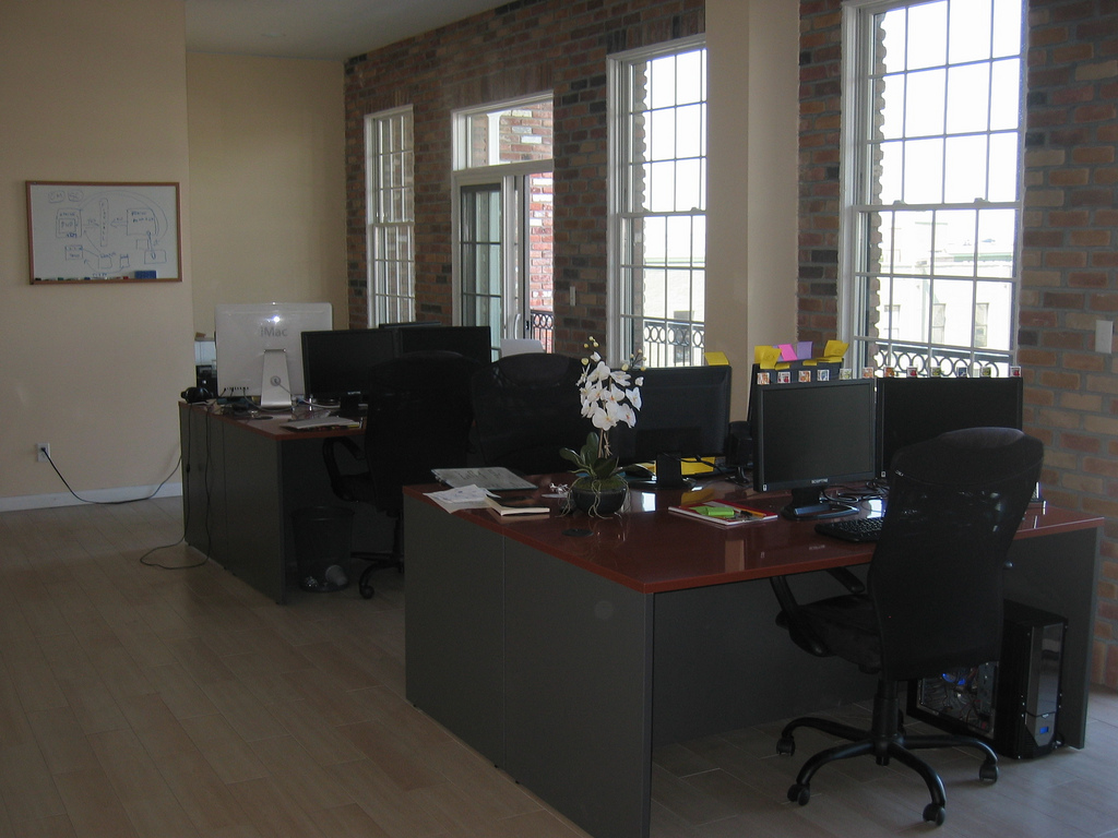
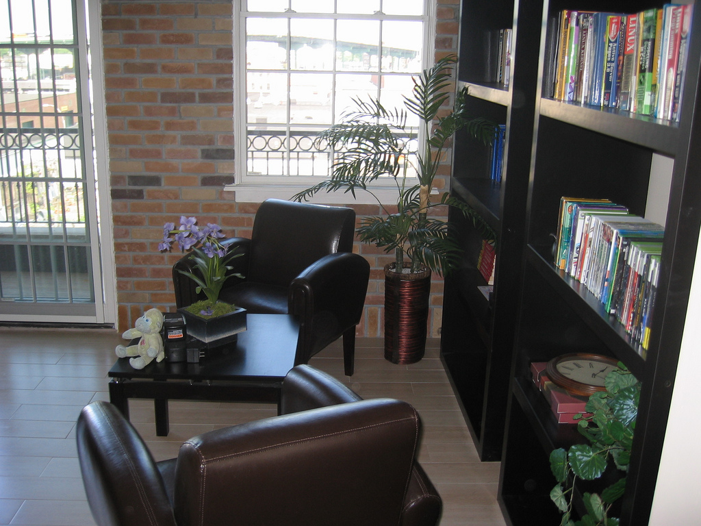
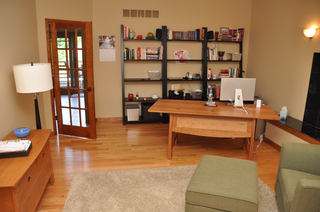
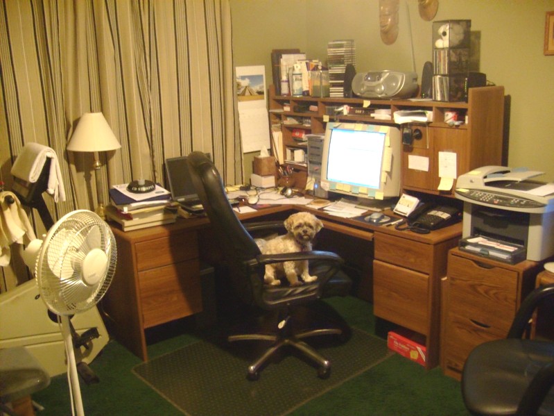
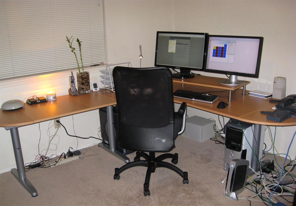
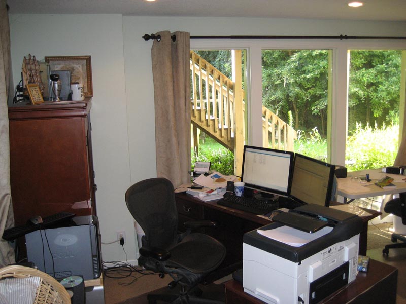
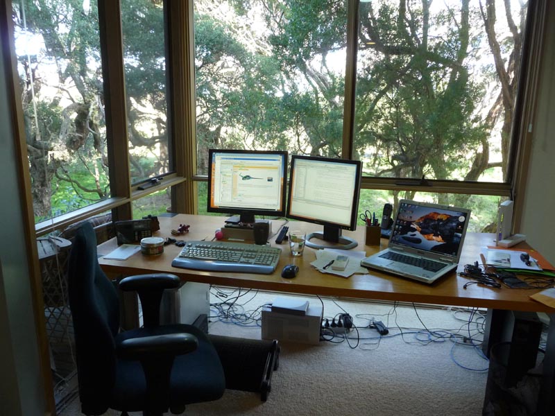
whereiwrite.org is a photographic project showing science fiction writers and their offices. I started wondering what the offices of other microISVs and small software companies look like. Were they Zen temples of minimalism, with just a desk, a chair and a laptop? Or were they mad scientist labs, piled to the ceiling with obsolete equipment and empty pizza boxes? I rather hoped it was the latter, so I wouldn’t feel so bad about my own cluttered little office. I asked for photos of offices on some forums frequented by independent developers. I got a great response. Click the images to see larger versions.
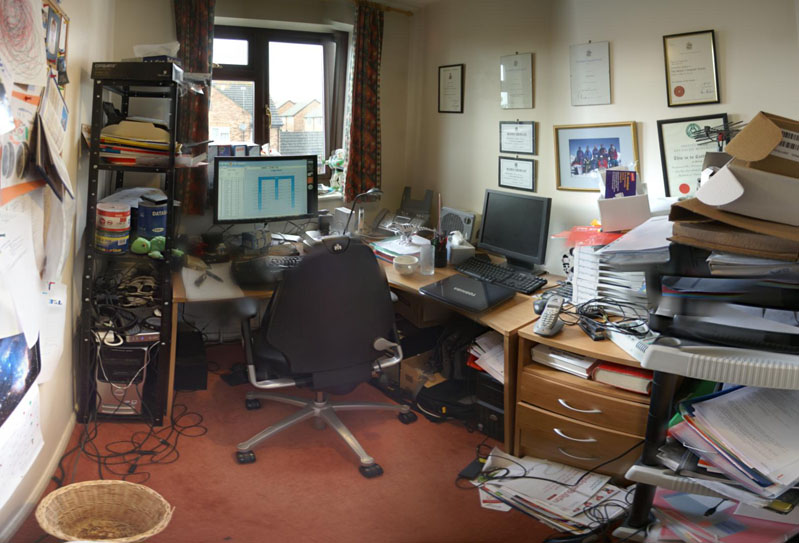
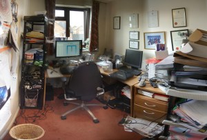 This is my own cluttered office. The image comprises 6 photos stitched together using Autostitch to simulate an ultra wide angle lens. This makes it look bigger than it is. My unexciting view of suburban Britain is enlivened by regular sightings of Red Kites. I resisted the temptation to tidy up, beyond emptying the overflowing wastepaper bin. The garage is full of envelopes and CDs and there are lots of programming book’s in my son’s room. We are in the process of selling the house, partly so we can buy a house with a bigger office. I like the idea of a treehouse office – one where I pull up the ladder when I need some peace and quiet.

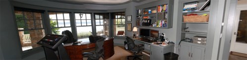
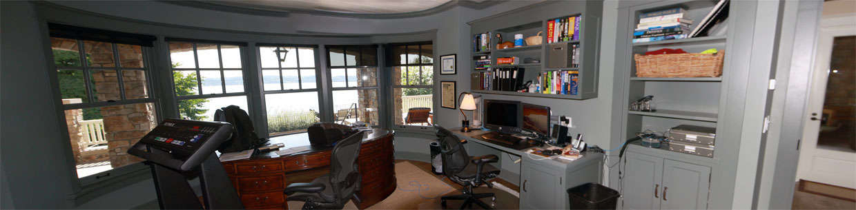
“In my office, I kind of try to separate the digital and analog worlds. Some days I’ll be coloring with my kids at the oval, English partners-desk in the center and helping with homework, but most days I’m doing software development to the right. I love it here in the Pacific Northwest; if I’m awake early enough I can catch a beautiful sunrise over the lake right outside my office, and even go for a swim by afternoon in the summertime if it gets too hot.”
Steve Murch, www.bigoven.com
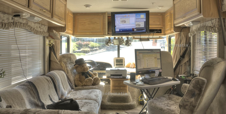
 “This is my temporary office while on the road. I use the TV as a monitor for the second computer (Windows 7). The normal monitor can be switched between either computer. I sometimes miss the third monitor, lazerjet printer and other stuff but not often.”
A roving microISV, who doesn’t want his customer to know he (temporarily) has no fixed abode
 “Living in Hong Kong, where residential and office space is so scarce and expensive, I work in a small corner of my small apartment. However, I have everything I need: my trusty two years old MacBook Pro, a not too comfortable chair, and a couch where I can take as many naps as I want. Oh, and a nice view of the mountains outside!”
Cesar Tardaguila, www.bambooapps.com
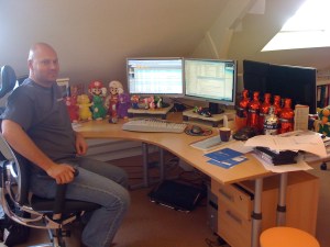
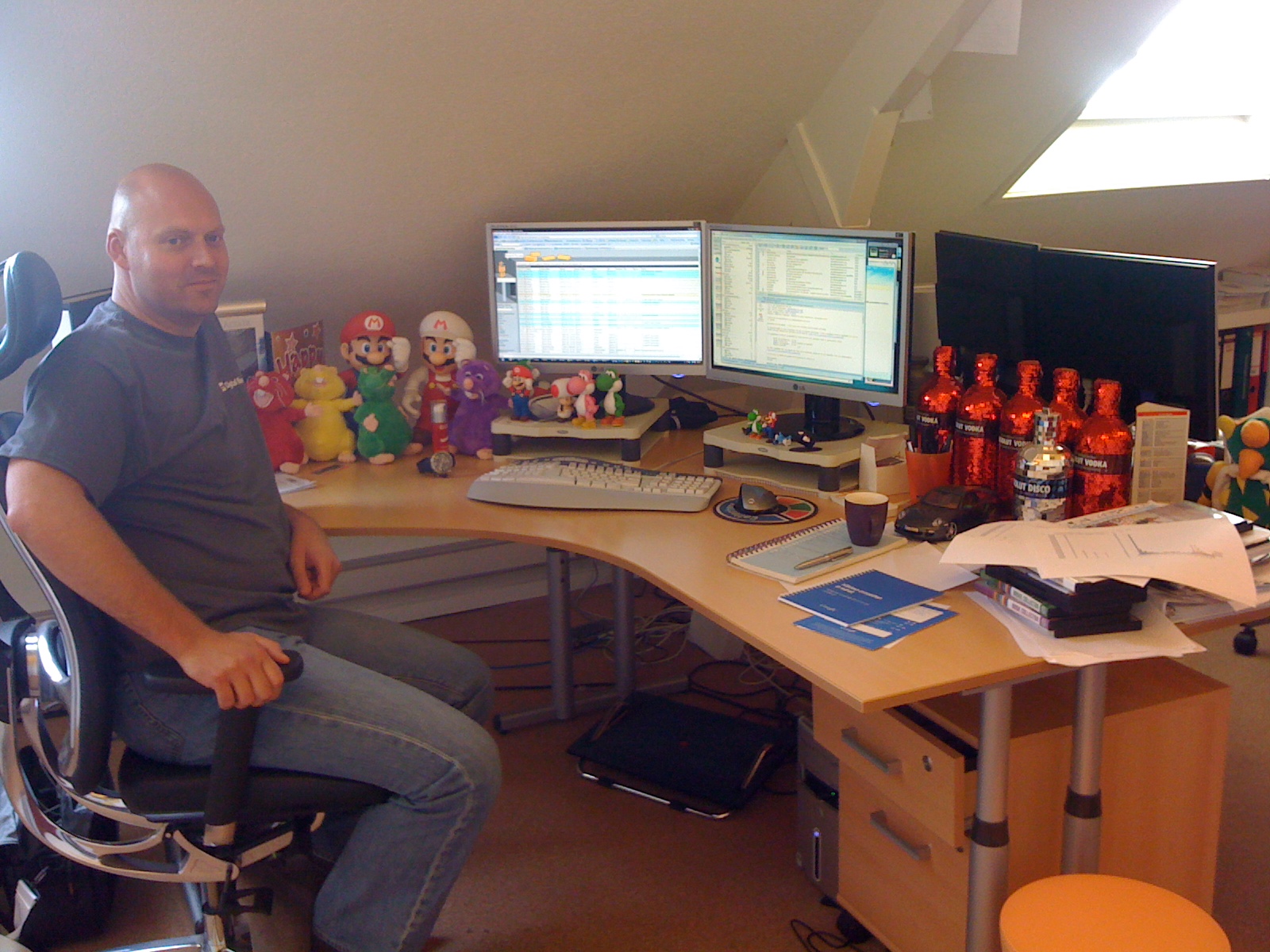
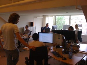 “This is me at my desk at the Collectorz.com HQ. As you can see, I am a Nintendo gamer, vodka drinker and Porsche fan. Now I must say that this not a real ‘where I program’ pic, because I don’t do a lot of programming any more. Check the 2nd pic for my developer team.”
Alwin Hoogerdijk, www.collectorz.com
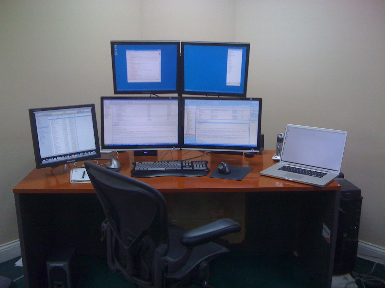
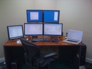 “I *hate* having clutter on my desk. You’ll notice that I didn’t show the rest of the office. It’s pretty messy! I started with two monitors several years ago and then moved straight to 4. I can’t live without at least 3 and the 4th makes a nice place to stash IM windows while I’m working. My music computer is on the left side (yes, it’s a Mac!), and I’m not sure that it isn’t the most important computer I own since I could never work without music playing.”
Mitchell Vincent, www.ksoftware.net
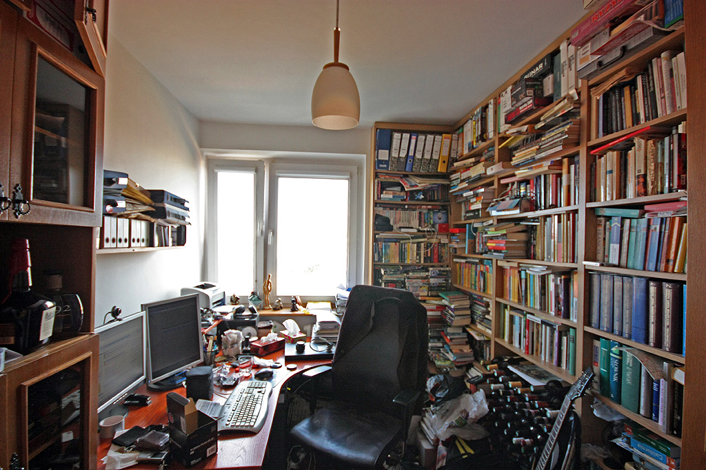
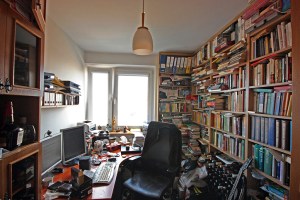 “As you can see the office is as crammed as possible, and the distractions are pretty obvious — the wine is waiting for its place in the cellar, and there is a bottle of whiskey on the shelf. Oh, and there are two Commodores C-128 behind the desk (invisible on the photo, they worked the last time I checked) along with 1081 monitor and a Playstation or two. And yes, there is a guitar behind the chair. The bad news is that the plans for the new house are ready and the next office will be four times as big! Regarding the workplace as such — I have two 19′ monitors and a computer box under the desk. I spent a lot of time making it silent, which really improves work comfort, especially during quiet night shifts.”
Piotr Kuzora, www.powerkaraoke.com
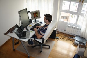
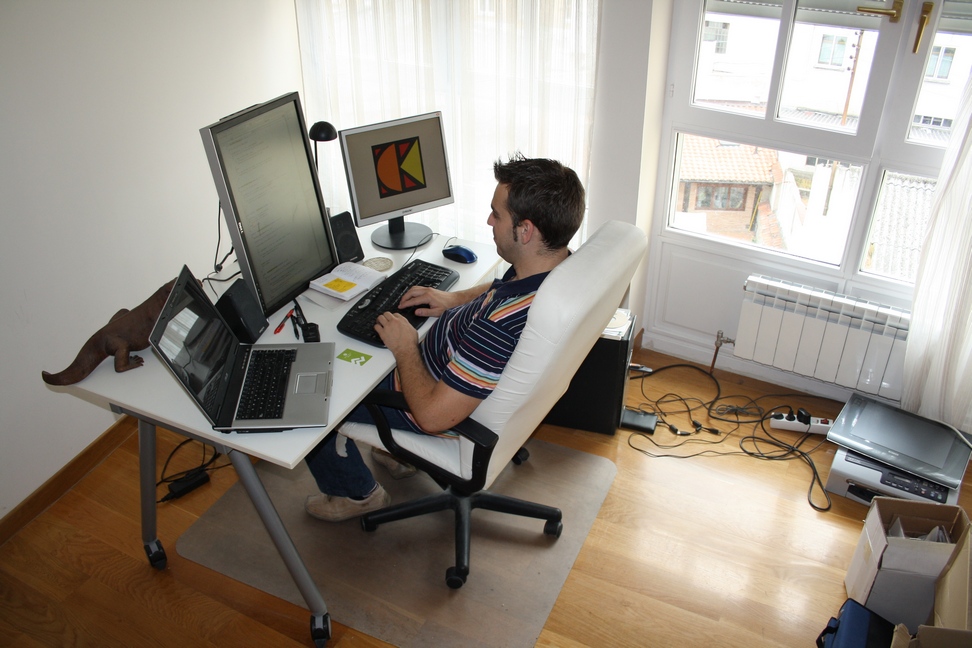
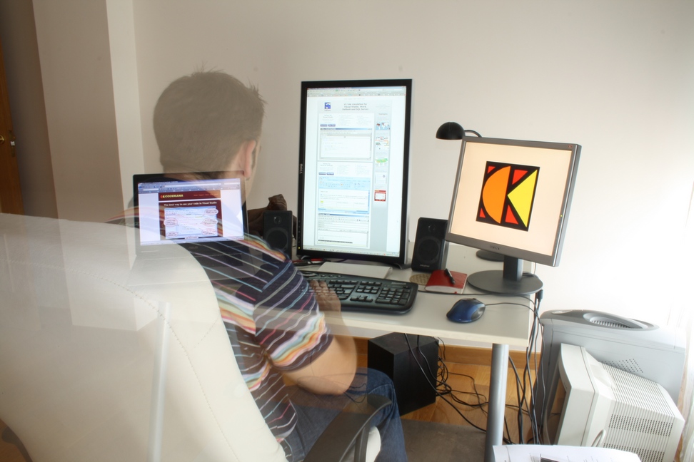
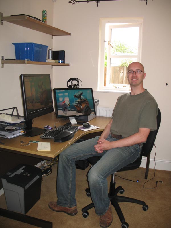
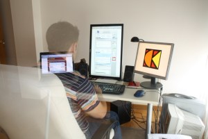 “This is my home office, in the city center of Vitoria-Gasteiz. Nowadays I spend as much time, if not more, at the J1CK office, my other entrepreneurial project, but this office is great for ViEmu and Codekana work: a lot of light, and the irreplaceable Dell 2408WFP in vertical position. The chair and the table are from Ikea, nothing fancy there.”
Jon Beltran de Heredia, www.viemu.com and www.codekana.com
(who can apparently control his own opacity)
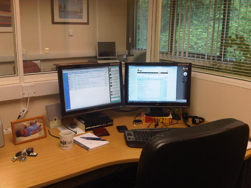
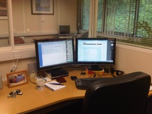 “This is in my office looking out on the larger office area. Our office is in a modern, purpose built office complex just outside the beautiful historic Saxon hilltop town of Shaftesbury in rural Dorset.”
Marcus Tettmar, www.mjtnet.com
(under monitors – where obsolete technical references go to die)
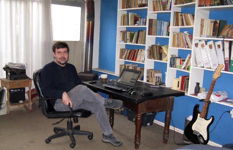
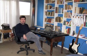 “My home office is a large basement, it has windows and good light, but it’s very cold. I am a very messy person, it’s full of books, boxes, old computers and even toys my kids left there. Luckily, it doesn’t show in the photo but my dog left some bones under my desk in the morning!!”
Javier Rojas Goñi, www.tekblues.com
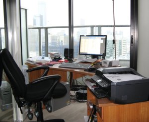 “Melbourne city skyscrapers in the background – I’m 26 floors up. I should have done this yesterday when the sun was shining.”
Tony Bryer, www.greentram.com
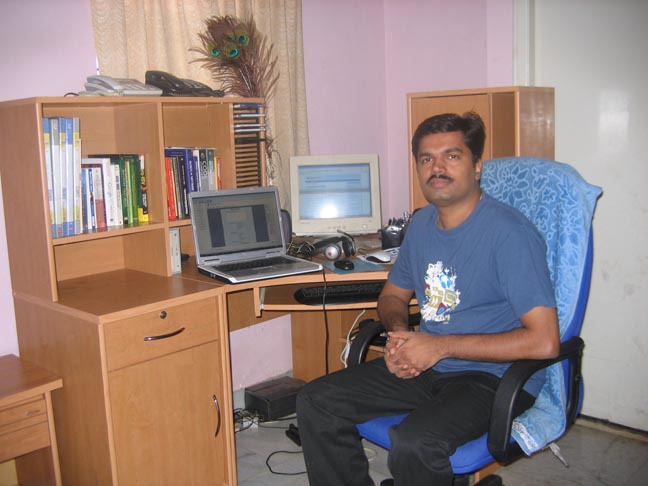
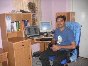 “There is one thing that is missing in the photo. That is my two year old daughter. She likes to sit on the table and pull out the books from the rack. Unsurprisingly, her favorite is ‘MicroISV From Vision to Reality’ by Bob Walsh. Somehow she enjoys tearing papers off from the book while her father is busy coding.”
Prasanth, www.simfatic.com
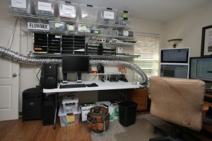
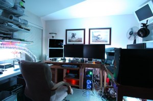 “I recently cleaned up my office so I took these photos… but my office is slowly returning to the big mess that it usually is. I need to do a tidy-up before things get out of hand again. I really like my Vornado 542B that’s clipped to a bookcase and set to blow air on me! Really cools me off. I have it on a remote control so I can easily turn it on and off from my desk. I am near Dallas, Texas.“
Albert Wiersch, www.htmlvalidator.com
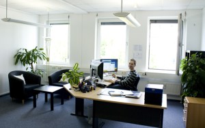 “This is one of the offices at Gurock Software here at the Technology Park in Paderborn, Germany (that’s Tobias in the picture). When we originally looked for office space, we wanted bright rooms with enough space to accommodate large desks and small reading corners. Getting our new office space (and 3×24″ monitors ) was easily the best investment we’ve made productivity-wise.”
Dennis & Tobias Gurock, www.gurock.com
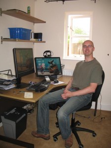 Tim Haughton, www.homedocumentmanager.com
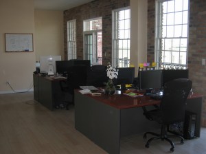
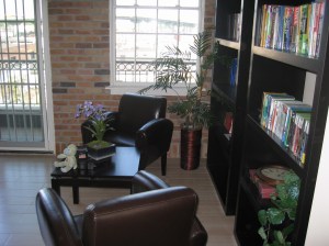 “This space suits us perfectly. It fits everyone very comfortably. It’s very, very bright, with lots of natural sunlight. The outdoor patio is perfect for morning group breakfasts and afternoon lunches when it’s warm. And … there’s a great pub downstairs to celebrate the days when we ship a new software product or a major update release.”
Andrey Butov, www.antair.com
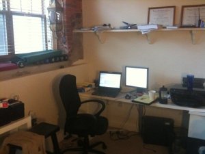 “My office is a mess because I’m a very passionate person. I love my work and when I’m not doing that, I’m out doing something else I really love. I have no love of cleaning and organizing though. In fact, 99.9% of the time I prefer chaos. The other .1%, I purge my mess and the cycle starts again. I know this isn’t a good system, but for now it works.”
Ian Drake, www.notifywire.com
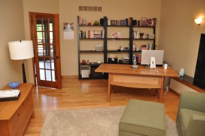 “My office is never really very messy… sorry.”
Ian Landsman, www.helpspot.com
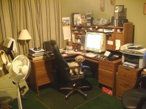 “Here’s where a real code monkey works.”
Dan Hite, www.spellquizzer.com
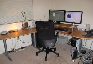
 “I work with specialized hardware for my software and there’s a school bell and a siren/strobe light flashing on the desk. On the far right side of the desk, I have a couple of IP phones and an IP speaker. I want some additional monitors. The two I have are a 23″ and a 24″, both at 1920×1200. I also use a second room as an office in my house and have another PC and a Mac. Below is the view from the window. The trail behind the house connects into a 300 acre park and there are usually mountain bikers and hikers on the trail on the weekends.”
Danny Weidig, www.acrovista.com
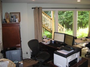 “Mine’s a bit messy. I stare out the window to distract me from it.”
Doug, who doesn’t want his blue chip clients to know he works from a messy home office
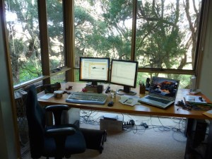
 “The 16th fairway of the golf course is just through the trees. The group of 3 trees on the left is actually one tree and it is a magnificently old (opinions vary from 100 to 600 years) Moonah Tree. Below is an Echnida which waddled past on Monday.“
Neville Franks, www.surfulater.com
Not had enough yet?:
Mitch Haile’s home office
Scott Hanselmann’s home office
Home office snapshots
I am not sure which is more diverse, the offices or the software that gets written in them. Thank you to everyone that contributed.
Have you got a bigger, smaller, untidier or more stylish office than any of the above? Do you have a better view out of the window? Add a link to your photo in the comments.

 It is important to choose the right Ecommerce provider for your business. A bad choice can have a significant impact on your sales and switching provider can be a major headache. But which one is the right one? It is easy enough to find out about prices and features, but what about the all-important intangibles such as support, ease of set-up and reliability? I hear a lot of good and bad reports about various vendors. I thought it was time for something a bit more comprehensive and systematic – a survey. That’s where you come in.
 Bob Walsh has finally broken cover on his latest project and
  I am been very happy using

 I have recently revamped the PerfectTablePlan payment pages. I asked Andrew Gibson of 3d-box-shot.com to create an image of the PerfectTablePlan packaging, using the existing artwork. I was very impressed with the result. The image is much cleaner and more aesthetically pleasing than I could have achieved by photographing the physical packaging. But I am much less keen on the practice of using box shots of software where is no box (i.e. download only). It seems disingenuous, at best. Andrew kindly agreed to write a guest article for this blog with an insider’s view on the art, science and ethics of software box shots.


 I noticed yesterday that I didn’t have any emails older than 2 days in the IMAP ‘Sent’ folders on my various email accounts with ISP 1and1.co.uk. After a bit of investigation and some emails to 1&1 support it appears that 1&1 have quietly renamed my ‘Sent’ folders to ‘Sent Items’ as part of their upgrade to their webmail. All I needed to do to access them from my Mozilla Thunderbird client was:

 I did some