Twice this week, I have come across embarrassingly bad data.
The first instance is the UK government’s fuel finder data. This is a downloadable CSV file of fuel station locations and prices from around the UK. A potentially very useful database, especially during the current conflict in the Middle East. A customer suggested it as a possible practice dataset for my data wrangling and visualization software, Easy Data Transform . So I had a quick look and spotted some glaring errors within a few minutes.
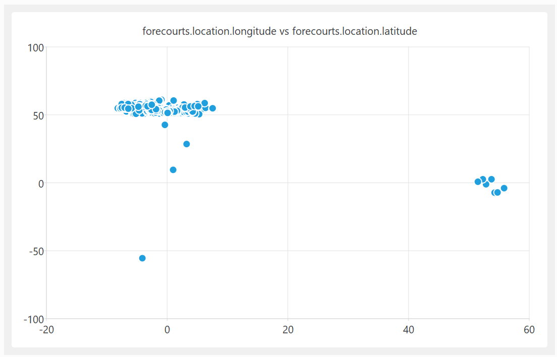
A quick plot of the latitude and longitude shows some clear outliers:
On further investigation, some of these UK fuel stations are apparently located in the Indian and South Atlantic oceans. In at least one case, it looks like they got the latitude and longitude the wrong way around.
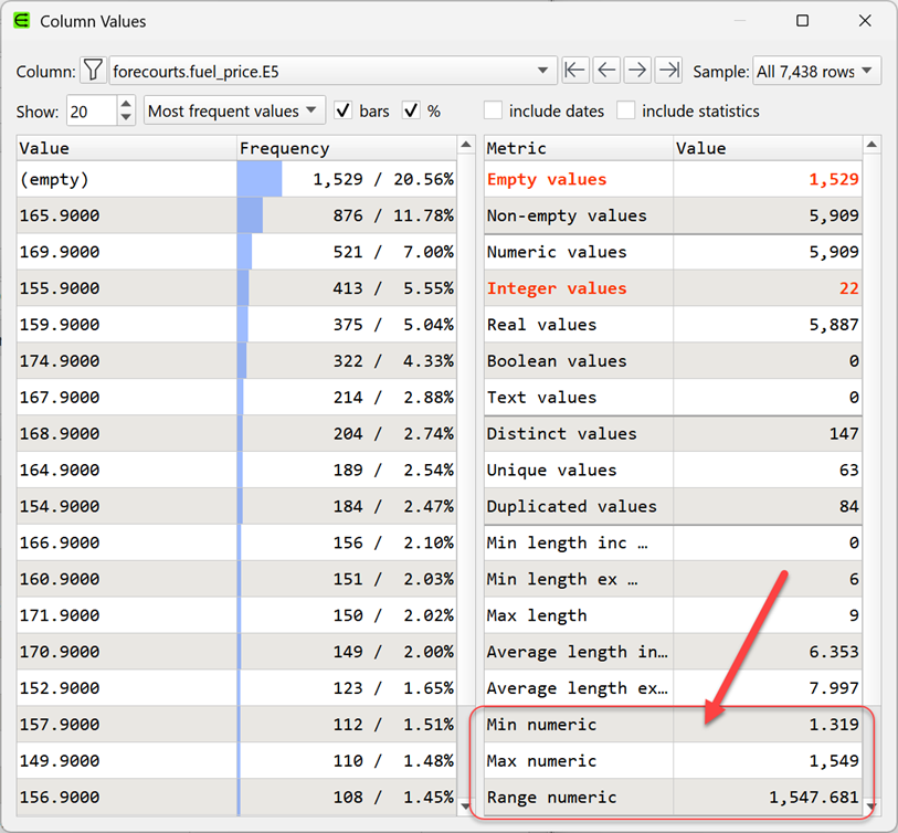
A quick look at the fuel price columns also shows some major issues:
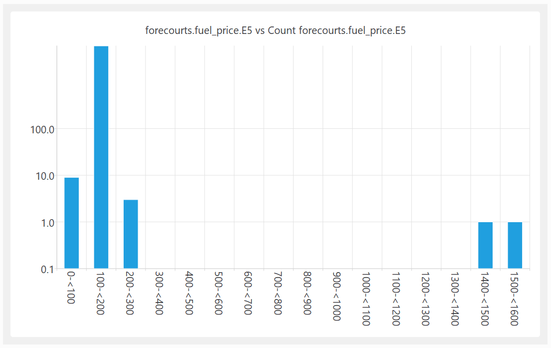
The ratio between the most expensive and cheapest fuel (per litre) is 1538:1. Clearly wrong.
Shown as a histogram with a logarithmic Y axis:
I am guessing that the reason for this bad data is that the fuel stations are submitting their own data and, humans being humans, they make mistakes. But then the government is publishing the data without even the most basic checks. That just isn’t good enough.
I reported the problem on 22-Mar-2026. They acknowledge my email on 24-Mar-2026 (“Thank you for sharing this, we have passed this on to the technical team to have a look at.”). The CSV file published on 29-Mar-2026 still has the garbage data.
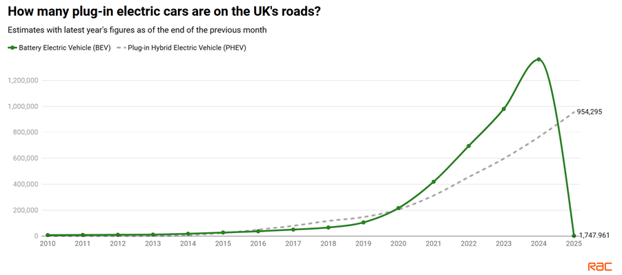
The second instance is a report on electric cars from UK motoring organization, the RAC. The first graph in the article is this:
Did the number of Battery Electric Vehicles on the UK’s roads suddeny drop from ~1.4 million in 2024 to ~0.0017 million in 2025? What happened to those ~1.4 million vehicles? I’m guessing that someone got their thousands and millions mixed up. But then they published the report with this glaring error. Did anyone mathematically literate even check this graph?
Lousy data undermines trust in institutions and can lead to bad decisions. I fear we are heading for a future where LLMs generate data, which people don’t bother to properly check. This data is then used train LLMs. The error is then much harder to spot once it is served back without the original source by LLMs. A slop-apocalypse.
Authors should have their work proof read, programmers should test their code and data people should do basic data validation. Let’s take some pride in our work.
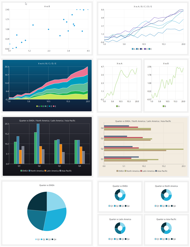
My data wrangling product, Easy Data Transform, got a major upgrade yesterday, with the addition of data visualization capabilities. Here are some examples of what it can produce in a few clicks:
You can see this new visualization feature in action in the video below:
(Likes and subscribes help me with the YouTube algorithm and are much appreciated)
Human brains are highly developed for visual processing. But data is often messy and in the wrong form for visualization. So data wrangling and visualization, tightly integrated together, is a powerful combination. It was a lot of work, but it makes Easy Data Transform a much more complete, end-to-end, solution. No more pasting data into Excel to get a chart!
At the same time, I have segmented Easy Data Transform into 2 products: Easy Data Transform Core Edition (data wrangling, one-time fee $99) and Easy Data Transform Advanced Edition (data wrangling+visualization, one-time fee $198). The Advanced Edition is a paid upgrade from the original product. Optional, of course. I sweetened the deal with a time-limited discount for existing customers who want to upgrade to Advanced Edition. The response from Easy Data Transform customers has been very positive.
Have you got some messy data, you want to turn into insights? Why not give Easy Data Transform Advanced Edition a try? It:
Runs natively on Windows and Mac.
Is drag and drop (no syntax to remember).
Does not store your precious data on someone else’s server.
Is deterministic and will not hallucinate!
Can process millions of rows in seconds.
Can create re-usable templates for repeatable processes.
You can download a free trial here. And you can get 15% off Easy Data Transform Advanced Edition until 17-Jul-2026 using this discount link.
Visual programming tools (also called ‘no-code’ or ‘low-code’) have been getting a lot of press recently. This, in turn, has generated a lot of discussion about whether visual or text based programming (coding) is ‘best’. As someone who uses text programming (C++) to create a visual programming data wrangling tool (Easy Data Transform) I have some skin in this game and have thought about it quite a bit.
At some level, everything is visual. Text is still visual (glyphs). By visual programming here I specifically mean software that allows you to program using nodes (boxes) and vertexes (arrows), laid out on a virtual canvas using drag and drop.
A famous example of this sort of drag and drop visual programming is Yahoo Pipes:
But there are many others, including my own Easy Data Transform:
Note that I’m not talking about Excel, Scratch or drag and drop GUI designers. Although some of the discussion might apply to them.
By text programming, I mean mainstream programming languages such as Python, Javascript or C++, and associated tools. Here is the QtCreator Interactive Development Environment (IDE) that I use to write C++ in, to create Easy Data Transform:
The advantages of visual programming are:
Intuitive. Humans are very visual creatures. A lot of our brain is given over to visual processing and our visual processing bandwidth is high. Look at pretty much any whiteboard, at any company, and there is a good chance you will see boxes and arrows. Even in non-techie companies.
Quicker to get started. Drag and drop tools can allow you to start solving problems in minutes.
Higher level abstractions. Which means you can work faster (assuming they are the right abstractions).
Less hidden state. The connections between nodes are shown on screen, rather than you having to build an internal model in your own memory.
Less configuration. The system components work together without modification.
No syntax to remember. Which means it is less arcane for people who aren’t experienced programmers.
Less run-time errors, because the system generally won’t let you do anything invalid. You don’t have to worry about getting function names or parameter ordering and types right.
Immediate feedback on every action. No need to compile and run.
The advantages of text programming are:
Denser representation of information.
Greater flexibility. Easier to do things like looping and recursion.
Better tooling. There is a vast ecosystem of tools for manipulating text, such as editors and version control systems.
Less lock-in. You can generally move your C++ or Python code from one IDE to another without much problem.
More opportunities for optimization. Because you have lower-level access there is more scope to optimize speed and/or memory as required.
The advantages and disadvantages of each are two sides of the same coin. A higher level of abstraction makes things simpler, but also reduces the expressiveness and flexibility. The explicit showing of connections can make things clearer, but can also increase on-screen clutter.
The typical complaints you hear online about visual programming systems are:
It makes 95% of things easy and 5% of things impossible
Visual programming systems are not as flexible. However many visual programming systems will let you drop down into text programming, when required, to implement that additional 5%.
Jokes aside, I think this hybrid approach does a lot to combine the strengths of both approaches.
It doesn’t scale to complex systems
Managing complex systems has been much improved over the years in text programming, using techniques such as hierarchy and encapsulation. But there is no reason these same techniques can’t also be applied to visual programming.
It isn’t high enough performance
The creators of a visual programming system are making a lot of design decisions for you. If you need to tune a system for high performance on a particular problem, then you probably need the low level control that text based programming allows. But with most problems you probably don’t care if it takes a few extra seconds to run, if you can do the programming in a fraction of the time. Also, a lot of visual programming systems are pretty fast. Easy Data Transform can join 2 one million row datasets on a laptop in ~5 seconds, which is faster than base R.
I’m sure we’ve all seen examples of spaghetti diagrams. But you can also create horrible spaghetti code with text programming. Also, being able to immediately see that a visual program has been sloppily constructed might serve as a useful cue.
If you are careful to layout your nodes, you can keep things manageable (ravioli, rather than spaghetti). But it starts to become tricky when you have 50+ nodes with a moderate to high degree of connectivity, especially if there is no support for hierarchy (nodes within nodes).
Automatic layout of graphs for easier comprehension (e.g. to minimize line crossings) is hard (NP-complete, in the same class of problems as the ‘travelling salesman’).
No support for versioning
It is possible to version visual programming tools if they store the information in a text based file (e.g XML). Trying to diff raw XML isn’t ideal, but some visual based programming tools do have built-in diff and merge tools.
It isn’t searchable
There is no reason why visual programming tools should not be searchable.
Too much mousing
Professional programmers love their keyboard shortcuts. But there is no reason why visual programming tools can’t also make good use of keyboard shortcuts.
Vendor lock-in
Many visual programming tools are proprietary, which means the cost can be high for switching from one to another. So, if you are going to invest time and/or money heavily in a visual programming tool, take time to make a good choice and consider how you could move away from it if you need to. If you are doing quick and dirty one-offs to solve a particular problem that you don’t need to solve again, then this doesn’t really matter.
‘No code’ just means ‘someone else’s code’
If you are using Python+Pandas or R instead of Easy Data Transform, then you are also balancing on top of an enormous pile of someone else’s code.
We are experts, we don’t need no stinkin drag and drop
If you are an experienced text programmer, then you aren’t really the target market for these tools. Easy Data Transform is aimed at the analyst or business guy trying to wrangle a motley collection of Excel and CSV files, not the professional data scientist who dreams in R or Pandas. However even a professional code jockey might find visual tools faster for some jobs.
Both visual and text programming have their places. Visual programming is excellent for exploratory work and prototyping. Text based programming is almost always a better choice for experts creating production systems where performance is important. When I want to analyse some sales data, I use Easy Data Transform. But when I work on Easy Data Transform itself, I use C++.
Text programming is more mature than visual programming. FORTRAN appeared in the 1950s. Applications with graphical user interfaces only started becoming mainstream in the 1980s. Some of the shortcomings with visual programming reflect it’s relative lack of maturity and I think we can expect to see continued improvements in the tooling associated with visual programming.
Visual programming works best in specific domains, such as:
3d graphics and animations
image processing
audio processing
game design
data wrangling
These domains tend to have:
A single, well defined data type. Such as a table of data (dataframe) for data wrangling.
Well defined abstractions. Such as join, to merge 2 tables of data using a common key column.
A relatively straightforward control flow. Typically a step-by-step pipeline, without loops, recursion or complex control flow.
Visual programming has been much less successful when applied to generic programming, where you need lots of different data types, a wide range of abstractions and potentially complex control flow.
I’ve been a professional software developer since 1987. People (mostly in marketing) have talked about replacing code and programmers with point and click tools for much of that time. That is clearly not going to happen. Text programming is the best approach for some kinds of problems and will remain so for the foreseeable future. But domain-specific visual programming can be very powerful and has a much lower barrier to entry. Visual programming empowers people to do things that might be out of their reach with text programming and might never get done if they have to wait for the IT department to do it.
So, unsurprisingly, the answer to ‘which is better?’ is very much ‘it depends’. Both have their place and neither is going away.
Winterfest 2023 is on. Loads of quality software for Mac and Windows from independent vendors, at a discount. This includes my own Easy Data Transform and Hyper Plan, which are on sale with a 25% discount.
Easy Data Transform and Hyper Plan Professional edition are both on sale for 25% off at Winterfest 2022. So now might be a good time to give them a try (both have free trials). There is also some other great products from other small vendors on sale, including Tinderbox, Scrivener and Devonthink. Some of the software is Mac only, but Easy Data Transform and Hyper Plan are available for both Mac and Windows (one license covers both OSs).
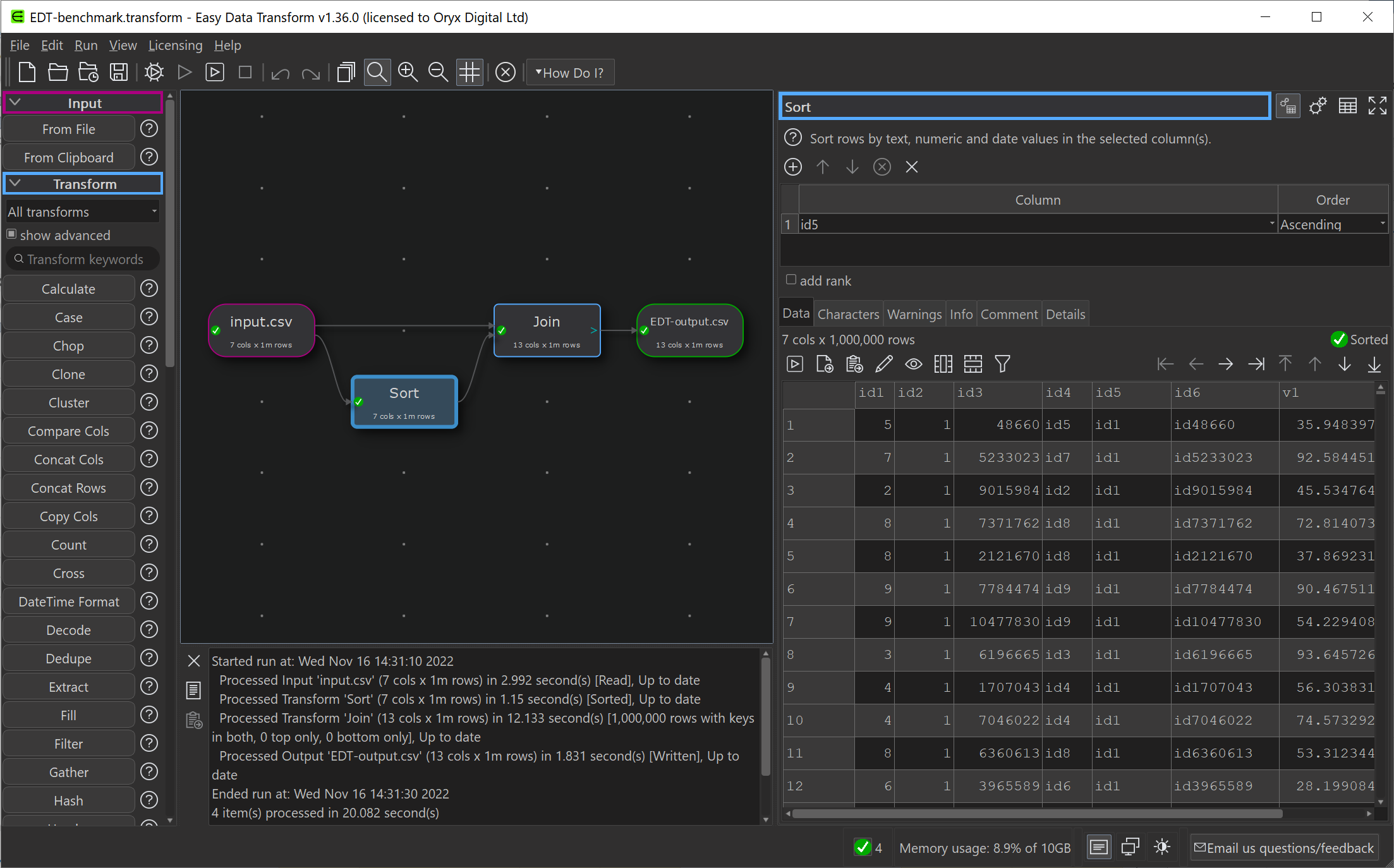
I have been gradually improving my data wrangling tool, Easy Data Transform, putting out 70 public releases since 2019. While the product’s emphasis is on ease of use, rather than pure performance, I have been trying to make it fast as well, so it can cope with the multi-million row datasets customers like to throw at it. To see how I was doing, I did a simple benchmark of the most recent version of Easy Data Transform (v1.37.0) against several other desktop data wrangling tools. The benchmark did a read, sort, join and write of a 1 million row CSV file. I did the benchmarking on my Windows development PC and my Mac M1 laptop.
Here is an overview of the results:
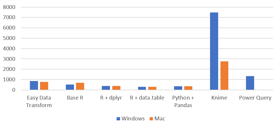
Time by task (seconds), on Windows without Power Query (smaller is better):
I have left Excel Power Query off this graph, as it is so slow you can hardly see the other bars when it is included!
Time by task (seconds) on Mac (smaller is better):
Memory usage (MB), Windows vs Mac (smaller is better):
So Easy Data Transform is nearly as fast as it’s nearest competitor, Knime, on Windows and a fair bit faster on an M1 Mac. It is also uses a lot less memory than Knime. However we have got some way to go to catch up with the Pandas library for Python and the data.table package for R, when it comes to raw performance. Hopefully I can get nearer to their performance in time. I was forbidden from including benchmarks for Tableau Prep and Alteryx by their licensing terms, which seems unnecessarily restrictive.
Looking at just the Easy Data Transform results, it is interesting to notice that a newish Macbook Air M1 laptop is significantly faster than a desktop AMD Ryzen 7 desktop PC from a few years ago.
Tabular data is everywhere. I support reading and writing tabular data in various formats in all 3 of my software application. It is an important part of my data transformation software. But all the tabular data formats suck. There doesn’t seem to be anything that is reasonably space efficient, simple and quick to parse and text based (not binary) so you can view and edit it with a standard editor.
Most tabular data currently gets exchanged as: CSV, Tab separated, XML, JSON or Excel. And they are all highly sub-optimal for the job.
CSV is a mess. One quote in the wrong place and the file is invalid. It is difficult to parse efficiently using multiple cores, due to the quoting (you can’t start parsing from part way through a file). Different quoting schemes are in use. You don’t know what encoding it is in. Use of separators and line endings are inconsistent (sometimes comma, sometimes semicolon). Writing a parser to handle all the different dialects is not at all trivial. Microsoft Excel and Apple Numbers don’t even agree on how to interpret some edge cases for CSV.
Tab separated is a bit better than CSV. But can’t store tabs and still has issues with line endings, encodings etc.
XML and JSON are tree structures and not suitable for efficiently storing tabular data (plus other issues).
There is Parquet. It is very efficient with it’s columnar storage and compression. But it is binary, so can’t be viewed or edited with standard tools, which is a pain.
Don’t even get me started on Excel’s proprietary, ghastly binary format.
Why can’t we have a format where:
Encoding is always UTF-8
Values stored in row major order (row 1, row2 etc)
Columns are separated by \u001F (ASCII unit separator)
Rows are separated by \u001E (ASCII record separator)
Er, that’s the entire specification.
No escaping. If you want to put \u001F or \u001E in your data – tough you can’t. Use a different format.
It would be reasonably compact, efficient to parse and easy to manually edit (Notepad++ shows the unit separator as a ‘US’ symbol). You could write a fast parser for it in minutes. Typing \u001F or \u001E in some editors might be a faff, but it is hardly a showstopper.
It could be called something like “unicode separated value” (hat tip to @fakeunicode on Twitter for the name) or “unit separated value” with file extension .usv. Maybe a different extension could used when values are stored in column major order (column1, column 2 etc).
Is there nothing like this already? Maybe there is and I just haven’t heard of it. If not, shouldn’t there be?
It has been pointed at the above will give you a single line of text in an editor, which is not great for human readability. A quick fix for this would be to make the record delimiter a \u001E character followed by an LF character. Any LF that comes immediately after an \u001E would be ignored when parsing. Any LF not immediately after an \u001E is part of the data. I don’t know about other editors, but it is easy to view and edit in Notepad++.
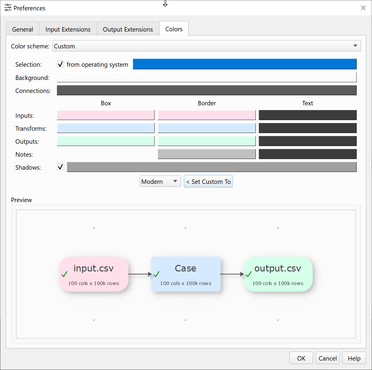
The colours used in Easy Data Transform make no difference to the output. But the colours are an important part of a user interface, especially when you using a tool for significant amounts of time. First impressions of the user interface are also important from a commercial point of view.
But colour is a very personal thing. Some people are colour-blind. Some people prefer light palettes and others dark palettes. Some people like lots of contrast and other don’t. So I am going to allow the user to fully customize the Center pane colours in Easy Data Transform.
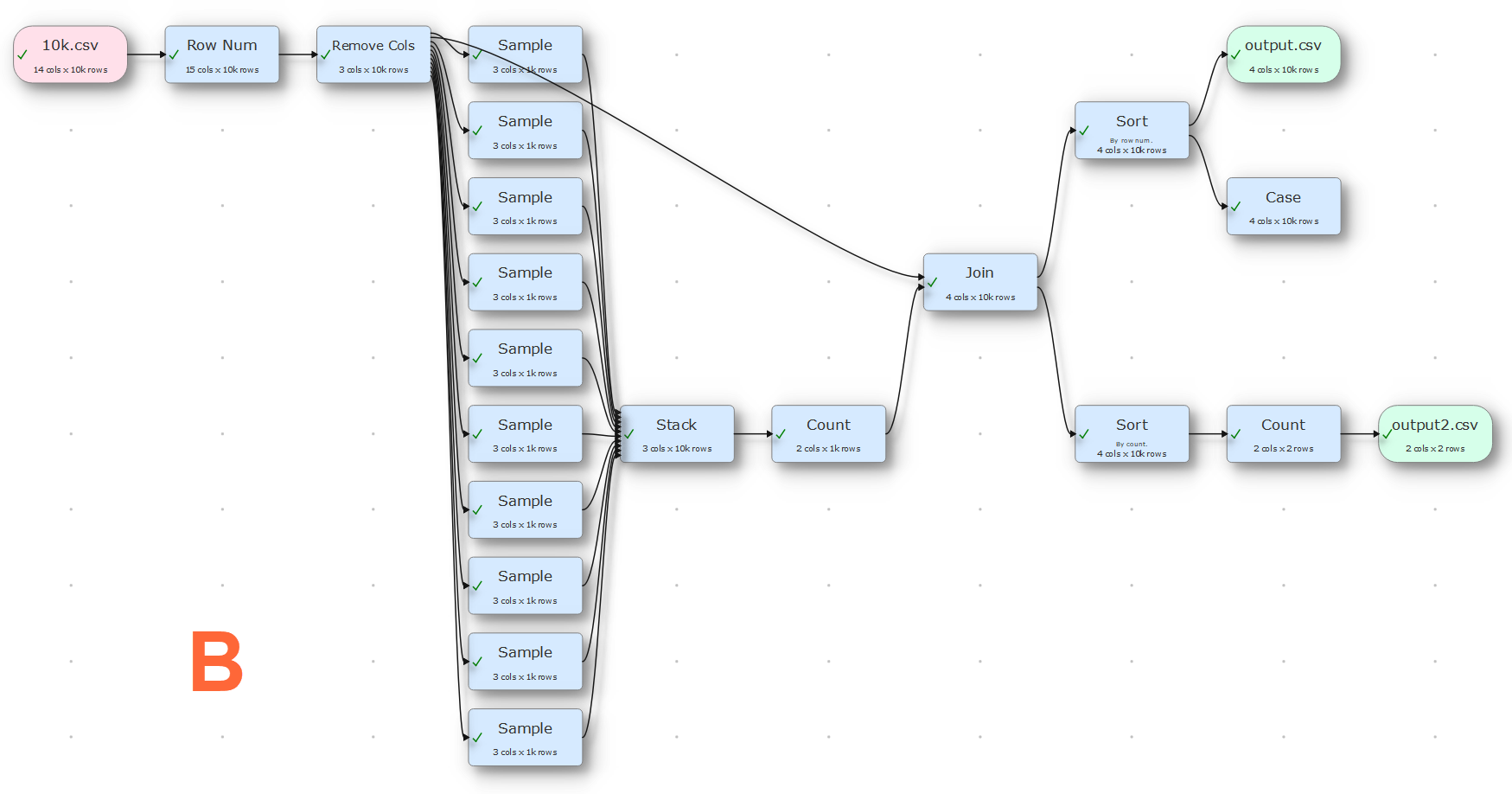
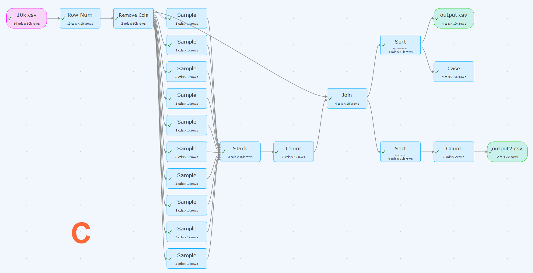
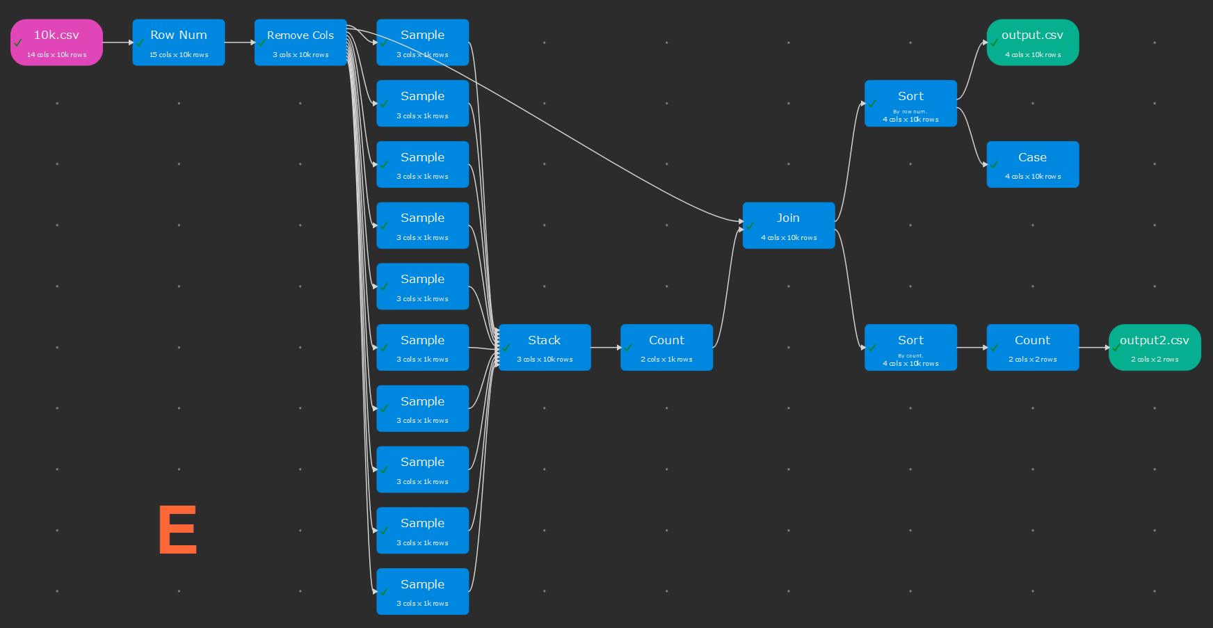
I also want to include some standard colour schemes, to get people started. Looking around at other software it seems that the ‘modern’ trend is for pastel colours, invisible borders and subtle shadows. This looks lovely, but it is a bit low contrast for my tired old eyes. So I have tried to create a range of designs in that hope that everyone will like at least one. Below are the standard schemes I have come up with so far. They all stick with the convention pink=input, blue=transform, green=output.
Which is your favourite (click the images to enlarge).
Is there a tool that you use day to day that has particular nice colour scheme?
I hope to also add an optional dark theme for the rest of the UI in due course (Qt allowing).
I have been working hard on Easy Data Transform. The last few releases have included:
a 64 bit version for Windows
JSON, XML and vCard format input
output of nested JSON and XML
a batch processing mode
command line arguments
keyboard shortcuts
various improvements to transforms
Plus lots of other improvements.
The installer now includes 32 and 64 bit version of Easy Data Transform for Windows and installs the one appropriate to your operating sytem. This is pretty easy to with the Inno Setup installer. You just need to use Check: Is64BitInstallMode, for example:
But it does pretty much double the size of the installer (from 25MB to 47MB in my case).
The 32 bit version is restricted to addressing 4GB of memory. In practise, this means you may run out of memory if you get much above a million data values. The 64 bit version is able to address as much memory as your system can provide. So datasets with tens or hundreds of millions of values are now within reach.
I have kept the 32 bit version for compatibility reasons. But data on the percentage of customers still using 32 bit Windows is surprisingly hard to come by. Some figures I have seen suggest <5%. So I will probably drop 32 bit Windows support at some point. Apple, being Apple, made the transition to a 64 bit OS much more aggressively and so the Mac version of Easy Data Transform has always been 64 bit only.
I have also been doing some benchmarking and Easy Data Transform is fast. On my development PC it can perform an inner join of 2 datasets of 900 thousand rows x 14 columns in 5 seconds. The same operation on the same machine in Excel Power Query took 4 minutes 20 seconds. So Easy Data Transform is some 52 times faster than Excel Power Query. Easy Data Transform is written in C++ with reference counting and hashing for performance, but I am surprised by just how much faster it is.
The Excel Power Query user interface also seems very clunky by comparison. The process to join two CSV files is:
Start Excel.
Start Power Query.
Load the two data files into Excel power query.
Choose the key columns.
Choose merge.
Choose inner join. Wait 4 minutes 20 seconds.
Load the results back into Excel. Wait several more minutes.
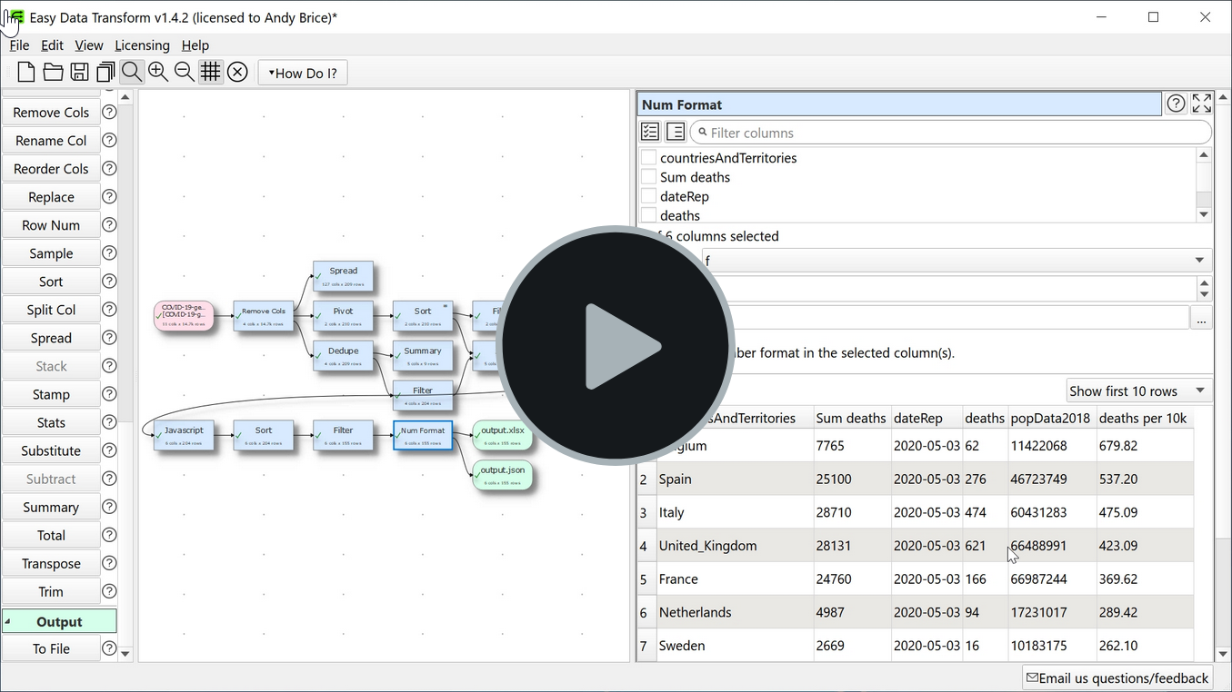
Here is a video of me using Easy Data Transform to analyze the data.europa.eu COVID19 dataset. Hopefully it gives an idea of what the software is capable of.